Uniforms are becoming increasingly important in the college football world. With each passing season, it seems like teams are in a race to come out with a new look or special uniforms -- anything that will make the school that much more attractive to possible recruits.
And don't be fooled ... recruits really do care about them.
Recruits aren't alone, either. Just about every time a school comes out with a new look, you'll be able to read about it here at CBS Sports as our readers can't seem to get enough of the uniforms, either.
So, if uniforms are that important, we must give them the traditional college football treatment: ranking them.
This week, I'll be ranking the uniforms of every Power Five conference, from the worst to the best. These rankings are based on absolutely nothing but my personal taste.
Today, we rank the uniforms of the Pac-12. Time to channel our inner Heidi Klum.
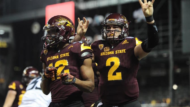
12. Arizona State: When Arizona State last rebranded back in 2011, I initially liked the new look. I dug the pitchfork logo on the helmets, and I thought a lot of the possible combinations would work well. In practice, however, I have not enjoyed the uniforms nearly as much as I thought I would. The only time I've seen an Arizona State uniform combination that I've liked was when they went with the charcoal-colored uniforms with the copper accents against Notre Dame. Those were sweet. Everything else just feels too aggressive.
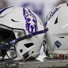
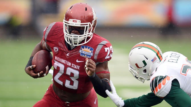
11. Washington State: If these rankings were based on logos, Washington State would be near the top, as I've always loved the unique "WSC" on the team's helmets. It stands out from so many other logos that seem too simple. The uniforms, though, well, I really don't have any other word to describe them other than boring. Now, there are times when boring uniforms are good. Boring looks good on some teams, but those teams tend to be the ones that win a lot. You can have boring uniforms when you're winning games. Washington State just hasn't won enough games to get away with it. It might not seem fair, and it may not even make any sense to you, but I just don't know how else to put it.
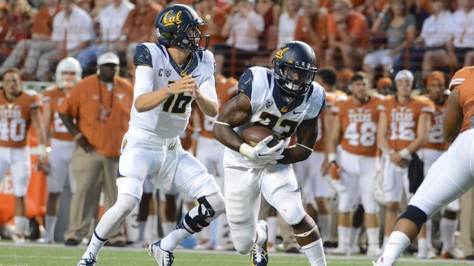
10. California: Cal suffers from a lot of the same problems that Washington State does when it comes to its uniforms. The only reason I put the Bears ahead of the Cougs is I like Cal's color scheme better. The blue and yellow work well together, but they could work a lot better. The Bears could probably afford to feature white a bit more because I tend to favor their road uniforms more than the home ones.
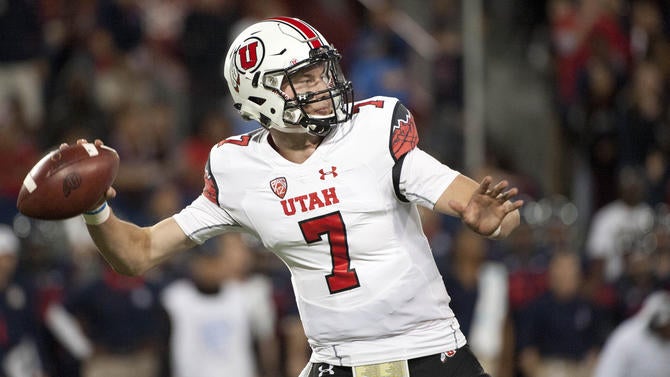
9. Utah: Now that we've gotten the bottom three out of the way, we've entered the portion of these rankings where the next five teams are all somewhat interchangeable for me. Like, these rankings could all change from week-to-week, but I've put them in this order based on their overall ensembles. There's nothing wrong with Utah's uniforms, it's just there's nothing exciting about them either. They're just there. Existing. They're the chocolate chip ice cream of uniforms. They're fine. You won't judge anybody for liking them, but if chocolate chip ice cream is your favorite ice cream, you just haven't tried enough other flavors.
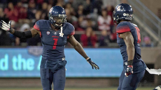
8. Arizona: There are some combinations of Arizona's uniforms that I like, and some that I don't really care for. Still, while there's nothing that I really hate about them, it's the whole gradients thing that keeps me from being able to rank them any higher. It all just reminds me of the crappy artwork I used to do in MS Paint while I was still in junior high. I just don't think you want your uniforms making people think of the mid-90s.
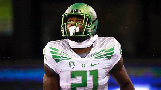
7. Oregon: It can easily be argued that Oregon is responsible for the prevalence of uniforms in today's game. After all, Oregon was in the business of making new uniforms before everyone else, and used those uniforms to expand the school's brand and make it more attractive to recruits. It also won plenty of games, which helped. The problem is that while Oregon may have a new look every week, I'd say only about 30% of them are good looks these days. It's a lot like a band that sticks around for a long time. Sure, the early stuff may have been great, but you can only stay original and good for so long before you start to lose some of the magic. Oregon's uniforms are at that whole "good god how many farewell tours are the Rolling Stones going to do" stage of existence.
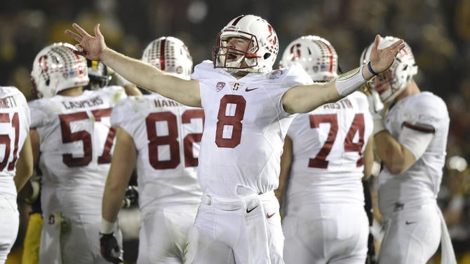
6. Stanford: Remember earlier when I was talking about how simple can be effective if you win? Well, here's a strong example of that. There's really nothing special about Stanford's uniforms, but there's nothing about them that's a visual turn-off, either. The colors are nice, the logo looks good on the helmet, and they aren't coming at you with ridiculous looking uniforms every other week. Though a recent turn to an all-black look has certainly been a disappointment, and keeps the Cardinal from getting any higher than sixth here.
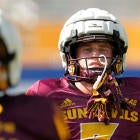
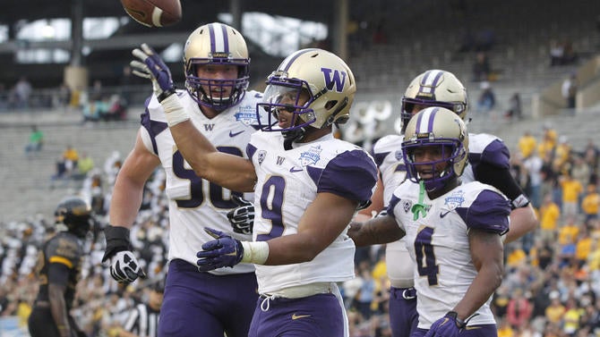
5. Washington: Of my five teams in the middle, I'll admit that the one thing that pushes Washington over the top of the previous four teams is the color scheme. There's just something about purple and gold, mixed with some white and black that I really dig. What I don't like about Washington's uniforms is the way the shoulders/sleeves are a different color than the rest of the shirt. I feel like that was only there because whoever designed the look believed they had to do something to convince their boss that they actually put in some work on it. Which is a shame, because I want to put the Huskies higher than this.
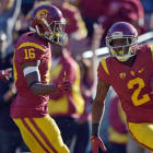
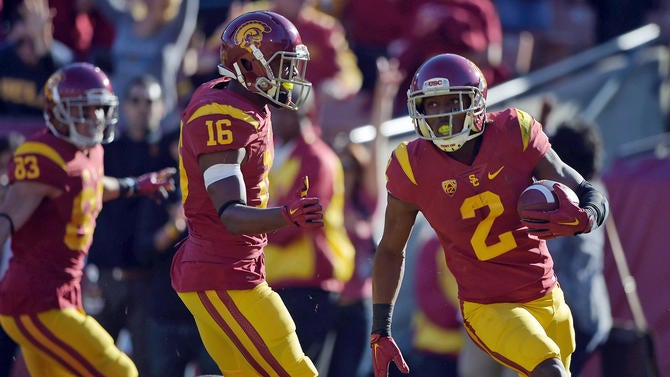
4. USC: A classic look. A famous look. A good look. Just not the best look in the Pac-12. Seriously, I have absolutely no complaints about USC's uniforms. I like them very much. I would proudly don the the cardinal and gold of the Trojans of Southern California. The look is clean, simple, and there's just so much college football history that's associated with the uniforms, as USC has had so much college football success. It's just, as a native Chicagoan, I still believe the Chicago skyline is a beautiful sight, but having seen it roughly a billion times, it doesn't inspire the same kind of awe that it used to. That's how I feel about USC's look.
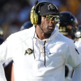
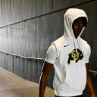
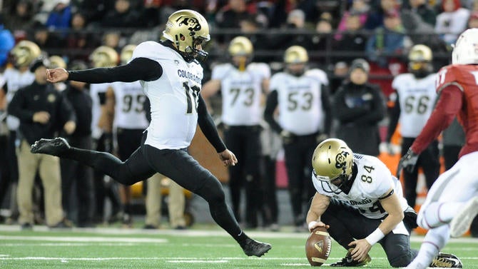
3. Colorado: I can't quite put my finger on what it is exactly, but I've always found Colorado's uniforms to be very appealing. I'm a fan of how black and gold work together, but more than anything, I just appreciate how Colorado doesn't try to hit you over the head with anything in their look. Whether it's the gold helmet-black jersey - gold pants combination at home, or the gold helmet-white jersey-black pants combo on the road, they're just both excellent looks. I'm not very high on the gray alternates that the Buffs have shown off in recent seasons, but they could be a lot worse, and as long as they remain a once-in-a-while thing, they're fine.
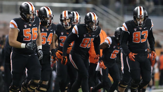
2. Oregon State: I have a feeling I'm going to be on an island with this. While I know there are others who like Oregon State's look, I don't believe anybody would have the Beavers this high. Well, sorry, I love the look. I love the way the black and the orange work together, and not just because it makes me think of Halloween and buckets of free candy (though I'm sure it doesn't hurt). Oregon State's black home uniforms, with the black, logoless helmets with the big orange and white stripes down the center, are easily one of my top five uniforms in college football. I love them. And that's why I have the Beavers this high, even if I don't enjoy the white road look nearly as much.
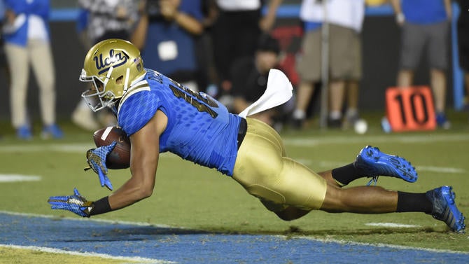
1. UCLA: When UCLA wears its gold and blue classics, there's nothing in college football quite like them. They're simply beautiful. They're so enticing that, whenever the Bruins wear anything else -- and UCLA feels the need to keep wearing all black for some reason known only to UCLA -- I actually get angry. Like, if you were married to a five-star chef, would you be going to McDonalds three times a week? Of course not, you'd have to be an idiot. Well, UCLA keeps going to McDonalds with their alternates, but even in the face of so much stupidity, those blue and gold beauties overcome the eyesores. They're magnificent.