


NHL previews: Atlantic Division | Metropolitan Division | Central Division | Pacific Division
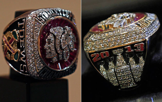
The Chicago Blackhawks received their Stanley Cup champion rings in Chicago over the weekend and as you could probably guess, they are kind of nice.
Created by Jostens Designs, the Blackhawks' ring has a lot to look at and certainly has some pop. Here are the details of the design.
The spectacular ring is framed by the words "Stanley Cup" and "Champions" and features the iconic Blackhawks logo fashioned in round brilliant and marquis cut diamonds with custom-cut tapered rubies set on a background of 14 kt. white gold.
The side design features seven baguette-cut rubies and two pear-shaped emeralds set in the shape of the Blackhawks' secondary logo. This emblem is set against the background of a "C" formed in yellow gold and yellow diamonds. Each ring is personalized with a championship team member's name and respective number against an antique black background.
The opposite side features five diamond-studded Stanley Cup trophies. Each one represents a championship title, and includes the years in which they were won, including 1934, 1938, 1961, 2010 and 2013.
Intricate arboring on the inside of each player's ring adds to the distinctive design, featuring the team's motto: "One Goal," and the playoff series score. The total weight of the championship ring is 93.0 grams and includes 260 diamonds and gemstones totaling approximately 14.68 carats.
Now a closer look at the ring courtesy of the Chicago Tribune.
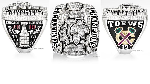
For comparison's sake, here's what the Blackhawks' ring looked like after winning the Stanley Cup in 2010. This one has just a bit more color to it.


