A little while back, we saw the Minnesota Timberwolves switch their style up, unveiling a brand new logo and colors, complete with a totally different wolf.
Now, their Northwest division rival, the Portland Trail Blazers, have followed their lead. Well, kind of.
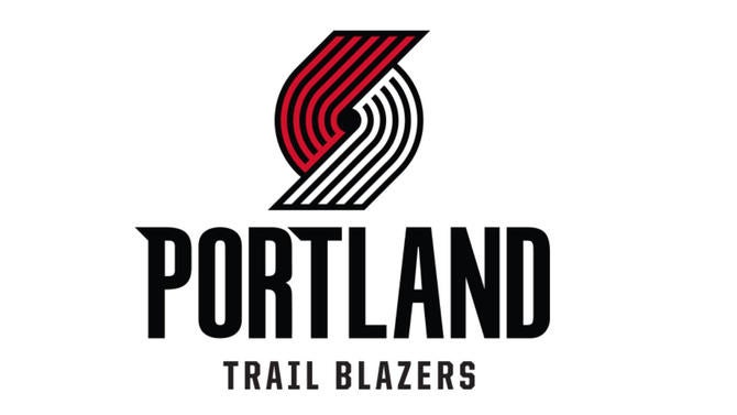
On Monday, the Trail Blazers dropped a new logo that looks pretty much like their old logo. The main change is the swap of the colors in the pinwheel, with red moving up top, and white -- instead of silver -- going to the bottom. There's also a slight design change in terms of the angles and the ends of the pinwheel which do look pretty nice.
Here, you can see the two pinwheels side by side.
Portland also updated the font, adding some stylized points to the "P" and the "T."
I'll let the Blazers themselves explain the minutia:
The most obvious change is that the red part of the pinwheel is now on top -- it was previously on the bottom -- and the bottom part of the pinwheel is now white rather than silver. The other "big" change is that the lines which comprise the two parts of the pinwheel are now connected by a straight diagonal line of the same color.
As for other changes, the font has been updated — there are now serifs on both the "P" and "T" — and the lines are now at a 45 degree angle, which according to the team represents "the 45th Parallel North that leads on a path to the Northwest region." Anyone who has driven over and over again past that 45th Parallel sign on I-5 in Salem can attest to that.
The detail behind the 45 degree angle is a really neat little factoid. I always love when teams get in-depth on the minor details like that. While there aren't many changes here, this is a nice little facelift for the Blazers, who already had one of the sharpest and most unique logos in the league.
I'm going to go ahead and give them a 9/10.