If you were one of the 16 teams in the NBA playoffs last year, Nike unveiled a bit of a surprise on Wednesday: new "Earned Edition" jerseys, a fourth uniform set for teams that played some extra games last season. While they're mostly reskinned "city" jerseys, the color switch did do some teams quite a few favors.
All-in-all, while 16 teams got an upgrade, it was only an improvement for some. Here's a look at all 16 jerseys.
Nike releases new uniforms for the 16 teams that made the playoffs last season called the “Earned Edition.” pic.twitter.com/VpjMzuCGGf
— NBA Central (@TheNBACentral) December 12, 2018
As with any jersey reveal, the question arises: Whose is the best? With these, there's another element. Which team improved the most? The new color schemes did some teams big favors, so here's who it benefited the most.
10. Golden State Warriors
The Warriors are one of the few teams that got a redesign from last year's look, and it's nice to see them lean into the yellow. "The Town" is back over the Golden Gate Bridge, and it honestly looks better than last season's grays. While it would have been nice to see yellow with the blue piping on this year's City look, this one came out looking really nice.
Town Gold
— Golden State Warriors (@warriors) December 12, 2018
Introducing the Nike NBA Earned Edition Jersey pic.twitter.com/kyw2I5PmVL
9. Minnesota Timberwolves
The Timberwolves are following the trend of the Heat, in that they want to brand around their City look. The Prince homage is back, only this time they're white. They still look good, but it's hardly a drastic redesign. After the last unveiling, it was reasonable to hope for a little more. Then again, when you end up with something that got the reception these did, how much would you really change?
A playoff berth earned us these 🕊 🕊🕊
— Timberwolves (@Timberwolves) December 12, 2018
Get yours 12/19.https://t.co/eD0a45uQ9z pic.twitter.com/8zbykiTJBs
8. Philadelphia 76ers
Speaking of white color palettes, the difference between the Timberwolves and 76ers is that Philly needed to go back to basics. The gray sweatsuits are out for a clean white look, and it makes the rest of the jersey pop. These are honestly so much cleaner. Up close they have an old-school ventilated look, too, which only adds to the allure.
#OnBrand x @sixers
— Chris Heck (@chrisheck76) December 12, 2018
Christmas Day snow in Boston?
2018/19 @nike Earned Edition pic.twitter.com/cTNmeswE28
7. Boston Celtics
Flipping the jersey color to green makes all the difference in the world. While the Celtics' City look was extremely "OK," these look a little bolder, and the gold lettering with white outline pops a bit better. All in all, these are a step in the right direction if you want to explore a "different" classic look for the Celtics. If nothing else, they feel less boring.
All 16 teams that qualified for the 2017-18 playoffs are releasing Earned Edition jerseys.
— Celtics Network™ (@celticsnetwork) December 12, 2018
The Celtics new jerseys have been on point this season 🔥 pic.twitter.com/jrPSQrdpNQ
6. Cleveland Cavaliers
As much as I usually hate artists' explanations for their work, I do like the reason for going to cooler colors being that it's cold as hell in Cleveland. These kind of look more like Costco cups, and they're a nice reimagining of the already cool City jerseys they had. If anything, they might be a bit more boring, but the two-toned jersey looks really appealing for whatever reason.
From water … to ice ❄️
— Cleveland Cavaliers (@cavs) December 12, 2018
Introducing our 2018-19 Earned Edition Uniform → https://t.co/ZjUdxY04VW #BeTheFight pic.twitter.com/XPTIL9HKFF
5. Indiana Pacers
We're now at a point where all of the jerseys are legitimately good, but the Pacers NEEDED this. Going from gray to white looks so much better, and they look like the Pacers again. Even though it may not be the best overall redesign, I think the Pacers win the most improved jerseys for this one.
Our Earned Edition uniform debuts December 28. pic.twitter.com/KhsWblaq6l
— Indiana Pacers (@Pacers) December 12, 2018
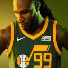
4. Utah Jazz
Nike really threw it back for the Jazz jerseys. There's really nothing to compare these with, given that the Jazz are using the same City jerseys as last season, but they took a chance with these and it paid off. The note logo is always welcome, and the green and yellow look pretty great together. Their City jerseys are popular, and for good reason, but these are some of the better jerseys they've worn in a while.
— Utah Jazz (@utahjazz) December 12, 2018
3. New Orleans Pelicans
This is a complete reskin of their City jerseys, only it replaces Mardi Gras colors with, well, Pelicans colors. The results are great, and better than their already good City look. The Pelicans arguably don't do enough with their color scheme, and this jersey shows that they're capable of a lot more.
The Pelicans were rewarded with a Nike NBA Earned Edition uniform for being a playoff team last season. The uniform will debut on 12/29 when the Pelicans host the Rockets at the Smoothie King Center. #doitBIG
— New Orleans Pelicans (@PelicansNBA) December 12, 2018
PHOTOS 📸: https://t.co/Gx7HZDHXQb pic.twitter.com/6k3oY2ft2o
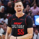
2. Miami Heat
Would anyone really be mad if the Heat just changed their name to the Miami Vice? They're going to be near the top of all of these lists, and the "Sunset Vice" look is no exception. You really just can't go wrong, period. Just fire up the jersey shop. You know you're buying your third Dwyane Wade vice jersey.
Talk to us vice. #SunsetVice
— Miami HEAT (@MiamiHEAT) December 12, 2018
https://t.co/Yjl4gBe3Yb pic.twitter.com/YbTPqZoIUI
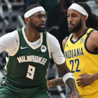
1. Milwaukee Bucks
The Bucks go back to the mecca for these, only this time they have their colors. The results are really, really cool. The gray at the bottom, the multiple shades of green up top. While I didn't hate the mecca jerseys' yellow, these are just unbelievably clean.
The 2018-19 Earned Edition will make it's debut on Christmas Day » https://t.co/hecqFH5Lvz pic.twitter.com/REEf9mqRb3
— Milwaukee Bucks (@Bucks) December 12, 2018