In case you had any doubts, it seems like the re-launch of the XFL is going to happen, like, for real. It took one step closer to reality on Wednesday with the reveal of the team names and logos for the eight franchises that will begin play in 2020.
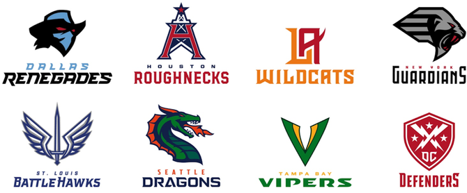
The teams that were introduced: the Dallas Renegades, Houston Roughnecks, Los Angeles Wildcats, New York Guardians, St. Louis BattleHawks, Seattle Dragons, Tampa Bay Vipers and D.C. Defenders.
Let's go ahead and hand out grades for names and logos because, honestly, what else better do you have to do today?
Dallas Renegades
From the XFL: Deep in the heart of Texas beats a different kind of pulse. A spirit untamed. A swagger that can't be denied. Where big meets bold meets badass. This is outlaw country, inside the lines. This is hell on wheels, between hash marks. This is their home on the range. The Dallas Renegades. Raising hell.
Name: B+...This one is pretty good. Dallas going with something that can be tied back to cowboys and outlaws is a win, and it definitely has a "badass" vibe.
Logo: C...Meh. It's not terrible but it's pretty generic. It looks almost identical to a logo that used to be available in Madden's create-a-team feature (this will be a common trend with these logos) and I don't love really love the color scheme. The powder blue should be reserved for Houston. However, the touch of red in the eyes is pretty sweet.
Deep in the heart of Texas beats a different kind of pulse.
— XFL (@xfl2020) August 21, 2019
A swagger that can’t be denied.
This is hell on wheels, between hash marks.
Raising hell February 2020: The Dallas Renegades. #XFLTeams pic.twitter.com/7QTx0dseYb
Houston Roughnecks
From the XFL: Resolute. Rippling with heat. Railing against fatigue. Unceasing and often unseen, they labor deep in the trenches. Mercenaries in the muck. Brawlers in blackened dirt. Not just for three hours. Not just when the lights are bright. These are the scratching, grinding, never-bending few. The Houston Roughnecks. Going to work for you.
Name: C...I get wanting to capture the blue-collar market, but Roughnecks? That's the best you could do?
Logo: A-...Yes, it's a total ripoff of the Oilers, but who's going to complain about that? The incorporation of the 'H' and the lone star is a pretty awesome touch. Seems kind of dumb to go with the same colors as the Texans though.
Mercenaries in the muck.
— XFL (@xfl2020) August 21, 2019
Brawlers in blackened dirt.
The scratching, grinding, never-bending few.
Going to work for you February 2020: The Houston Roughnecks. #XFLTeams pic.twitter.com/vDeSCA3SPs
Los Angeles Wildcats
From the XFL: In the land of bright lights. Far from the flash and fame. They've already begun to prowl. Enter their den and be dominated. Run away and be ripped apart. This is prime time meets primal instinct. This is showtime with a snarl. This is our time to roar. The L.A. Wildcats. Unleashed.
Name: D+...All the interesting things about L.A. and we get the super-generic Wildcats. Boooooooring.
Logo: B...It's certainly not reinventing the wheel -- in fact, it feels like this could be the offspring of a logo from a handful of other LA sports teams, but that's not necessarily a terrible thing. It's got a sleek and classic feel to it. That being said, you would have no idea what the team's name was based off of the logo alone.
This is prime time meets primal instinct.
— XFL (@xfl2020) August 21, 2019
This is showtime with a snarl.
This is our time to roar.
Unleashed February 2020: The Los Angeles Wildcats. #XFLTeams pic.twitter.com/XLZVH0UD2T
New York Guardians
From the XFL: Sentries carved of stone. Watchdogs over the metropolis. A prehistoric predator. A beast evolves, turned loose in a new kind of jungle. All teeth and talons, eyes unblinking. They know fear because they feed off it. They are your first line of defense, and there is no need for a second. The New York Guardians. On duty.
Name: B...Supposedly named after the gargoyles that are installed as overseers on top of buildings in New York. It's creative and different enough from much of what the New York sports scene has going on already.
Logo: C...That looks more like a lion wearing an Egyptian headdress than it does a gargoyle. Sportslogos.net suggests that maybe it's inspired by the lions outside the New York Public Library, which would be neat, but it doesn't even look like those lions, so....at least the colors fit?
Watchdogs over the metropolis.
— XFL (@xfl2020) August 21, 2019
They are the first line of defense, and there is no need for a second.
On duty February 2020: The New York Guardians. #XFLTeams pic.twitter.com/7AwCU3IV9a
St. Louis BattleHawks
From the XFL: Winged warriors. Preparing for flight. Preparing to fight. They await their orders. Then attack as one. Diving, dodging, swooping, striking. Their mission: create chaos. Their mandate: Win at all costs. The St. Louis BattleHawks. Cleared to engage.
Name: A-...It may not make a ton of sense, but it sounds cool. Although I wonder how St. Louis hockey fans feel about the team being so closely named to the Blackhawks.
Logo: B-...Generic but fine.
Winged warriors. Preparing for flight. Preparing to fight.
— XFL (@xfl2020) August 21, 2019
Their mission: create chaos. Their mandate: win at all costs.
Cleared to engage February 2020: The St. Louis BattleHawks. #XFLTeams pic.twitter.com/wGocLm80Tx
Seattle Dragons
From the XFL: Rising from the turbulent sea. Beneath the darkening skies of their weather-hardened home. Relentless, ruthless, ravenous. Not of mythology, but of muscle and might. Not of folklore, but of football. This is your darkest fantasy…in cleats. The Seattle Dragons. Breathing fire.
Name: C+...Super generic and pretty meaningless (to the best of my knowledge Seattle doesn't have many dragons) but it's definitely a name, that's for sure.
Logo: C-...I can't prove it but they definitely took this from a video game create-a-team generator somewhere. I am VERY interested to see what their uniforms look like with that color scheme.
Relentless, ruthless, ravenous.
— XFL (@xfl2020) August 21, 2019
Not of mythology, but of muscle and might.
Breathing fire February 2020: The Seattle Dragons. #XFLTeams pic.twitter.com/odx2YFnlwa
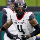
Tampa Bay Vipers
In the shadows, they wait. Demons, born in darkness. Hunters by instinct. Cold-blooded by nature. Their bite, unavoidable. Their grip, inescapable. They slither and stalk their competition. Luring all who challenge them into the jaws of defeat. The Tampa Bay Vipers. Ready to strike.
Name: B+...Not bad, but why does Tampa Bay continue to get sports teams? I'm not saying Tampa doesn't deserve them, but why Tampa Bay? No other body of water gets as many sports teams as this one. It's ridiculous. Why not the Boston Harbor Vipers, huh?
Logo: A...We've got a winner. Awesome color scheme and the snake fangs seamlessly worked into the 'V' is very cool.
Hunters by instinct. Cold-blooded by nature.
— XFL (@xfl2020) August 21, 2019
Luring all who challenge them into the jaws of defeat.
Ready to strike February 2020: The Tampa Bay Vipers. #XFLTeams pic.twitter.com/ziN4DDx47Q
Washington D.C. Defenders
On the shoulders of giants, they stand tall. Unconquerable. Unyielding. Marching ever forward, a force united. One quest. One purpose. One resolve. Seeking glory through grit. Victory through valor. The DC Defenders. Taking their stand.
Name: D+...Not sure what the difference between a Guardian and a Defender is but, hey, at least this one's not controversial.
Logo: D...Should have gone with the Breadsticks.
One quest. One purpose. One resolve.
— XFL (@xfl2020) August 21, 2019
Seeking glory through grit. Victory through valor.
Taking their stand February 2020: The DC Defenders. #XFLTeams pic.twitter.com/7Qzrd4hZM9