The Alliance of American Football is set to begin play in 2019, and now teams have a look to go with their names. The eight-team league features the Arizona Hotshots, Atlanta Legends, Birmingham Iron, Memphis Express, Orlando Apollos, Salt Lake Stallions, San Antonio Commanders and San Diego Fleet. While the teams had their names, the jerseys remained a mystery.
On Tuesday, all eight jersey combinations were unveiled. They were able to get kind of liberal with their designs (think Arena Football League), and that resulted in both some familiar and some not-so-familiar looks.
Here's a ranking of the eight jerseys based on how we think they'll look on the field. A lot of these looks brought in aspects of AFL and college designs, and the results in some cases were pretty neat.
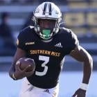
8. Memphis Express

These jerseys don't look bad, but the design is definitely a bit too comfortable, and they look a lot like someone else. Hint: Look at the number of the model. The stripes down the side are also a little awkward, but the red trim around the collar looks nice. It looks like these borrowed that design element from Nike, but toned down the thickness of it.
7. San Antonio Commanders
There will be those that like these for the consistency of them, but that's why I find them lacking. Using two tones of red hurts, and the two-toned helmets don't do them any favors either. If they were going that route, they could have made part of the helmet gray to offset the awkwardness of it.
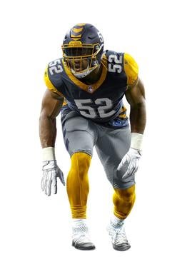
6. Atlanta Legends
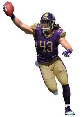
Once again, these looks just a bit too familiar, but the real problem I see here is the lettering down the sides. If nothing else, it's a different design choice, but that kind of thing is better left alone. The purple also ends up looking like a vest with those gold sleeves. I like the idea behind these, and the purple socks with the gold pants look especially cool, it's just the small details and the familiarity behind these I'm not keen about.
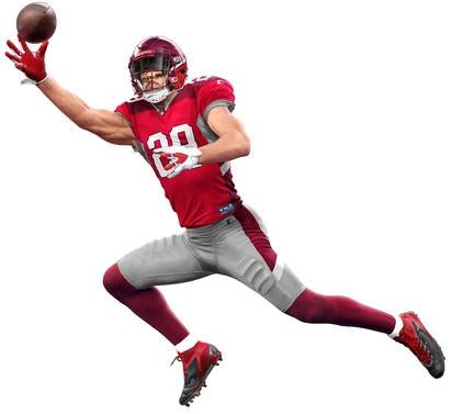
5. Arizona Hotshots
It feels wrong to not have the Hotshots play in Seattle with this look, but the color palette is still quality and this is a rare case where side stripes don't hurt the overall look -- probably because the orange is used as a consistent accent.
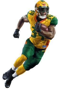
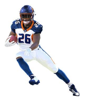
4. San Diego Fleet
Again, consistent design choices matter. Having the yellow used consistently as an accent is a nice look. The only complaint I have is the navy blue stripe on the pants and the fact that the Fleet helmets look a little like a road. Still, having a nice two-tone palette is refreshing, and I think these will look nice on the field.
3. Orlando Apollos
That matte blue on the helmets is too nice for me to not rank this team top three, and the fact that the Apollos strayed away from the normal jersey looks on these pays off. The consistent use of the orange is nice, and the whiteout look offset by blue socks looks really good.
2. Birmingham Iron
These may look a little boring at first, but they're called the Iron. This team has a nice, vintage look to it.
- Salt Lake Stallions
Pants match the shoulders, socks match the helmets -- literally my one issue with these is the random dark blue on the sides, but the way the entire jersey comes together is too nice for me to be mad about it. These jerseys came out way too clean to be anywhere but the top of the list.