Baseball is back! The 2017 Major League Baseball season will start on Sunday, April 2, and what better way to kick-start the year by ranking baseball’s best uniforms.
For this fashion experiment, we’re going to pick out the best threads for each team (home, away, alternate, throwback) and courageously rank all 30 of them. I’m sure we’re all going to be in agreeance with my picks and there’ll be no debating whatsoever, so come with us, why don’t you?
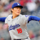
1. Los Angeles Dodgers (home uniform)

You can’t knock a classic. What sets this one apart from any other uniforms in baseball is the red number font, otherwise known as the TV numbers. Baseball uniform historian Todd Radom explains the story behind those numbers here. The Dodgers were the first MLB team to implement TV numbers. The combination of the blue wordscript and the red numbers makes this uniform set timeless. The L.A. caps aren’t too shabby either.
2. New York Yankees (home uniform)
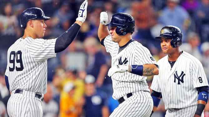
Speaking of timeless uniforms, we have the Yankees at No. 2 on our list. You can’t go wrong with the simplicity of the Bronx Bombers’ home uniforms. The N.Y. logo is probably the single most recognizable logo in the world of sports. Go anywhere outside of the United States and you’re bound to find a Yankees cap. Slap that logo on the chest, add the classic pinstripes, along with no name on the back of the jersey (NNOB) and you’ve got an iconic uniform.
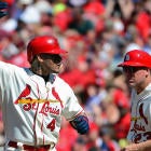
3. St. Louis Cardinals (cream home uniform)
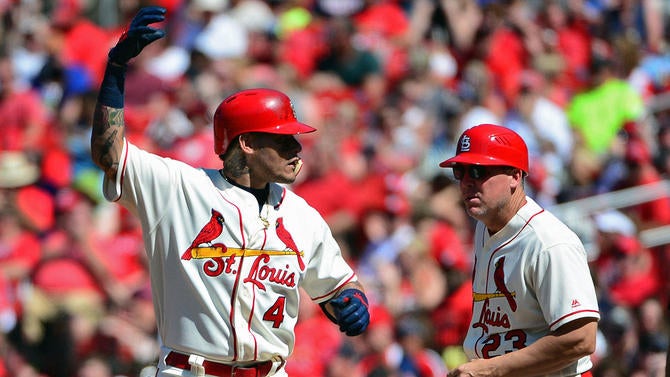
Cardinals fans like to think they’re the best fans in all of baseball. Well, on our list, the Cards’ Saturday home jersey is the best cream uniforms in baseball. I know the white “Cardinals” wordscript is the traditional look we’re all accustomed to seeing, but I think the “St. Louis” wordscript takes the cake. The red blends really well with the cream, especially with the headspoon piping (which is not included in the traditional whites).
4. Chicago Cubs (home uniform)
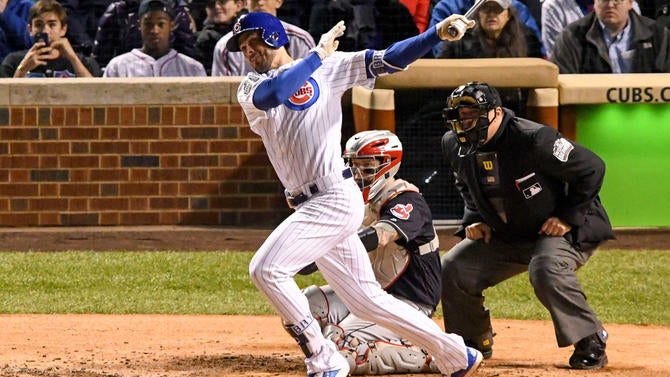
Sorry, Cubs fans, but the Cardinals finish ahead in this list. Hopefully the World Series trophy is a nice consolation prize. The royal blue pinstripes with the traditional Cubs logo on the chest is a look that is just as iconic as the Yankees (N.Y. logo and NNOB gets the edge, though).
5. Boston Red Sox (home uniform)
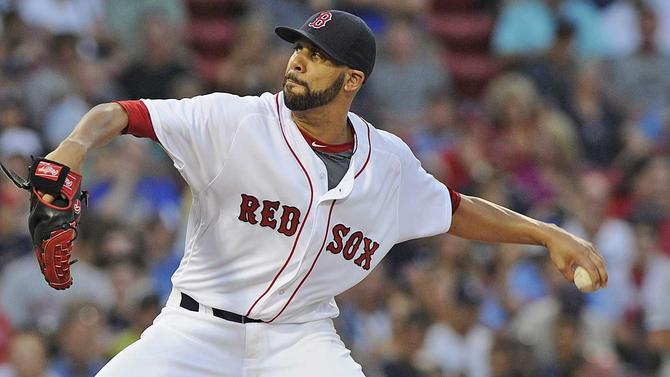
“Red” on one chest, “Sox” on the other and the red headspoon piping in the middle. It doesn’t get any better than that, does it? Thanks to the relocation of a certain Brooklyn baseball team, the Red Sox are owners of the most iconic “B” cap logo in the world. Like the Yankees, they get bonus points for only having the jersey number on the back.
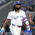
6. Toronto Blue Jays (blue alternate uniform)
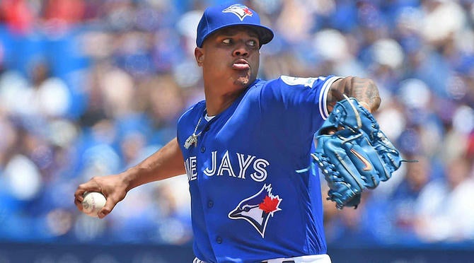
I’m so glad the Blue Jays brought back this look (or at least modernized it). It’s no coincidence why Toronto is back to being one of the perennial playoff contenders.
7. San Francisco Giants (cream home uniform)
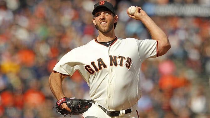
If you haven’t noticed, I’m a sucker for cream jerseys. And this is one of the best cream uniforms in the game.
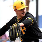
8. Pittsburgh Pirates (yellow throwback uniform)
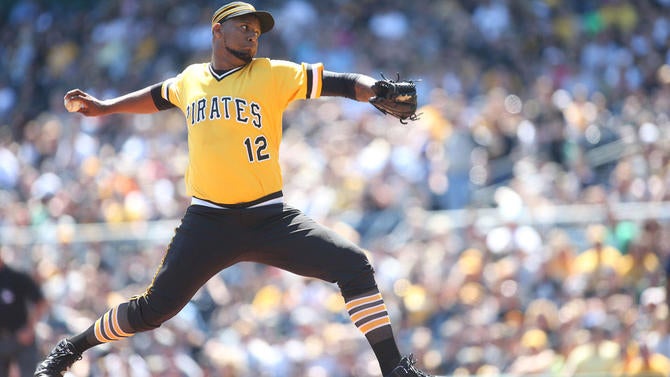
These uniforms (only worn on Sunday home games) bring back memories of the “We are family” Pirates clubs of the late ‘70s. And what makes this look so great is the contrast in the yellow tops and black pants. The socks and pillbox cap are cherry on top of this ice cream sundae.
9. Oakland Athletics (yellow throwback uniform)
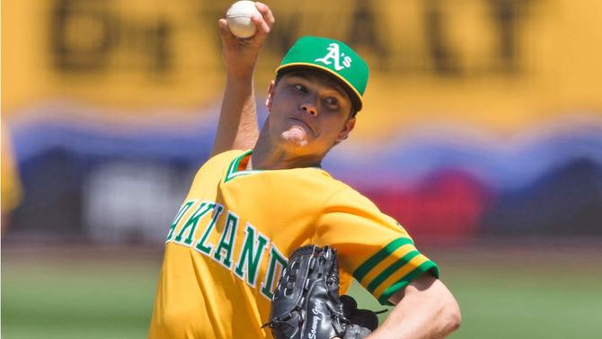
If you haven’t noticed, I am a huge fan of throwback uniforms and yellow jerseys. Baseball needs more yellow. Pair with the kelly green and you’ve got a hit. The only thing missing is yellow pants. The A’s only wore this one last season against the Cubs, but they should think about bringing these in permanently.
10. Seattle Mariners (cream home uniform)
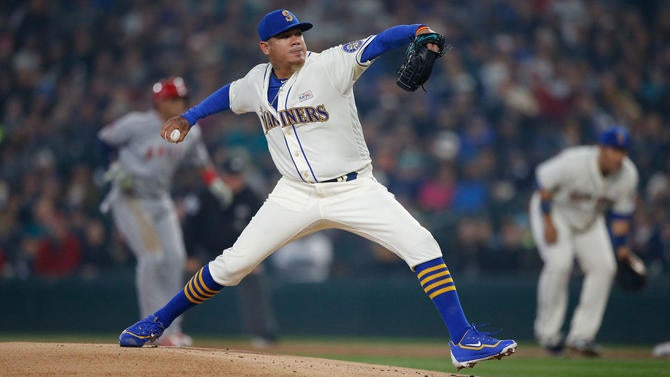
Don’t these unis remind you of the early ‘90s Ken Griffey Jr. days? It’s magical. The only thing missing is the Mariners trident hat in blue and yellow. King Felix sure knows how to rock them with striped socks (above).
11. Milwaukee Brewers (home throwback uniform)
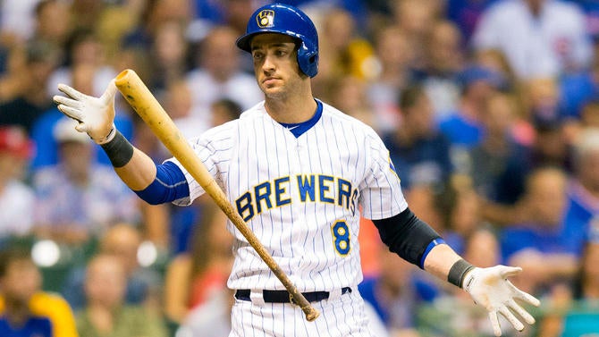
All is well in baseball now that the Brewers brought the ball-and-glove logo back to life. Next step is to bring these gorgeous throwbacks into the permanent rotation. Milwaukee is in the midst of a major rebuild, so why not harp back to the glory days, aesthetically?
12. Chicago White Sox (home throwback uniform)
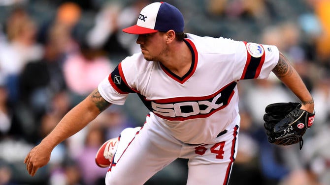
We’re in the throwback portion of our rankings, if you haven’t noticed. The White Sox have pretty bland uniforms. They’re fine as is, really, but the throwback unis with “Sox” across the chest really stand out. The numbers on one pant leg is also another underrated aspect of these lovely get-ups. And now that Chris Sale is out of the picture, the Chicago front office won’t have to worry about anyone cutting up the threads in the locker room.
13. New York Mets (home throwback uniform)
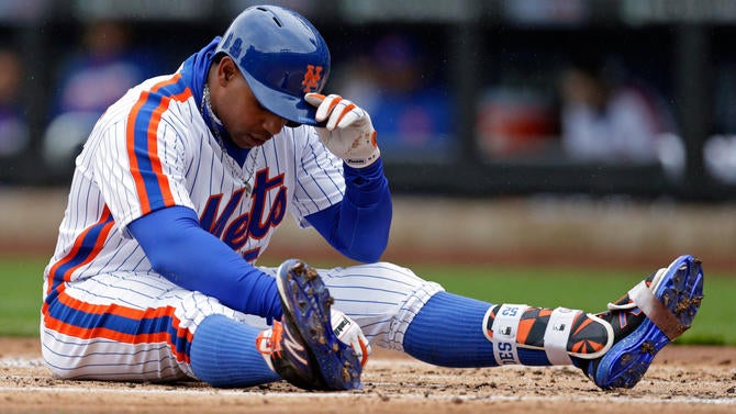
The Mets have great home uniforms, but the 1980s throwback worn last season probably stands out the most thanks to the blue and orange racing stripes that run from the shoulders down to the legs. And our man pictured above, Yoenis Cespedes, sure knows how to rock the look. Doesn’t this bring back memories of the Dwight Gooden and Darryl Strawberry glory days? The only thing that can possibly ruin this look is Tim Tebow donning a No. 15 jersey. Ugh.
14. Kansas City Royals (light blue alternate uniform)
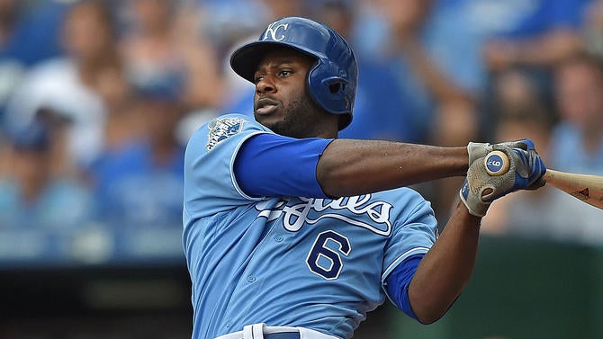
The Royals’ white home uniforms look pretty similar to what the Dodgers wear at Chavez Ravine. The only difference is the red TV. numbers. That’s why I went with the powder blue joints pictured above. It’s a great modern look that channels back to the George Brett days. All we’re missing here is matching powder blue pants. Make it happen, K.C.!
15. Detroit Tigers (home uniform)
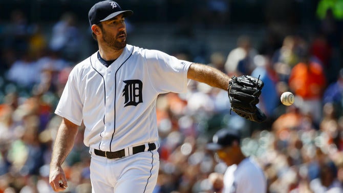
Another classic look. The Old English “D” has become emblematic for the city of Detroit. The dark blue-white look will never grow old to any baseball fan. However, it’s a tad bit bland for my liking, which is why I have it at 15.
16. Philadelphia Phillies (cream home uniform)
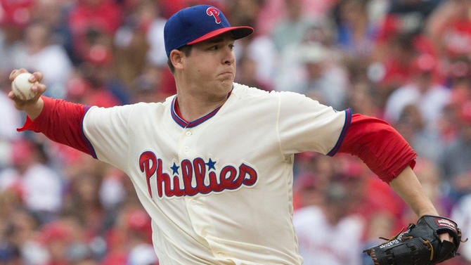
Can’t get enough of that cream. The classic Phillies logo across the chest (with the star dotting the “I”) goes so well with the cream look. And I’m glad the Phillies don’t have numbers on the front of the jersey. Now if we could only swap the blue cap with the red brim with an all-red cap. Who knows, maybe that’ll happen soon.
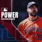
17. Houston Astros (orange alternate uniform)

Let’s thank the baseball gods that the Astros got rid of the red-and-gold look for a more traditional set of uniforms. It’s great to see the “H” logo back on the lids. The headspoon piping and the number in front of the jersey seems a little overkill. If the Astros made some tweaks, these orange unis would be slotted a little higher in my rankings.
18. Baltimore Orioles (orange alternate uniform)
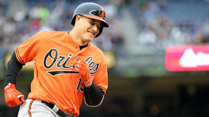
Speaking of orange, the Orioles have one of the best sets in baseball. The white outline on the wordscript really brings the “Orioles” out. The return of the cartoon bird in 2012 was desperately needed. My man pictured above, Manny Machado, makes that cartoon bird look fly AF.
19. Atlanta Braves (cream home uniform)
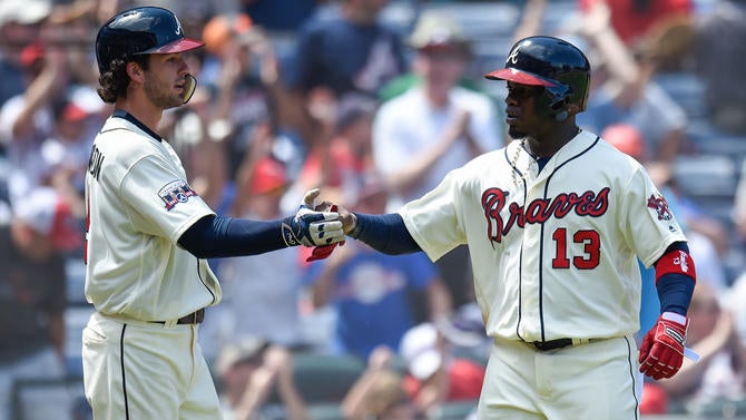
We’re getting creamy again. Hopefully we see Dansby Swanson wearing these for years to come. These unis worn on Saturday home games are wonderful, but they can do away with either the number on the front or the headspoon. Pick one, Atlanta.
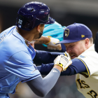
20. Tampa Bay Rays (light blue alternate uniform)
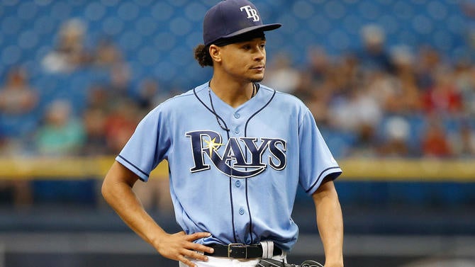
This isn’t my first choice among the light blue unis in baseball, but this a pretty fly set for a team that hasn’t been around for too long. They’ve come a long way from the days of the Devil Rays. Tampa Bay finally has its classic look.
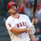
21. Los Angeles Angels (red alternate uniform)
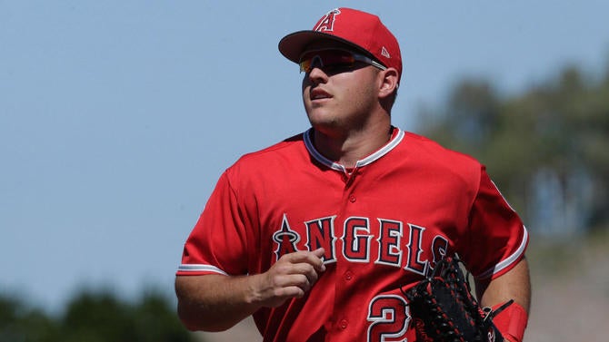
The Angels should incorporate some navy blue (and a pinch of yellow) back into the rotation and bring back the upper-case “a” cap logo from the days of Reggie Jackson. The red-on-red look is the best among the Angels’ rotation. They’re wasting Mike Trout’s prime seasons with this dull look.
22. Minnesota Twins (cream home uniform)
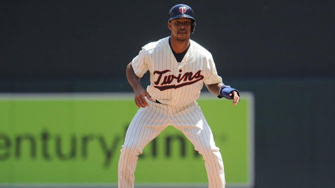
This is the last of the cream uniforms on our list. The Twins went to a more vintage look once they opened up their new ballpark in 2010. The difference between this uniform and their traditional home look is simple: pinstripes added, vintage wordscript and cream over white. That’s a recipe for perfection.
23. Cincinnati Reds (home uniform)
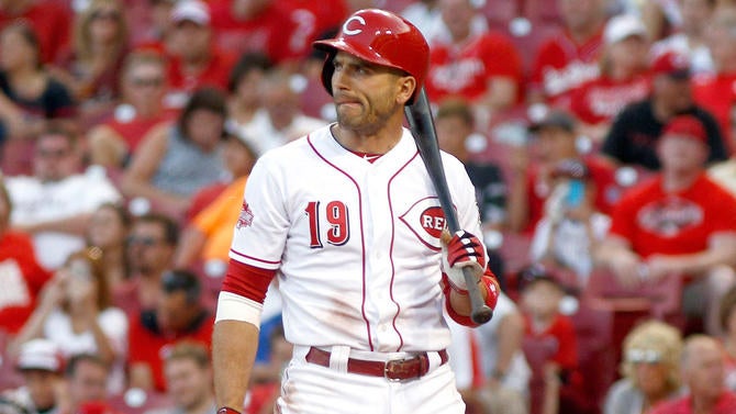
The block shadow on the numbers is such an outdated touch. The headspoon piping is OK, at best. Just go back to the old big red machine look of the ‘70s or the vests worn in the early ‘90s with the red pinstripes.
24. Texas Rangers (red alternate uniform)
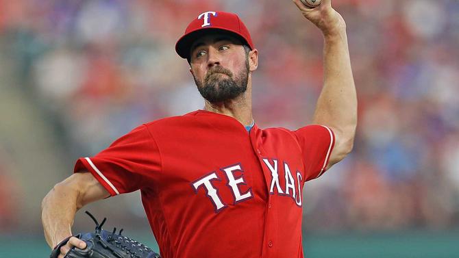
The Rangers are in need of a Texas-sized redesign.
25. Washington Nationals (home uniform)
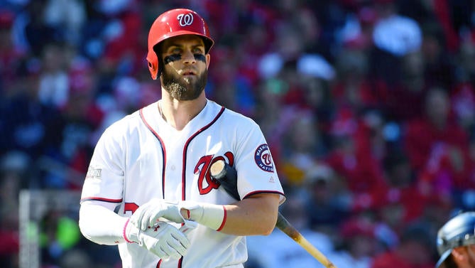
The curly “W” logo is a nice foundation for a uniform design, but it’s the only thing the Nationals have in their favor. The rest of the uniform look is pretty bland, and leaves much to be desired.
26. Miami Marlins (black alternate uniform)
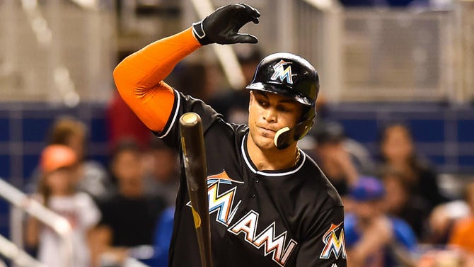
I’m cheating here because I’m taking Giancarlo Stanton’s orange sleeve into aesthetic consideration when it comes to judging Miami’s uniform. Take that away from consideration and the Marlins are probably slotted a little lower on this list. A part of me wishes they had kept the black-and-teal look and the “F” logo from the Florida Marlins days.
27. Colorado Rockies (home uniform)
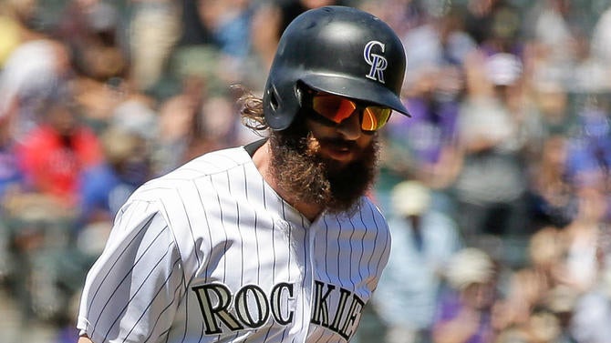
This is one of the rare occasions where pinstripes fail to give the finishing touches to a great look.The Rockies should get rid of the pattern all together and embrace the purple in their home jersey -- much like they have with their alternate jersey.
28. San Diego Padres (brown alternate uniform)
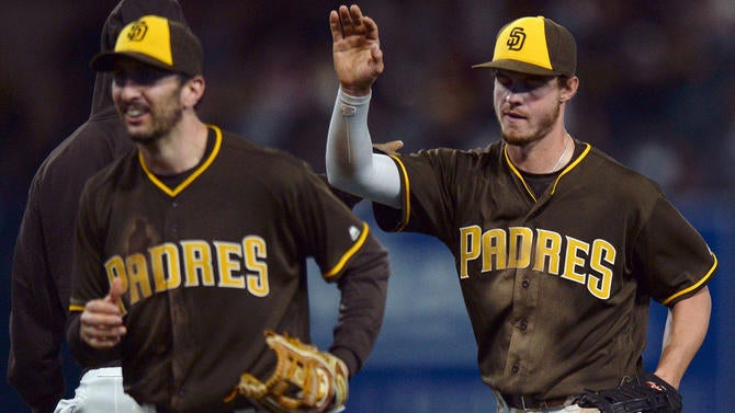
We’ve punished the Padres, and here’s why. Last year, they had a good thing going with their navy S.D. logo with the yellow trimming. Apparently, the ballclub rolled out that look to celebrate the 2016 All Star Game at Petco Park. For whatever reason, they chose to keep the same set of uniforms, but get rid of the yellow trimming in the home white, navy and road grey looks. That’s why we chose the brown set. The brown lids are killer. Stay classy and go back to the Tony Gwynn look from the ‘80s, San Diego.
29. Cleveland Indians (navy alternate uniform)
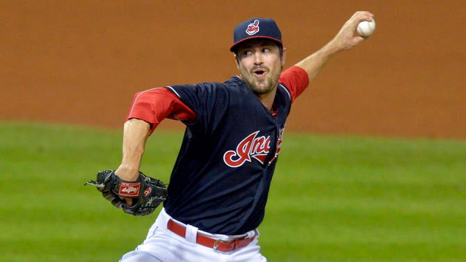
Talk to me when you permanently get rid of the Chief Wahoo logo, Cleveland. Once the “Block C” fully replaces the offensive logo, we’ll bump Cleveland up in our rankings.
30. Arizona Diamondbacks (home uniform)
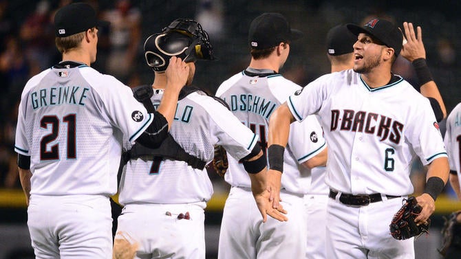
The Diamondbacks had a good thing going with their extremely ‘90s aqua/purple look. They even won a World Series with Randy Johnson, Curt Schilling and Luis Gonzalez rocking that look. But in 2007, they ditched the aqua and purple for Sedona red. In 2016, they shifted the uniform paradigm with a futuristic gradient design that featured a charcoal grey road uniform with a half pant-stripe and a red gradient design at the bottom of the pants. Arizona has dome some tweaking this season, getting rid of the gradient “bloody sock” look on the pants and the pipping on the pants now goes from hip to heel. They’re nice changes, but the current set still has the resemblance of a batting practice jersey. Go back to the aqua and purple, please.
