LOOK: Wizards reveal new logos
A soccer-type shield features the Washington Monument and a star theme.

The Washington Wizards unveild new logos Wednesday, moving completely away from any Wizards imagery, and to much more of a "soccer shield" type look. From the official site:
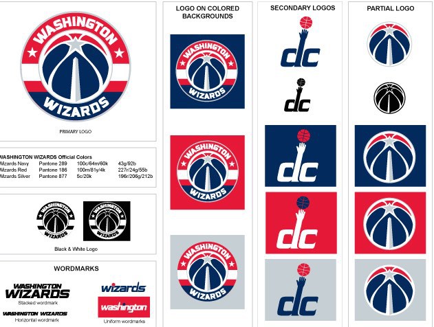
The star combined with the Washington Monument is a good look. I'm still not a super fan of the creepy baby-like hand extending towards the ball. (And turn that thing sideways and it's not a good look, either.) But the main logo change looks very much like a soccer-type logo.
The team moved away from the old colors back to "Bullets" colors a few seasons ago. It's clear that owner Ted Leonsis wants to rebrand the team, and it's a good idea, but Bullets is too controversial in today's environment to return to. They need to find something patriotic that they can embrace that doesn't have the violent connotation. The rebranding, however, is going great.