Last season for the Marlins was the first under the new ownership group, with the most visible member being CEO Derek Jeter. The first thing the new owners did was slash payroll, sending out star outfielders Giancarlo Stanton, Marcell Ozuna and Christian Yelich, among others. More recently, they've gotten rid of the "Home Run Feature" from left-center that was sort of the defining trait of Marlins Park.
Next on the list? A new logo and new uniforms. We've known for a while the Marlins were going to be making such changes for next season and we recently got a glimpse with this video, posted to the Marlins official YouTube channel:
If you don't want to watch the video and instead just want to see the logo, here you go:
Generally speaking, the initial public opinion on cosmetic changes like this is something along the lines of "OMG, that is so awful!" For me, though, this is a big improvement. That hypothetical quote from the last sentence was actually my reaction the last time the Marlins changed their logo and uniforms. There were just too many colors, for one. This scheme works well and I like the more realistic and prominent fish.
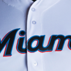
And for the new uniforms, which were unveiled on Friday:
All of our work and hustle is for the city across our chest. #OurColores pic.twitter.com/xFlzCJKPCj
— Miami Marlins (@Marlins) November 16, 2018
Here's how the team describes the new look in their Friday press release:
Miami's new colors are: Caliente Red, Miami Blue, Midnight Black, and Slate Grey. Our Colores can be seen throughout the culture of Miami, on the vibrant streets and metropolitan landscape of South Florida, and are representative of the shades of colors found in the large variety of cultural flags flown throughout the community's many neighborhoods. The logo and colors aim to capture the rich baseball history, diversity, and energy of the area. The pairing of Miami Blue and Caliente Red pop off of the base color of Midnight Black, energizing the script and giving the logo an electric and vibrant look -- emblematic of the Miami energy and nightlife.
The styling of the modern script "M" and curved tapered serif font is a classic approach influenced by the typography commonly found among the Latin-American culture. The look has as much to do with the infusion of the local Hispanic culture as it does with the history of baseball in Miami as the font style and accent colors are a throwback to the Miami Marlins and the Havana Sugar Kings of the 1950s.
And here's a closer look at their 2018 ensembles, via the Marlins' online store:
New Marlins jerseys just popped up on their site pic.twitter.com/gHxdM5c3eg
— Igor Mello (@SuperIgor) November 16, 2018
Disappointed by the ongoing absence of the original teal? Of course you are.