


The Knicks officially unveiled their new uniforms on Thursday, returning to a cleaner look and adding in little touches meant to give meaning to the new laundry.
Let's start with the big-picture look. (All images courtesy of Getty Images.)
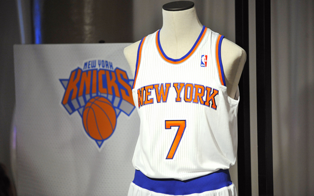
So the attempt here is to "clean" the jersey, opening up the space and removing the black elements put in place in the '90s. It's fine, I suppose, even if the blue outline on the lettering seems to create more of a moody, neon glow than a true outline.
But what's up with the underarms lining? The stripe outline in orange and blue rotates from the top of the shoulder down to the armpit and then just ... dies. Like some lonely abandoned trail that just peters out into the forest of armpit hair. No way for a stripe to die, really.
The big addition to this jersey is the lettering around the collar on the back inside. Observe:
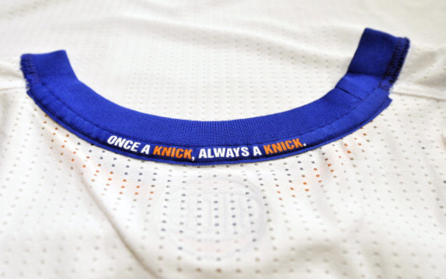
Not entirely sure why they want to condemn a man like that, but sure ...
Kidding!
Here's how they look from the front and back, featuring a can-we-say svelte Amar'e Stoudemire? Dude's been hitting the gym.

If the goal was indeed to foster a cleaner look, they succeeded. But it also does take some of the imposing oomph out of them. No word on whether there will be changes to the away jersey as hinted at last week.