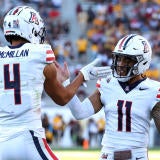
It's throwback Tuesday.
Throwback uniforms have always been a hit with fans, and on Tuesday a few of the top college football teams released throwback inspired uniforms that will have the spotlight in a game next season. Release for the Under Armour outfitted schools is in celebration of 150 years of college football. While none of the uniforms are an exact replica to their older counterparts, the attempt is to add a modern flair to a classic look.
Here is my ranking of the uni's released so far:
1. South Carolina Gamecocks
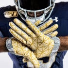
The South Carolina Gamecocks released their late 1980s-era throwback uniforms on Twitter with what was borderline a short film. It had a plot, characters, suspense and intense cinematography to go with it. Besides the fantastic and well thought out reveal, the uniforms look pretty good too. Through the very dramatic smoke in the video you can see the black uniform with maroon details. The gloves spell out "Carolina" when put together, a nice touch to the otherwise intense uniforms.
Back in Black 🔥#CFB150 pic.twitter.com/iP6hohWDUn
— Gamecock Football (@GamecockFB) August 13, 2019
2. Maryland Terrapins
Maryland comes in second for me, but it was close. Not only did their video seem well thought out, but the uniforms, which are meant to mirror those worn in the early 1980s, do as well. Little details like the black lining on the numbers to make them stand out and the "Terps" on the gloves and pants to match the helmet take the uniform to the next level. The orange may be too much for some, but I am a big fan of the bold color. The uniforms will hit the field during their homecoming game.
It's Iconic. It's Maryland.
— Maryland Football (@TerpsFootball) August 13, 2019
... and for #UMDHomecoming. It's BACK! #𝓣𝓮𝓻𝓹𝓼 x #CFB150 x @UAFootball pic.twitter.com/mVGMRQGwRP
3. Notre Dame Fighting Irish
The Notre Dame Fighting Irish uniforms are clean and classic. The gold and navy play so well off each other and this is no exception. The helmet shines in the video and while the gloves are not my all time favorite, at least they tried something with them. The numbers are appealing, with the mesh look and a gold outline that serves as a nice middleman between the white of the numbers and the navy of the uniform. The shiny gold pants are reminiscent of the ones used in 1988, the year the uniforms mimic. You can catch the uniforms on Senior Day, November 23.
To send off our seniors, we’re going back to ’88... and adding some modern flare. 💥
— Notre Dame Football (@NDFootball) August 13, 2019
More: https://t.co/7dL9FKEQIk#GoIrish ☘️ #CFB150 pic.twitter.com/TPZFfLerYV
4. Cincinnati Bearcats
The Bearcats released classic looking red and black uniforms for their throwbacks. The stripes on the jersey, pants and helmet are make the whole thing cohesive. The all red is too reminiscent of a garish NFL color rush jersey for me, but you can't deny that they look clean. They are meant to look like the uniforms used in the 1950s and 60s but "feature a number of performance innovations, including ... stretch mesh ventilation, improved fit, belt-length cut with elastic hems and lightweight team embellishment," according to a press release from UC.
🔥 THROWBACKS 🔥#Bearcats | #CFB150 | @UnderArmour pic.twitter.com/u50JT2rlHF
— Cincinnati Football (@GoBearcatsFB) August 13, 2019
5. Northwestern Wildcats
Northwestern's 'fauxback' uniform is the definition of middle of the road for me. The purple translates well on the helmet but the rest of the uniform is very "meh." The "NU" above the the number seems out of place. Either the font is off, the size is wrong or there is a lack of pizzazz with the lettering, but something is not working. Possibly a combination of all three. I will give them creative points for using a 1960s-era version of their mascot, Willie the Wildcat, on their gloves. The uniforms will be seen in Northwestern's game against Wisconsin, who came in last on this list, on September 28.
We stand on the shoulders of those who came before.#CFB150 inspired throwbacks. Coming 9/28.#B1GCats x #GoCats pic.twitter.com/ELbkDXm09o
— Northwestern Football (@NUFBFamily) August 13, 2019
6. Boston College Eagles
The Eagles got lucky Wisconsin's uniform was so boring, because BC did not bring much to the table when it came to revealing the throwback uniforms. The team is throwing it back to 1984 and displays a uniform with gold pants and a maroon jersey, with gold stripes on the arm. BC went with a very similar throwback design last season as well. I needed more from Boston College to give an official rating, but what I see is neither incredible or horrible.
1984⏪@UAFootball #CFB150 Throwbacks.#WeAreBC🦅 pic.twitter.com/8Q9aOcYLKP
— BC Football 🏈 (@BCFootball) August 13, 2019
7. Wisconsin Badgers
Wisconsin tried. Like Northwestern, the Badgers' look isn't a true throwback, but a modern take on how an old uniform translates today. The pants look more like khakis than a football uniform and the jerseys don't have much to criticize because there isn't much there. It looks like a last minute effort to throw something together and takes no risks in creativity or style. I'll give it to the Badgers, the 1889 jerseys they showed in their promo video do not have much to go off of, but the plain number with the just as plain "UW" resting above it is nothing I am going to lose my mind over. The only dynamic part of any of the lettering on the entire uniform is a slight white drop shadow on the helmet. Not their best work, though I see why they made it plain after looking at what they used as a reference.
Classic feel
— Wisconsin Football (@BadgerFootball) August 13, 2019
Fresh look
9.28.19#OnWisconsin pic.twitter.com/WSSMQJV9Hx