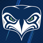
The Seattle Seahawks got kind of crazy and unveiled a new alternate logo this week, but there's already one problem: No one seems to like it.
If the reaction from Twitter is any indication, the Seahawks might want to head back to the drawing board on this one.
For the past 41 years, one of the greatest mysteries in the NFL has been the question of what the Seahawks' logo looks like from the front. Since the team's inception in 1976, they've used variations of a logo that only shows a profile view of the seahawk.
The new logo shows what that same seahawk would look like from the front, and let's just say, it's not pretty.
After the Seahawks unveiled the new alternate logo on Tuesday, Twitter quickly found out about it and then proceeded to do what everyone on Twitter does best: make fun of it.
The most obvious question with the new logo is clearly: Were they trying to make it look like Mr. Burns?
I… I just don’t know what to think about this new #Seahawks logo. pic.twitter.com/2jVVsPaIUk
— Stephen Cohen (@scohenPI) September 6, 2017
We definitely can't discount that theory.
It's also possible that the team is planning on changing their name to the Emus, and to be honest, this actually seems plausible.
Nice new logo Seahawks pic.twitter.com/ZWoBVuvQI3
— Simon Bull (@SimonBull94) September 6, 2017
This next tweet is basically why the Seahawks probably never showed us their logo from the front: They didn't want us to be able to identify their mascot.
Seahawks new logo and mascot @sportspickle pic.twitter.com/CadQpAWAJ7
— Matt (@Datt_Mavis_) September 6, 2017
The Seahawks new logo also kind of looks like a mean librarian if you draw some glasses on it and put some hair in the right places.
New Seahawks logo looking like a librarian who is disappointed in you because you turned your books in past their due date pic.twitter.com/OVrfw0YdgH
— Natalieeeee (@MsNatalieHughes) September 6, 2017
The person below thinks the new logo looks like a "Finding Dory" character and I'm kind of starting to come around on that.
@Seahawks new logo be lookin like becky from @findingdory pic.twitter.com/wCgFb6aiIe
— ✖️ Christine ✖️ (@the_tecson) September 6, 2017
It's a good thing the Seahawks marketing team didn't ask Twitter to rate the logo before they unveiled it because I'm thinking that it would've gotten a big fat "F."
Seahawks new logo looks amateur
— 超新星 (@EatEmMusic) September 6, 2017
I love my Seahawks but that new alternate logo just looks waaay too weird 🙅🏼
— Savannah Wilson (@saavvvssss) September 6, 2017
The Seahawks new logo is 🚮🚮
— 💀SINISTER💀 (@iamKeithParsons) September 6, 2017
Change that ugly logo please pic.twitter.com/lkt2JsVB0u
— Keenan (@AcDcRack) September 6, 2017
I am a:
— Amanda Hall (@mandarose3) September 6, 2017
⚪️ Male
⚪️ Female
🔘 Seahawks Fan
Seeking:
🔘To ban the ugly alternate logo.
Anyway, for the fans out there who do like the new logo, I have some good news for you: You can now buy merchandise featuring the logo at the Seahawks' Pro Shop.
Now you can get the new #Seahawks alternate logo on hoods, tees, hats and more!
— Seahawks Pro Shop (@SeahawksProShop) September 6, 2017
In stores and online!
SHOP https://t.co/sVtJOqk1rS pic.twitter.com/gbbjYZon8F
