Uniforms are becoming increasingly important in the college football world. With each passing season, it seems like teams are in a race to come out with a new look or special uniforms -- anything that will make the school that much more attractive to possible recruits.
And don't be fooled ... recruits really do care about them.
Recruits aren't alone, either. Just about every time a school comes out with a new look, you'll be able to read about it here at CBS Sports as our readers can't seem to get enough of the uniforms, either.
So, if uniforms are that important, we must give them the traditional college football treatment: ranking them.
This week, I'll be ranking the uniforms of every Power Five conference, from the worst to the best. These rankings are based on absolutely nothing but my personal taste.
Today, we rank the uniforms of the Big 12. It's the smallest conference of the Power Five, but it was also the most difficult to rank, as only a few really stand out, and there aren't any I truly dislike.
But that's what they pay us the big bucks to figure out, so we did.
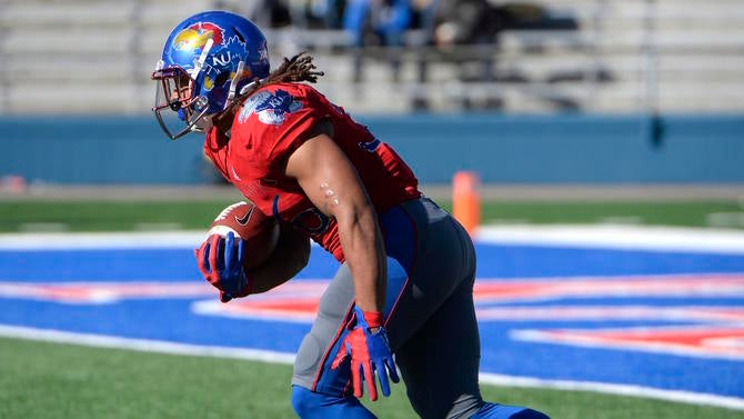
10. Kansas: Kansas football received an updated look last season, which it desperately needed, but it still doesn't do much for me. The good news, if there is any, is that I don't actually hate the uniforms. I don't strongly dislike any Big 12 uniform, it's just Kansas is the one I like the least. What really drives me insane about Kansas' uniforms is the number font. It's the same font they use on their basketball uniforms, but trying to make your football uniforms look just like your basketball team's -- which is so typically Kansas -- just doesn't work. The one look I really do like, though, was that throwback powder blue looking ensemble last year. Even if they don't stick with powder blue, that's the look Kansas should be going for.
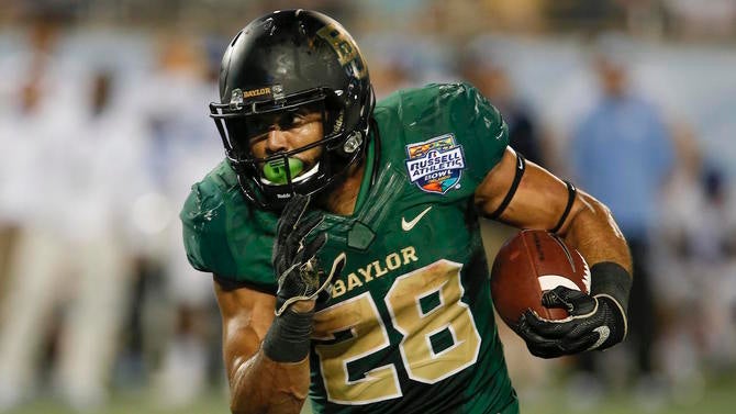
9. Baylor: I just don't like them very much. While I'm fine with the combination of green and gold -- get that money -- as colors, Baylor's entered that "let's be like Oregon" mindset of seemingly needing a new uniform every week. As a result the Bears are trying to shoehorn colors like black and gray into their uniforms, and they just don't fit. Then there's the number font, which looks like the kind of font you'd see in a movie about a football team in 2050, except that in reality, even 35 years from now, nobody will think that looks good.
8. West Virginia: I like the colors. I like the design of the uniforms. I've always been a big fan of the WV logo. I freaking hate the font of the numbers. One thing I've learned this week, as I've become CBS Sports' official Uniform Critic, is that the numbers on a uniform can make or break your look. After all, there are so many things you can do with the design of the jersey, so I believe that, behind only colors, the number font is probably the second-largest factor at play. And West Virginia chose a horrible one. It just ruins everything else.

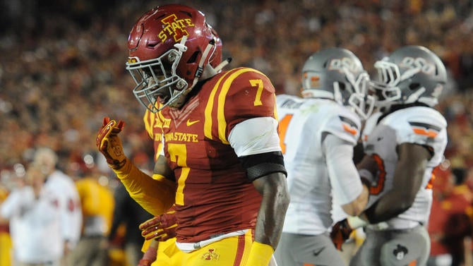
7. Iowa State: Iowa State's uniforms look a lot like USC's, both in the color scheme and the general design, but they just don't look as good, do they? I'm sure a big reason for that is because Iowa State doesn't have the history that the Trojans do. Whether it's fair to hold that against them when it comes to their uniforms, hey, I can't control the way my mind works. The eyes like what the eyes like, and while the eyes don't dislike Iowa State's look, they aren't exactly fond of it, either. It makes me think of McDonald's. I don't like McDonald's.
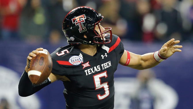
6. Texas Tech: As is the case at so many schools, the alternates tend to get a bit ridiculous, but Texas Tech's base look is pretty strong. Black, red and white are three good colors to work with, and while the uniforms are rather simple and clean -- which is good -- there are also a few little flourishes here and there to help them stand out a bit more from the crowd. I don't even mind when the Red Raiders go with the gray look, and I hate just about everybody's gray look. Why is gray a color that everybody needs to try these days? Is gray the new black? It really feels like gray is the new black.
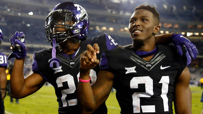
5. TCU: Big fan of purple and black here, and I'm a big fan of TCU's overall look. The one thing holding them back is the font of the numbers -- there it is again -- but, in TCU's case, the font isn't horrific. It just isn't very good, or at least it's not bad enough to drag them down further than fifth in the conference. There are levels to this, after all. After you've seen the number font West Virginia uses, you're really grading on a curve everywhere else, so the Frogs should probably send their fellow Big 12 newcomer a thank you card.
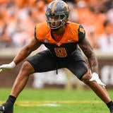
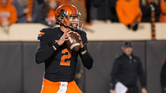
4. Oklahoma State: The Cowboys suffer from the same problem that Baylor and Oregon do in that there are just too many damn combinations. What works for Oklahoma State, though, are the team's colors. I'm just a fan of how orange and black work together. I'm also a fan of the giant Pistol Pete logo the Cowboys wear on their helmet from time to time. I know that having roughly three million different uniform combinations they can wear any given week is something Oklahoma State seems to be proud of, but in my opinion, cutting some of those combinations loose would only make Oklahoma State's look even stronger. Addition by subtraction, particularly if the subtraction includes the gray.
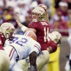
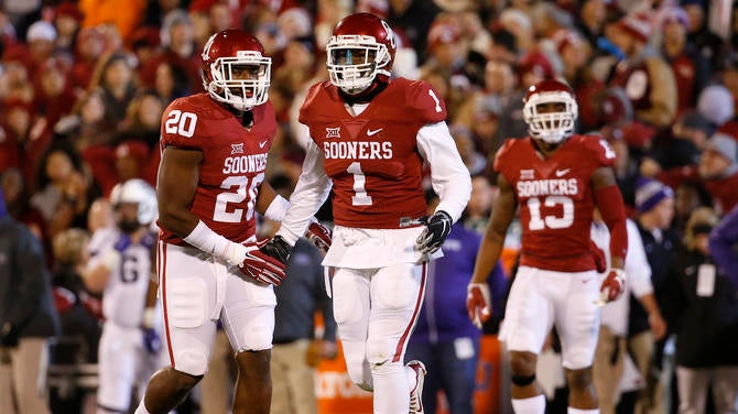
3. Oklahoma: A classic look, both in that we've seen Oklahoma wearing it for such a long time, and in that there's nothing crazy about it. It's clean, it's simple, and it has normal looking numbers on it. The crimson plays so well with the white, and of course the logo is instantly recognizable. The one thing that worries me about the Sooners, however, and is keeping them only at No. 3, is they've gone to some alternates in recent years, and I'm not a fan of them. They aren't appalling alternates, but when you're Oklahoma, you really don't need them. So stop using them.
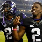
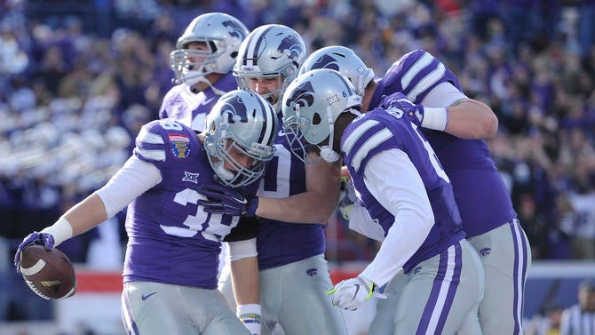
2. Kansas State: I very nearly put Kansas State at No.1, I like its uniforms that much. The purple works well with the silver and white, and the Wildcats keep it simple by wearing silver helmets and pants, and only switching between the jerseys. The jerseys are clean, and the helmet works with the purple and white stripe, as well as a logo that's unique and good-looking. Kansas State's uniforms are the embodiment of Bill Snyder. There's nothing fancy going on here, they just stick with what works for them.
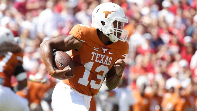
1. Texas: Listen, Texas' uniforms are fantastic. You may not like the Longhorns, but if you don't like the way they look, that says more about you than anything else. The moment you see that shade of burnt orange, you know exactly what team you're looking at. It's unique, as is the white helmet with the beautiful longhorn logo on it. Everything about the jersey and pants is perfect too. There are no weak spots. I do have one concern, though. It's that, in recent years, Texas has been trying to work some black into the rotation. Stop it. Stop it right now. I know you've been feeling some peer pressure to add a new color, but ignore it. You're perfect just the way you are.