They often say that you don't truly know what you've got until it's gone. That's a phrase that can easily apply to sports, whether it's because of a retired star player, an outdated style or play or the glory days of a certain franchise.
But it can also apply to sports fashion and uniforms as well.
Nostalgia is hitting the sports uniform scene pretty hard these days, with more and more classic looks making a comeback and reclaiming relevance. Unfortunately, throwback looks have had a tougher time making a comeback in the NFL recently due to the league's helmet policy that requires one shell per season.
Still, it hasn't stopped us from wondering which teams could benefit by reverting to an alternate look that they've worn in the past, whether it was a few years ago or a few decades ago. There are several worthy candidates, so let's explore.
Atlanta Falcons
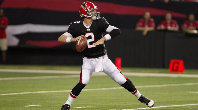
The Falcons uniforms aren't terrible right now, but I've always preferred the retro style look -- primarily because the red helmet is so great, especially when contrasted against the black jersey. (It also looks good with red-on-red.) The jersey itself is really simple and could use a little bit of sleeve striping, but overall I think this classic ensemble would be an upgrade over the busier modern version.
Cleveland Browns
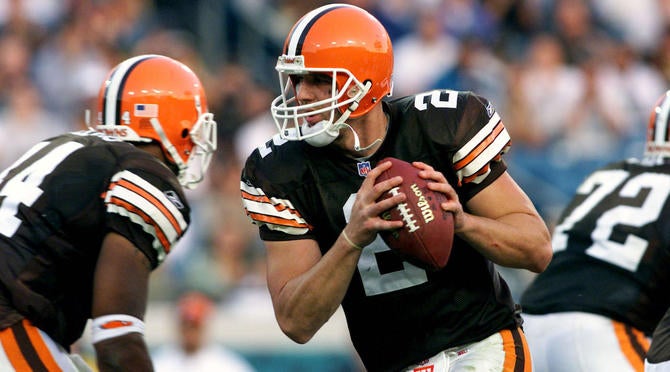
Every time I think that the new Cleveland Browns uniforms aren't as bad as people make them out to be, I remember how good the old ones were and how it's a shame they downgraded so drastically. I understand why they made the change -- they wanted to be hipper and more modern while also ushering in a new era of Browns football -- but it hasn't exactly worked out the way they'd hoped. The team is stuck with the newer look until at least 2020, but it has expressed interest in dumping them already. The Browns would be smart to go back to the more traditional look, but if nothing else they should go back to the white facemask (which they wore before changing to gray, then brown) because it helps make the uniform pop significantly more.
Denver Broncos
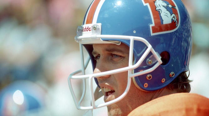
My main gripe with the Broncos is that they ditched their old 'D' logo, which was one of the best in all of football. I really loved the orange and blue that they used to rock in John Elway's heyday, but the orange and navy still looks pretty solid with that classic logo -- as evidenced by their Color Rush iterations. Either version would be a significant upgrade from Denver's current primary look.
Los Angeles Chargers
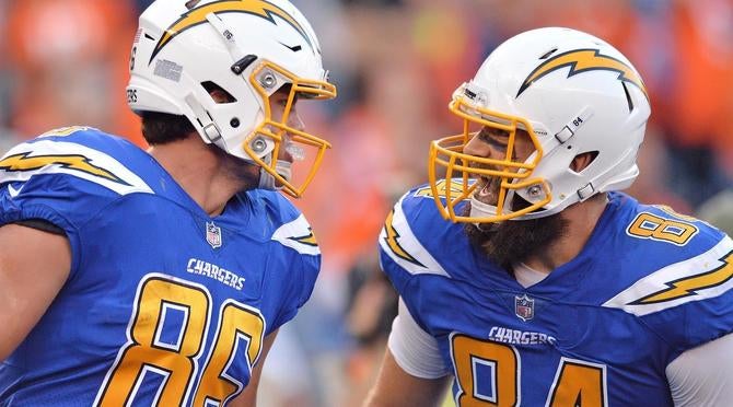
The Chargers have very solid uniforms to begin with, but their Color Rush jersey/helmet combination might be better than any of their primary combos -- yes, including the power blue. The blue, white and yellow scheme screams "electric" more than anything else, and isn't that what you want from a Chargers uniform? The yellow facemask helps bring the entire look together. If they use these as their primary look with some white pants, they'd boast a top-three uniform in the league.
Miami Dolphins
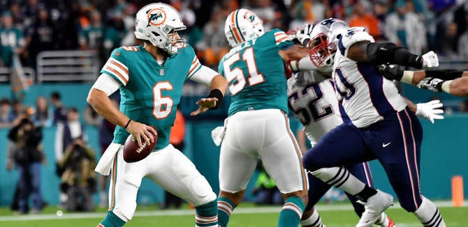
I don't hate the new Miami Dolphins look, but it pales in comparison to this throwback version that they still occasionally break out. I'm a fan of the deeper teal, and the uniform does well to play the orange and white off of each other in the striping and the numbers. Altogether, this look just brings more of a classic vibe that has real staying power. My only gripe is that I'm not the biggest fan of gray facemasks, but it's not enough of a drawback to offset how great this look is.
New England Patriots
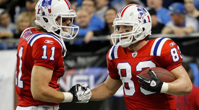
The NFL helmet rule that requires teams to use one helmet shell per season is what killed off these amazing Patriots throwbacks; otherwise we'd probably still be seeing them at least once a year. The Patriots' current primary set isn't bad, but it's getting stale and the team will probably be looking to make a change for a post-Brady era. Some version of the red, white and blue throwback style would be a good place to start.
New Orleans Saints
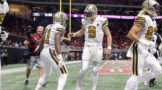
The Saints are another one of those teams with a pretty stale primary look. However, they have some great throwbacks that they've used in recent years, including their Color Rush jersey from 2017. The sleeve striping and gold numbers make this jersey style exponentially better looking than the one they typically wear, and it just seems like a better fit for New Orleans in general. They'd need to tweak the helmet to match the jersey colors but that's easy enough to do. They'd definitely be better off with this look.
New York Giants
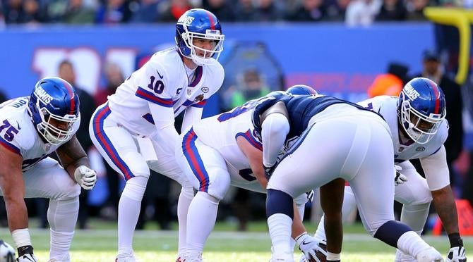
Let's face it, the Giants' current primary set is boring. They have a great color scheme with blue, white and red, and they don't do enough to play those colors off each other. But when the team brought back this look (which was their road uni from 1980-1999) for Color Rush over the past couple of years, it sparked a bit of nostalgia while also providing a reminder that the Giants are severely underachieving with their present uniforms. This classic look would be a welcome full-time change.
Philadelphia Eagles
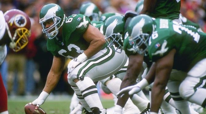
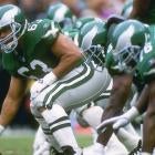
It's all about the Kelly Green, honestly. These jerseys are incredibly simple, but the vibrant green base with white numbers and black trim is just an outstanding combination. The old school Eagles logo on the sleeve is a great added touch, and so is the striping on the pants. I'm not overly impressed with the old school helmet, but if Philly could design an updated version of the winged lid that worked in some black accents, it could be a big-time upgrade over the deeper green look that they sport now.
Tampa Bay Buccaneers
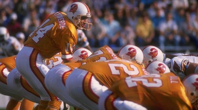
The Bucs' original creamsicle look is such a distinct and awesome aesthetic. The color scheme is great and the logo is fantastic; it all just works. But for as great as it is, Tampa's current set is equally as bad. They've got a top-five worst uniform in the league right now and it's a shame considering this classic is gathering dust in retirement. It just makes too much sense to bring it back.
