The NBA City Edition uniforms are an outlet for all 30 teams to pay tribute to their respective local surroundings, whether it be the scenery, the landmarks, the influences and/or the culture. The City unis are also often a way to get teams to think creatively and offer some outside-of-the-box branding ideas.
Over the past few years, it has resulted in a number of crazy uniforms -- from the Wolves' Prince-inspired jerseys, to the various "Vice" unis from the Heat, to the FDNY unis from the Knicks. We've gotten plenty of City unis that deviate from traditional looks, and many of them have been received quite well. Others? Not so much.
With this year's crop getting unveiled, let's take a look at all of the official releases so far and grade them one-by-one.
Atlanta Hawks
The Hawks are rolling with "Peachtree" uniforms this year in honor of the ubiquitous Atlanta street. The uniform is pretty well-executed. It fits with the team's regular look while bringing a unique colorway with the black and peach. Grade: B
🍑Peachtree Drip 🍑
— Atlanta Hawks (@ATLHawks) November 20, 2019
Presenting our 19-20 Nike City Edition Peachtree Jerseys#PeachUpATownDown | @SharecareInc pic.twitter.com/PX0tTDNDWK
Boston Celtics
These are quite brutal. Putting aside the fact that I think the Celtics are one of the few sports franchises that have so much tradition and such great uniforms that they should always wear the same two jerseys, these unis are just completely uninspired. The font is lazy. The trim is lazy. All of it's lazy. Grade: D-
Introducing our 2019-20 City Edition uniforms ☘
— Boston Celtics (@celtics) November 21, 2019
On-court & at retail on 11/27 pic.twitter.com/PmNJoCUgkO
Chicago Bulls
Once again the Bulls' City uniforms are a nod to the Chicago flag. It's a good idea in theory but these leave a lot to be desired. It's extremely weird to see the Bulls logo in baby blue, especially on top of a baby blue base. Feels like the regular red might look better. Grade: C-
Introducing this season’s City Edition uniforms, inspired by the Chicago Flag and the lake and rivers of Chicago. pic.twitter.com/Q0Yf3eoApO
— Chicago Bulls (@chicagobulls) November 20, 2019
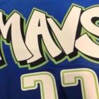
Dallas Mavericks
Absolutely not. Grade: F
Inspired by Art + Basketball, the 2019-2020 City Edition Jersey is OUT. #MAVSCITY.
— Dallas Mavericks (@dallasmavs) November 19, 2019
INFO: https://t.co/lFMjfcJd0c pic.twitter.com/Nmk7HZTJzb
Denver Nuggets
The Nuggets are bringing back the rainbow skyline jersey, which is great news, though this time it's on a black base. I'm not crazy about the white collar but other than that it's a good look. Grade: B+
Take a closer look at our 🔥 new uniform!
— Denver Nuggets (@nuggets) November 20, 2019
📸: https://t.co/TSQ8gVdqhJ#RiseOfTheRainbow pic.twitter.com/RAPmEjT0NE
Detroit Pistons
It's "Motor City" and racing stripes once again for the Pistons. This year, they've traded in the metallic look for a more vibrant red and blue. A lot of the reaction seems to be negative, but I kind of dig these. Grade: B
Inspired by the muscle car heritage of the Motor City.
— Detroit Pistons (@DetroitPistons) November 21, 2019
Our 2019 City Edition Jersey is here 🔴🔵 pic.twitter.com/pGK4am4n3P
Houston Rockets
The Rockets have moved away from the China-themed City jerseys that they've had over the the past couple of years, which is probably a good decision, all things considered. These NASA-inspired "H-Town" unis aren't amazing but they're neat in concept. Grade: B-
Our City Edition Uniforms Have Arrived! #OneMission pic.twitter.com/4IsGFNFnys
— Houston Rockets (@HoustonRockets) November 19, 2019
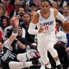
Los Angeles Clippers
The Clippers' City jerseys are a major switch-up from the team's typical branding, but that's not necessarily a bad thing as they try to reinvent themselves. These unis are basically a cross between the Brooklyn Nets and "Grand Theft Auto: San Andreas." Grade: B-
The @LAClippers unveil their new City Edition uniforms on the cover of SI 👀 https://t.co/7pyGtSQNai pic.twitter.com/hf7Rh14TYd
— Sports Illustrated (@SInow) October 15, 2019
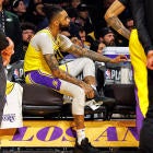
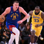
Los Angeles Lakers
The Lakers trusted Shaq to design their City uniforms this year, which was a display of confidence. They turned out fine. Grade: B-
Take a detailed look at the 2019-20 City Edition Uniform designed by the one and only, @SHAQ. pic.twitter.com/wBHG2ReZoD
— Los Angeles Lakers (@Lakers) November 21, 2019
Miami Heat
No surprise here: The Heat have gone back to the "Vice" theme, this time bringing a baby blue version. The look is still top notch; it's just annoying that the Heat haven't made the full-time switch yet. Grade: A-
It’s all in the details💧
— Miami HEAT (@MiamiHEAT) November 25, 2019
Be the first to cop #ViceWave at Tuesday’s Midnight Madness event. More info - https://t.co/aCdhjd35tl pic.twitter.com/BRSecrYeTw
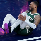
Milwaukee Bucks
Milwaukee is all about cream uniforms these days. The Bucks are abandoning their MECCA-inspired City unis in favor of "Cream City" branding inspired by the bricks that laid the foundation for the city. I love the base idea, but there's just something missing. Grade: C+
It’s BACK!!
— Milwaukee Bucks (@Bucks) November 20, 2019
All the details on the return of the Cream City Jersey!!
#CreamCity
Minnesota Timberwolves
I get that these are supposed to be clean and minimalistic, but there's a thin line between that and boring. These fall on the wrong side of the line.Grade: C-
𝙇𝘼𝙎𝙏 𝘾𝙄𝙏𝙔 𝙊𝙁 𝙏𝙃𝙀 𝙀𝘼𝙎𝙏, 𝙁𝙄𝙍𝙎𝙏 𝘾𝙄𝙏𝙔 𝙊𝙁 𝙏𝙃𝙀 𝙒𝙀𝙎𝙏
— Timberwolves (@Timberwolves) November 20, 2019
Be the first to rep our new Twin Cities uni 🐺 » https://t.co/OUPdt7EF0l pic.twitter.com/l0afN8Xuvu
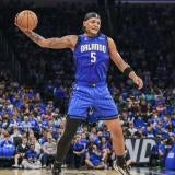
Orlando Magic
The Magic are bringing some citrus into the mix with these orange-trimmed City uniforms. They're not that bad but they might be too different for no good reason. They look more like a Suns jersey than anything else. Grade: C
🍊O R L #ORLAboveAll 🍊 pic.twitter.com/TEJnxUxST8
— Orlando Magic (@OrlandoMagic) November 15, 2019
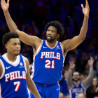
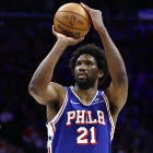
Philadelphia 76ers
These aren't too different or exciting when compared to what the Sixers have previously rolled out, but it's still a rather clean and classic look. You may not love them but it's hard to hate them. Grade: B-
The threads.
— Philadelphia 76ers (@sixers) November 20, 2019
🧵⤵️ pic.twitter.com/mIeQ2xsGlG
Portland Trail Blazers
The Blazers uniform combines a bit of team history with a touch of modern and it works so, so well. These are outstanding. Grade: A
Our newest uni combines the team’s first two uniforms along with some modern design accents & vintage coloring: https://t.co/C2QsobAHQB pic.twitter.com/sdw4T458Ld
— Portland Trail Blazers (@trailblazers) November 19, 2019
Sacramento Kings
Like Portland, the Kings attempted to blend a little bit of old and new. Their experiment didn't work out nearly as well. Should have just went with the baby blue instead. Grade: C+
Blending old branding and new branding, the new City Edition uniforms feature red, baby blue, white and gray. pic.twitter.com/NAJmxepDgP
— Sacramento Kings (@SacramentoKings) November 20, 2019
Washington Wizards
These are kind of like Philly's in that they don't look much different from the team's normal branding, but it works as a clean alternate. That'll do. Grade: B-
🇺🇸🇺🇸🇺🇸 #RepTheDistrict 🇺🇸🇺🇸🇺🇸
— Washington Wizards (@WashWizards) November 20, 2019
📸 | https://t.co/27pauJuCB7 pic.twitter.com/gvzQv3Zwgz