The NBA unveiled unique designs for the In-Season Tournament courts on Monday, and there was a lot to unwrap. While some teams understood the assignment, others played it too safe -- and, of course, some tried to do a little too much.
There have been plenty of alternate jerseys over the years, but this is the first time the NBA has implemented an alternate court for all 30 teams. The inaugural In-Season Tournament will tip off on Nov. 3 and concludes with the championship game on Dec. 9. Until then, let's have some fun examining the designs.
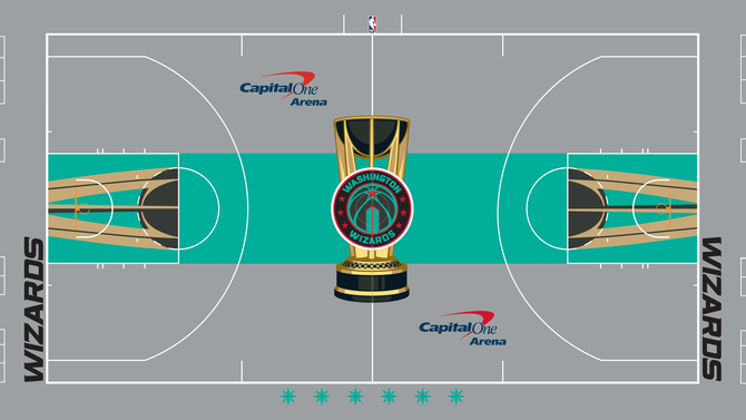
30. Washington Wizards
It's not a requirement to use the team's main colors, but it feels like that would make the most sense. No hate on teal as it's a great color, but overall this looks more like a court for the WNBA's New York Liberty.
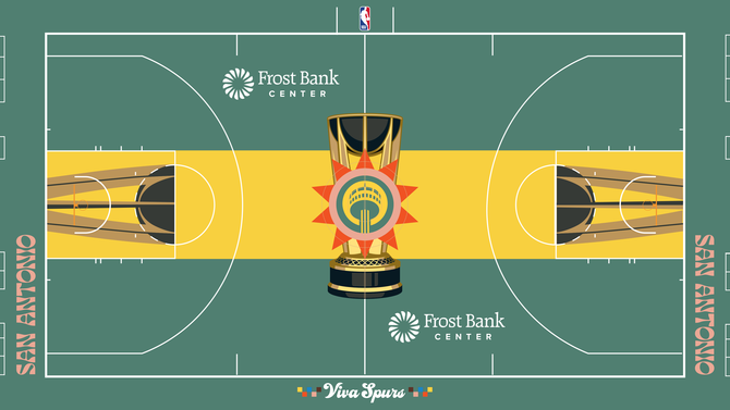
29. San Antonio Spurs
The Spurs don't deserve to be dead last because they took a chance, but it just didn't work out. Although it was clever to try to use the Fiesta colors, this is giving Seattle SuperSonics nostalgia.
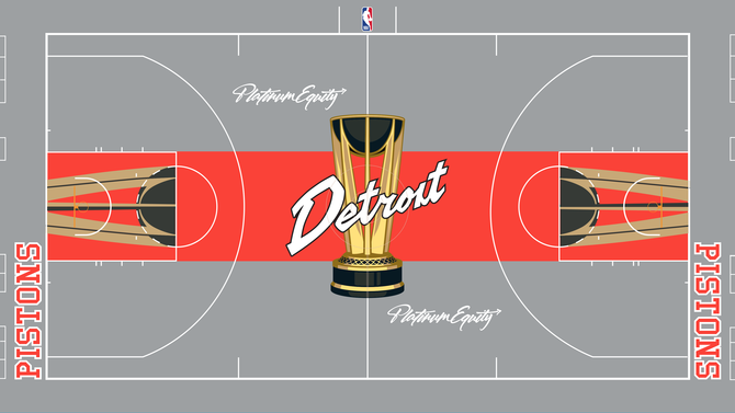
28. Detroit Pistons
For branding purposes, it feels like the Pistons should've incorporated some blue to this design because you should be able to tell whose court it is without having to read.
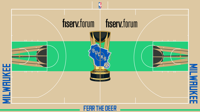
27. Milwaukee Bucks
The colors are not bad, but the Bucks logo needs to stand out more because it unfortunately gets overshadowed by the name of the arena.
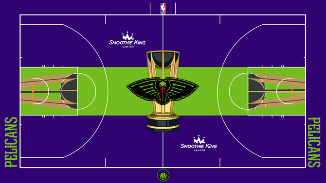
26. New Orleans Pelicans
This is another one of those designs in which we can appreciate that a risk was taken, but it ended up giving more Halloween or space video game vibes.
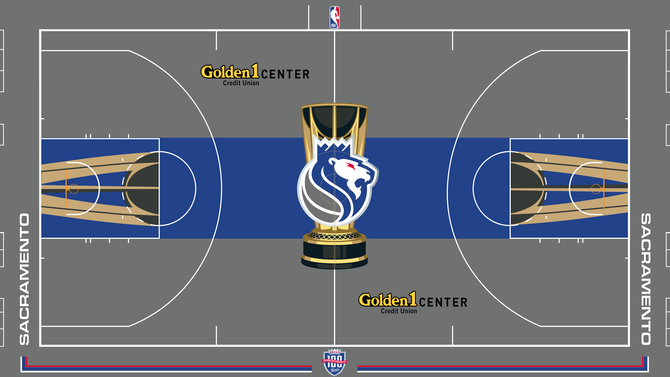
25. Sacramento Kings
Points for the throwback logo, but otherwise there is not much exciting about the Kings' design.
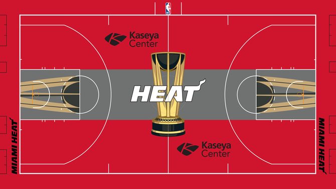
24. Miami Heat
The Heat have a cool team name and could've gotten really creative with this assignment, but unfortunately the design is bland, and that's disappointing.
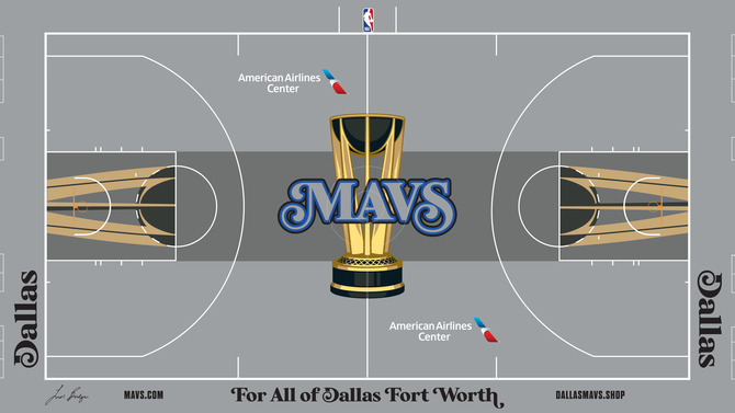
23. Dallas Mavericks
It's not bad, but the font on the sidelines looks like it's plucked from a newspaper and the logo could've been more exciting.
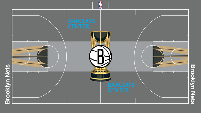
22. Brooklyn Nets
This looks too basic. Not really any creativity going on.
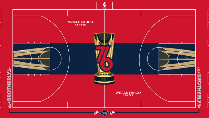
21. Philadelphia 76ers
Nothing necessarily wrong with the 76ers' design except it's boring and, like with other teams, more could've been done with the logo.
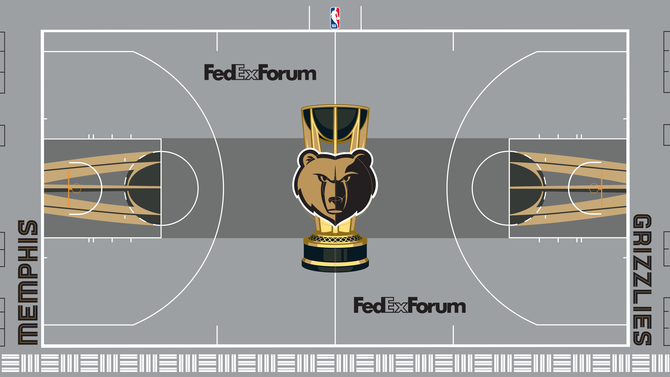
20. Memphis Grizzlies
Gold is awesome, but this doesn't quite make sense for the Grizzlies. If the Vegas Golden Knights ever played basketball instead of hockey, this would fit them very well.
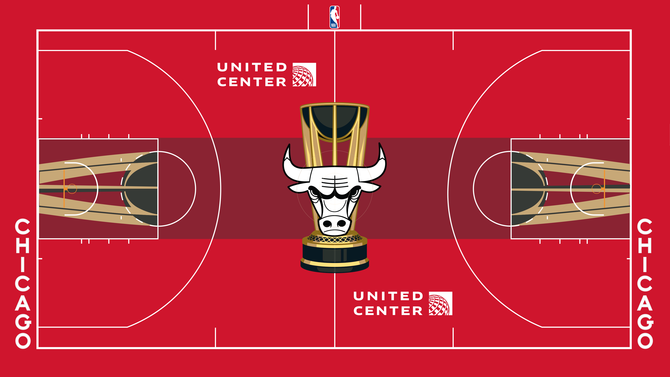
19. Chicago Bulls
The choice of making the logo white was interesting. It definitely stands out, but I'm not sure if this design as a whole should've been the final draft. It's not quite there yet.
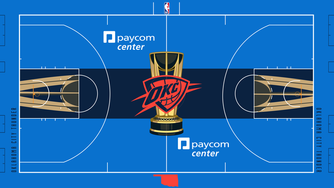
18. Oklahoma City Thunder
There could've been so many cool designs with the Thunder's colors, but this is a forgettable look.
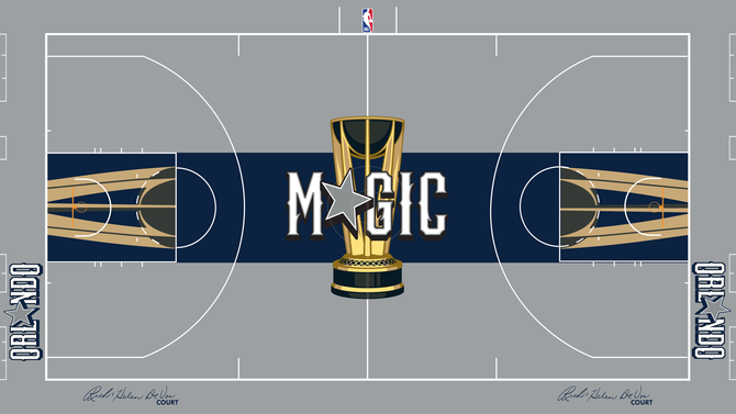
17. Orlando Magic
Not quite as magical as it could've been. Making the star the star of the show would fit the Dallas Cowboys better.
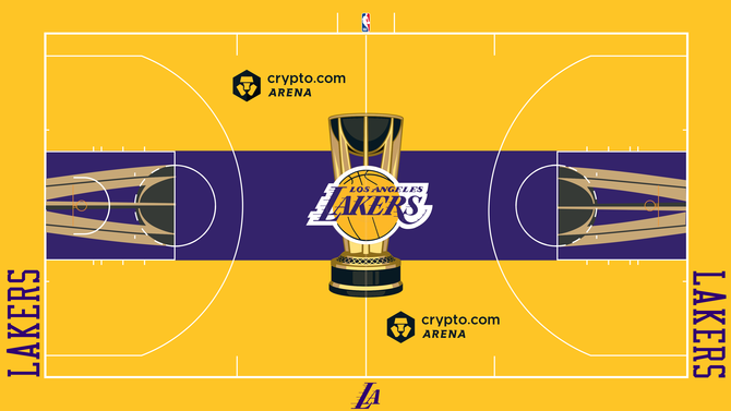
16. Los Angeles Lakers
There is no doubt purple and gold are iconic colors, but this might be a bit too much gold. It will either look really cool during a game or tire your eyes out.
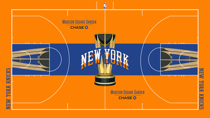
15. New York Knicks
Good job on branding, but this is another example of a team overloading on color and potentially making it hard to keep fans' eyes on the game. Staring at the logo could get disorienting.
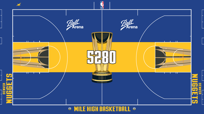
14. Denver Nuggets
The Nuggets took a chance by making their literal mile high elevation (5,280 feet) their logo instead of the actual logo, and it kind of works. This design would be a cool graphic for TV or social media.
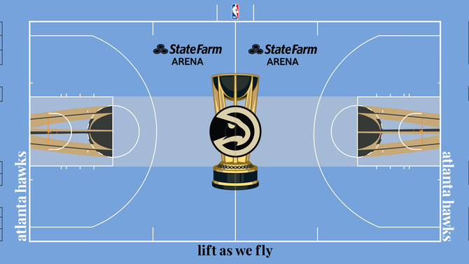
13. Atlanta Hawks
The logo feels like it's part of the trophy, and maybe that's a good thing. It's a clean design. The only note would be to make the words "lift as we fly" a bit more visually exciting.
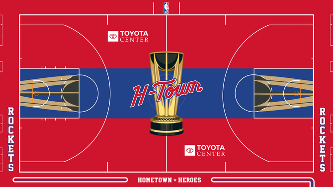
12. Houston Rockets
Maybe too much red, but it's fun and looks like it has the makings of a cool varsity jacket.
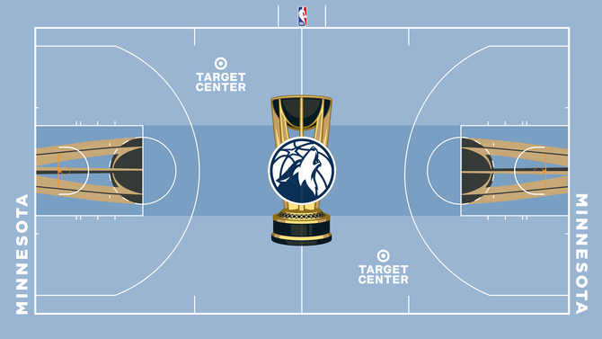
11. Minnesota Timberwolves
Very similar to the Hawks because of the baby blue, but I still can't deny the aesthetic is beautiful. Simple, yet classy and elegant.
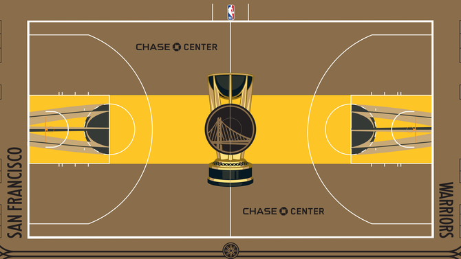
10. Golden State Warriors
This feels like a design fans will either love or hate, so it deserves to be sort of in the middle. The colors represent the Warriors' dynastic run over the years, but some might have issues with the shades of brown.
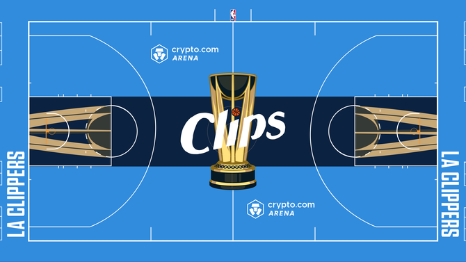
9. Los Angeles Clippers
While it might not be enough to be the top court on this list, good choices were made here. The Clippers' logo stands out while also fitting perfectly with all the other parts. It just feels right.
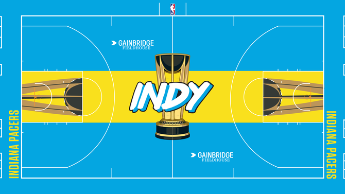
8. Indiana Pacers
The Pacers got creative with this one and came up with a vibrant, fun design. Just like the Rockets, the Pacers have plenty of merch potential here.
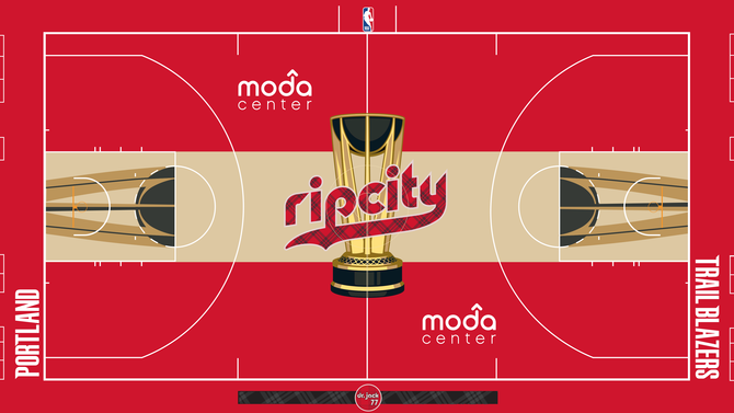
7. Portland Trail Blazers
Portland and flannel? Perfect match. This design is creative yet it stays true to itself. Good use of colors without being too overwhelming or one-dimensional.
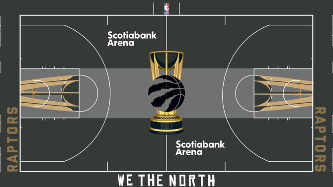
6. Toronto Raptors
Perhaps it's missing red, but other teams made grey and black look boring while the Raptors made it feel luxurious. The "We The North" along the sideline helps make a statement.
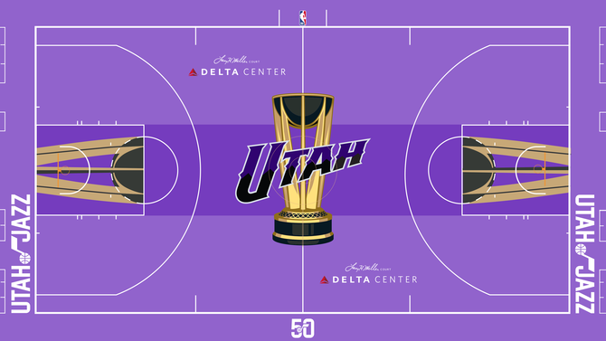
5. Utah Jazz
The purple shines, but the overall design is not overwhelming. "Utah" stands out beautifully in the middle. No notes.
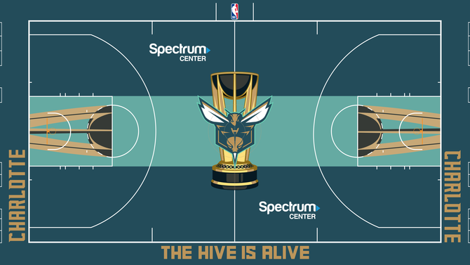
4. Charlotte Hornets
The colors, the logo: This is how you make a cool design that doesn't look like a video game. Just enough to be exciting, but didn't cross the line.
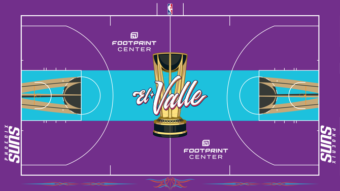
3. Phoenix Suns
The Suns had fun with their El Valle look. It's worth applauding the effort made to come up with something special and vibrant that represents the community.
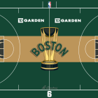
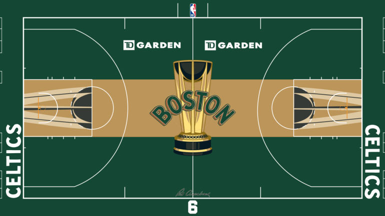
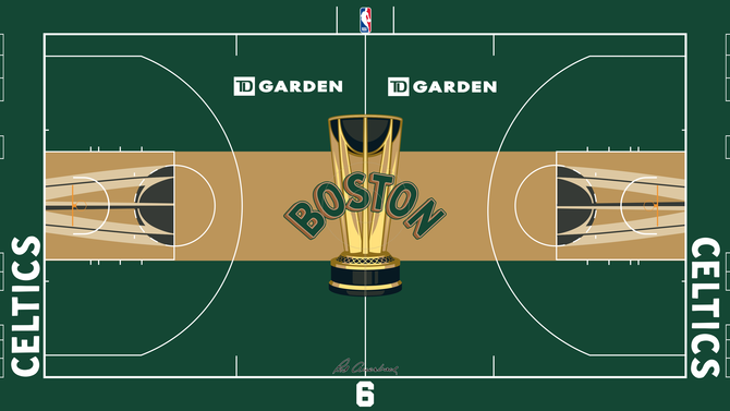
2. Boston Celtics
It's perfect for the team, it just screams Boston, and everything came together cleanly. Lucky the Leprechaun can be proud.
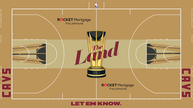
1. Cleveland Cavaliers
The Cavs did a great job creating a unique look for their court while making sure they didn't go over the top. They found a perfect balance between creative and professional.