Weeks after they were inadvertently leaked by NBA 2K18, Nike's NBA "City Edition" jerseys finally were released and put up for sale. According to the Nike site, there's a bit of lore behind every team's look, from the Clippers' San Diego roots to the Warriors' rich Chinese culture.
Some of the studs include the Bulls, Bucks and Kings, while a few of the duds are the Hawks, Cavaliers and Thunder. Every team seemed to draw from a different inspiration -- whether it was the 76ers' gorgeous look inspired by the Declaration of Independence or the Timberwolves embracing the fact that where they live is freezing, to cool effect -- and the result was a cornucopia of colors and looks. (The Heat, Knicks, Raptors and Rockets' city jerseys will be released at a later date and weren't included here.)
CBS Sports handed out grades for all 26 jerseys released -- with Jack Maloney taking the Eastern Conference teams and Kevin Skiver on the Western half. They're listed below alphabetically by city.
Atlanta Hawks
🔥 Jeezy debuting the new City Jersey 🔥#TrueToAtlanta pic.twitter.com/wi2QXGhz0c
— Atlanta Hawks (@ATLHawks) December 15, 2017
Leave it to the Hawks to get funky with their new jerseys. There is a lot going on here with the futuristic font, the highlighter-yellow-on-black color scheme and the triangle design down the side. Unfortunately, it's all a bit too much -- even with Jeezy as the one who debuted them. Overall, a disappointing effort.
Grade: D
Boston Celtics
Nike unveiled the City Edition Uniforms today. Here's the @celtics jersey. pic.twitter.com/kpn6SERBcn
— Celtics on NBC Sports Boston (@NBCSCeltics) December 27, 2017
What is up with trying to force a gray jersey upon the Celtics? They had the garish gray sleeved jerseys a few years ago, and now they have these new threads. Which are … fine? The parquet design paying homage to the iconic floor is a nice touch, but it's hard to see.
Grade: C
Brooklyn Nets
Nets City Edition | For Brooklyn#WeGoHard #NikeXNBA pic.twitter.com/MltfHwakBt
— Brooklyn Nets (@BrooklynNets) December 27, 2017
Interesting attempt to go with the homage to the Brooklyn Bridge, but you can barely see the wiring design, so not sure how that's going to play out on the court. Also, putting all of "Brooklyn Nets" across the chest is too much. Just "Brooklyn" would have been better.
Grade: C
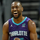
Charlotte Hornets
PRESS RELEASE: HORNETS UNVEIL NEW JORDAN BRAND “BUZZ CITY” UNIFORMhttps://t.co/5q9DmcqVmo pic.twitter.com/IIGcDQv7gI
— Charlotte Hornets (@hornets) December 27, 2017
This was a bold effort, and it worked out well. The teal and purple design down the side looks fantastic on the black jersey, and the font for "Buzz City" is a success. Also, being able to have the iconic "Jumpman" logo on their jerseys will always give Charlotte a boost.
Grade: B+
Chicago Bulls
Introducing the City Edition jersey, inspired by our hometown. The #Bulls will wear these for the first time at home against the Lakers on January 26. pic.twitter.com/2QGKdGGkdM
— Chicago Bulls (@chicagobulls) December 27, 2017
Brilliant. This is such a clean look. The angled script font is great, and they perfectly executed the city aspect of this jersey by tying in the color scheme and design of the Chicago flag.
Grade: A+
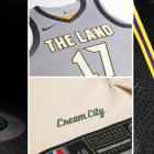
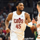
Cleveland Cavaliers
The City Edition first-look:
— Cleveland Cavaliers (@cavs) December 27, 2017
“The Land,” Cleveland's popular nickname, displays across the chest.
Side panels, inspired by the iconic “Guardians of Transportation” sculptures.
The State of Ohio on the waistband + the Ohio flag underneath the flap, a nod to #Cavs fans across Ohio. pic.twitter.com/jCJFuRDFK6
Absolutely not.
Grade: F
Dallas Mavericks
Only in Dallas will you feel the energy the downtown skyline brings to its Dallasites. Marked by the neon glow on the letters, numbers and piping, the new Mavs City Edition Jersey reflects the swagger of the Big D and the vibrancy of Dallas nights.#NIKExNBA #MFFL pic.twitter.com/aNNxUeJD8c
— Dallas Mavericks (@dallasmavs) December 27, 2017
The Mavericks went with a relatively clean look. According to Nike, the neon piping was to "[reflect] the swagger of the Big D and the vibrancy of the Dallas nights." In reality, it looks like they wanted to go with a black jersey that also had Mavs' colors. It isn't necessarily bad, just a bit boring for a team with such a distinctive look.
Grade: C+
Denver Nuggets
5280.
— Denver Nuggets (@nuggets) December 27, 2017
City has officially arrived. pic.twitter.com/5r4ydBgzt2
The Nuggets have a neat design on their uniforms. The duel pickaxes enclosing a gold mountain pretty well encapsulates the team's look. It looks like Nike actually took a bit of a risk and added a logo on this uniform, and the logo looks really nice contrasting with the deep blue.
Grade: A-
Detroit Pistons
Our city. #MotorCity.
— Detroit Pistons (@DetroitPistons) December 27, 2017
Introducing our new jersey: https://t.co/kgnN6cTzg7 pic.twitter.com/DqMS6Fe8Ei
There's nothing really wrong with these, but they're pretty boring. Going with "Motor City" across the chest instead of "Detroit" or "Pistons" is a nice touch, but the font feels too small. Overall very forgettable.
Grade: C
Golden State Warriors
#DubNation, Check out the NEW @warriors City Edition Chinese Heritage Jerseys! Order yours today at: https://t.co/hXPt3iT097 pic.twitter.com/lntQVfVKUL
— WarriorsTeamStore (@warriors_store) December 27, 2017
The Warriors have a history of paying homage to the Chinese culture in the Bay Area, and Nike's city choice for them is no different. Prosperity is on the shorts, and the chest logo combines the Golden Gate Bridge logo on the normal unis with a dragon over it. The blue and red piping add a cool accent to what isn't a great yellow – the most questionable design choice.
Grade: B
Indiana Pacers
A tribute to Indy’s rich racing history.
— Indiana Pacers (@Pacers) December 27, 2017
Learn more about our #NIKExNBA City Edition Uniform: https://t.co/oRzneh2uMc pic.twitter.com/byr6s9uP4P
They definitely went for it with the Pacers' new look, trying to tie in the Indianapolis 500 and car racing aspect, but it was not a success. The checkerboard design should be on the side panels, and the number should be in the middle. Also, why is the number so dang big.
Grade: C-
Los Angeles Clippers
From the Beaches of S.D. 🏖 to the Palm Trees of LA 🌴, we’re commemorating the 40th season since the team moved to California.
— LA Clippers (@LAClippers) December 27, 2017
👕: https://t.co/Wv7gqd5xOS
🎥: https://t.co/RJqx938lon pic.twitter.com/epz7rjC52u
Frankly, these ones are a bit boring. Nike says that they wanted to pay tribute to the team's San Diego roots with these, hence the late 1970s/early 1980s-looking blue and orange, but they just come out looking soft. It definitely doesn't have the effect of the Chargers' powder blues and ends up just looking a bit bland.
Grade: C-
Los Angeles Lakers
Meet the newest addition to the Lakers uniform lineup.
— Los Angeles Lakers (@Lakers) December 27, 2017
For the City. By @kobebryant. #LakeShow| #NIKExNBA pic.twitter.com/Ok7Ussh6jF
Obviously Nike is going to want to pay tribute to Kobe. It's a cool idea, adding a Black Mamba print as a base, but it's a questionable choice for "city" jerseys. Hollywood -- these jerseys are reminiscent of adidas' "Hollywood Nights" Lakers set -- is going through a bit of a purge, but there's a lot of other L.A. history to celebrate.
Grade: B
Memphis Grizzlies
Our MLK50 City Edition uniform is inspired by the 1968 Memphis Sanitation Workers Strike ‘I Am A Man’ slogans & reflects on the events, circumstance & losses surrounding the movement, including the 50th Anniversary of the assassination of MLK
— Memphis Grizzlies (@memgrizz) December 22, 2017
MORE: https://t.co/27ZF7XPkSU pic.twitter.com/4FpuLnOIIa
Some may say that they're boring, and I know that this will seem counter-intuitive to what I said about the Clippers, but these Grizzlies jerseys are hard to hate. Maybe it's the history behind them -- they reference the 1968 Memphis Sanitation Workers' strike -- but there's something elegant in the simplicity behind these. Sometimes, less is more.
Grade: A-
Milwaukee Bucks
Everything you need to know about the Bucks X @Nike Cream City Uniform » https://t.co/l6BdnX6wHF pic.twitter.com/2DJZYz84Ku
— Milwaukee Bucks (@Bucks) December 27, 2017
The Bucks' rebrand continues to go well with this jersey, which is extremely cool. They did well to incorporate that diabolical looking deer logo, and the stripes across the chest give just the right amount of color to offset the cream colored jersey.
Grade: A-
Minnesota Timberwolves
Connected by threads. United through fabric.
— Timberwolves (@Timberwolves) December 27, 2017
Introducing the City Edition uniform. #AllEyesNorth
Learn more: https://t.co/Kk4IYTuhI3 pic.twitter.com/djI4aHi7AA
The Timberwolves' rebuild hasn't just been on the floor -- they've been doing some rebranding, too. These jerseys take the wolf motif and turn it up to 11, and although I'm not always a fan of gray jerseys, these just work. The marks on the side keep these from being boring and take the jerseys into awesome territory.
Grade: A
New Orleans Pelicans
Our new City Edition uniforms 🔥
— New Orleans Pelicans (@PelicansNBA) December 27, 2017
#NIKExNBA #NOLA #DoItBIG pic.twitter.com/kkAw2iKGbh
People just don't really know what to do with the Pelicans, so they fall back onto Mardi Gras. The reasoning might be "if it ain't broke don't fix it." The result isn't "bad" per se, it just isn't different either. The "dancing" numbers, as Nike describes them, just look like the right one is falling, and it feels like trying to get too cute design-wise for a tried and true Pels' look.
Grade: B
Oklahoma City Thunder
⚡️These will go fast.⚡️@nikebasketball City Edition for OKC.
— OKC THUNDER (@okcthunder) December 26, 2017
On sale 10a tomorrow in @ChesapeakeArena Thunder Shop and at https://t.co/te4YBJA1DP pic.twitter.com/1h2ZkA3qci
Remember when I said I'm not huge on gray jerseys? Well, this is why. This looks like it was designed in Paint for a graphic design course. The italicized OKC, the random blue and orange stripe and the gray number (with a thicker lining than the lettering) just comes together in the absolute worst way.
Grade: D
Orlando Magic
Reach beyond limits. Our city. Our tradition. Introducing the all new Orlando Magic City Edition jersey. #puremagic #nikexnba pic.twitter.com/BTmgNHdduh
— Orlando Magic (@OrlandoMagic) December 27, 2017
Why?
Grade: D-
Philadelphia 76ers
This one’s for the city pic.twitter.com/t4WismIk2y
— Ben Simmons (@BenSimmons25) December 27, 2017
The Sixers keep winning with their jerseys. The Declaration of Independence-inspired look is so simple and clean. The red and blue piping is a perfect accent to the parchment colored jersey, and the script font "Phila" looks exquisite.
Grade: A
Phoenix Suns
A new look hits the court on January 26th for Latin Night! Check out the new City Edition uniform. https://t.co/dUhFLSSxG4
— Phoenix Suns (@Suns) December 27, 2017
A common theme with me: I will always appreciate the jerseys that take the city theme somewhat seriously. Phoenix has a vibrant Hispanic community, so the "Los Suns" lettering is a nice touch (even if that jersey has existed in the past as part of Latin Heritage kits), and the different shades of purple don't clash. The result is more of a gradient, and while these aren't the most exciting, they look nice.
Grade: B+
Portland Trail Blazers
Honoring our fans and the place we call home.
— Trail Blazers (@trailblazers) December 27, 2017
Learn more about the Nike 'City' Edition uniforms » https://t.co/DcJJl2tVDw pic.twitter.com/GtxowcXh7a
My opinion on these has changed about 30 times. These jerseys have the unfortunate distinction of being compared to the Adidas Rip City jerseys, which were clean as hell. These just have a weird, 1990s grittiness to them (blame the black and red) – but I guess ending up in the '90s is the most Portland thing that Nike could have done.
Grade: C
Sacramento Kings
The City Edition: From the Court Up ⬇️⬆️ pic.twitter.com/v0OODjfyBK
— Sacramento Kings (@SacramentoKings) December 27, 2017
Take notes, Clippers, because this is how you go with a 1980s color scheme. The white into the baby blue looks awesome, and the lion logo looks amazing. These have just the right red accents, and they're a worthy way for the lion to be represented for the first time.
Grade: A+
San Antonio Spurs
We are proud to call Military City, USA our home.
— San Antonio Spurs (@spurs) December 27, 2017
Our new #NIKExNBA uniform honors the service men and women of the U.S. Armed Forces, many who have also called San Antonio home. pic.twitter.com/KzgZ8DU5eB
Military City, USA lives up to its name with these digital camo printed jerseys. The Spur logo and letters being slightly offset actually looks decent. While some may say that there's too much going on for these jerseys to work, the effort put into them and the tradition behind them elevates them a bit.
Grade: B
Utah Jazz
A Closer Look.#Nikexnba pic.twitter.com/0yEQS8cg1n
— Utah Jazz (@utahjazz) December 25, 2017
If there's one thing Utah has, it's natural beauty, which Nike tried to convey in these jerseys. The results are… suspect. The effort is definitely there and once you read the description it starts to make sense, but if you don't bother to read the write-up, like most people, these end up looking more like Suns' knockoffs than anything else.
Grade: C-
Washington Wizards
Explore our City Edition uniforms 👀https://t.co/IhscfSiv74#NIKExNBA #DCFamily #TheDistrict pic.twitter.com/mlQ82kPyQ3
— Washington Wizards (@WashWizards) December 27, 2017
Another very strong effort. Emphasizing "The District" in dark font against the white jersey is perfect, and the added touches of the Washington Monument on the "d," and the basketball dotting the "i" are brilliant.
Grade: A-