The NBA has officially unveiled all 30 City Edition uniforms that teams will debut during the inaugural In-Season Tournament. There is more than a fair share of basic designs, but some teams created something special while honoring an important part of their culture.
Artistic chances were taken and they didn't always work out (I'm sorry, Brooklyn), but for others their boldness was rewarded. Here are all 30 City Edition uniforms, ranked:
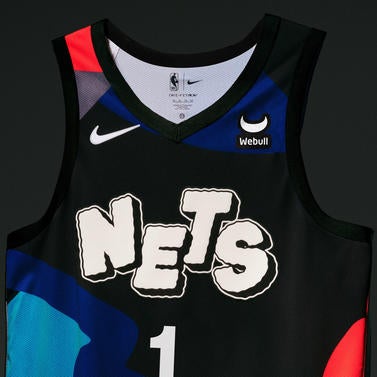
30. Brooklyn Nets
Really appreciate the intent to create something unique, but the abstract design is too much. Looks a bit too cartoonish.
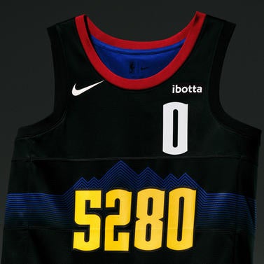
29. Denver Nuggets
The mountain design in the background looks great, but it can't save the whole uniform. While the team has been embracing the Mile High branding, the elevation on this jersey looks like a running bib.
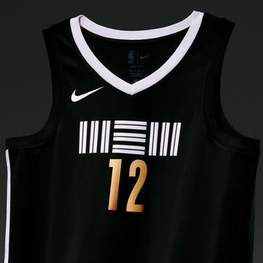
28. Memphis Grizzlies
I wanted to like this one, but it's a little too minimalist. Also, if it takes me more than five seconds to figure out the lines are supposed to read "MEM," it's not a great design.
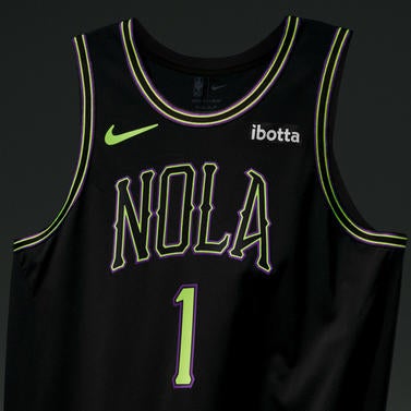
27. New Orleans Pelicans
It looks like the Pelicans are going for a space theme, but the design's main issue is it's just not exciting enough.
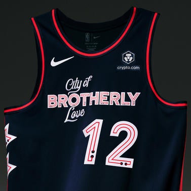
26. Philadelphia 76ers
This could've been a great look, and although "City of Brotherly Love" is a nice message, its placement here makes the jersey look like a knockoff at Forever 21.
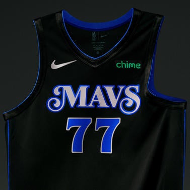
25. Dallas Mavericks
The blue outline is so thin and there's not much of a design. Also, the font for the numbers and "Mavs" don't really go together as well as they should.
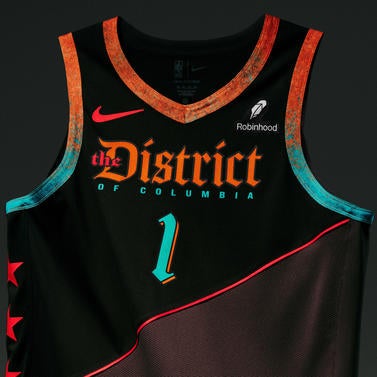
24. Washington Wizards
This uniform is inspired by the 40 boundary stones laid out in the 1700s to create the original outline of Washington, D.C. The backstory is awesome, but the execution wasn't quite there despite unique ideas like the rust.
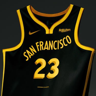
23. Golden State Warriors
The lettering rising up is supposed to represent the San Francisco cable car system, but it feels like that could've been executed better because "San Francisco" just seem like it's floating away.
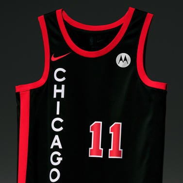
22. Chicago Bulls
This one has a bit of a computer-generated, generic feel to it.
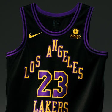
21. Los Angeles Lakers
The triangle word mark is different and makes it look like a house. Creative, but it looks too busy.
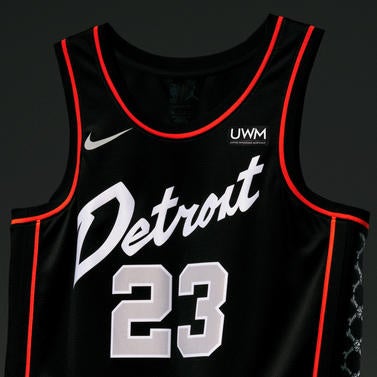
20. Detroit Pistons
It's a clean look, but it doesn't stand out much and is kind of forgettable.
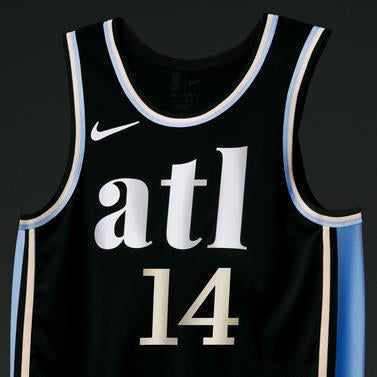
19. Atlanta Hawks
The blue pays homage to the Hawks' 1968 uniforms, and it's a really nice touch. I don't hate this jersey, but it's not memorable.
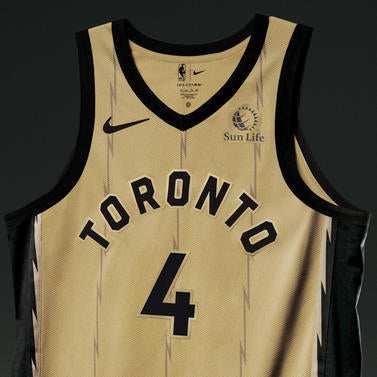
18. Toronto Raptors
It's a simple design that could've been elegant, but I'm not a huge fan of the gold being so matte.
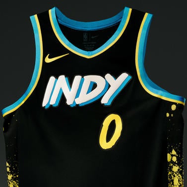
17. Indiana Pacers
Good idea, but the design may be a bit too conservative because more paint splashes would've taken it to a new level.
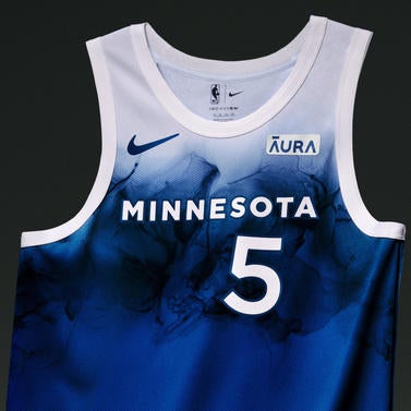
16. Minnesota Timberwolves
This is a bit frustrating because the water design had great potential to make a splash, and I can see the vision. However, it feels like this shouldn't have been the final draft.
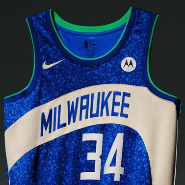
15. Milwaukee Bucks
It's not sparkly, but the speckled pattern kind of tricks you into thinking it is. This design feels electric.
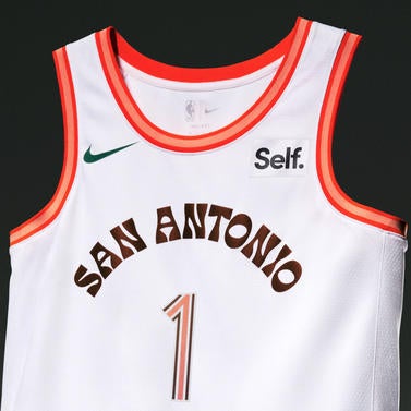
14. San Antonio Spurs
Very simple, but it's a nice throwback to the World's Fair that San Antonio hosted in 1968. It just feels like it needs a little extra something.
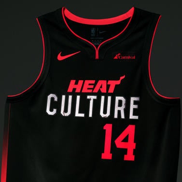
13. Miami Heat
This jersey has some nice little details, but from afar it looks too simple.
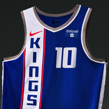
12. Sacramento Kings
These are not the Kings' current colors, but the design was inspired by 1968 Cincinnati Royals road uniform. It has a bit of a European soccer jersey look.
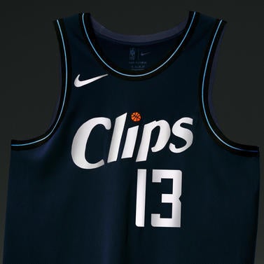
11. Los Angeles Clippers
This is a simple design, but it has a cool retro-yet-modern vibe.
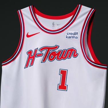
10. Houston Rockets
Another solid throwback look, giving varsity jacket vibes.
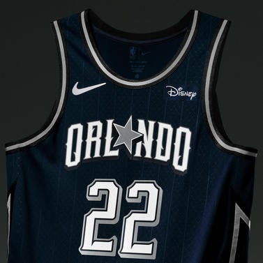
9. Orlando Magic
It's a nice jersey, but it is too close to the Dallas Cowboys brand.
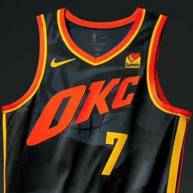
8. Oklahoma City Thunder
Hard to explain, but this just looks like a basketball jersey. Maybe it's representing the Thunder's partnership with Love's a little too much.
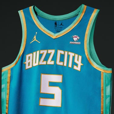
7. Charlotte Hornets
This is a great use of the team colors. Looks beautiful, especially the gold trim.
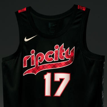
6. Portland Trail Blazers
Definitely applauding the decision of Portland playing with the plaid. Maybe they could've added more of it, perhaps on the side trim.
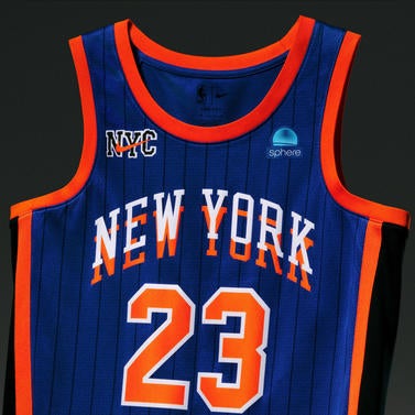
5. New York Knicks
You could tell whose jersey this is without having to read the name. The colors are vibrant and the font effect is creative but not too crazy.
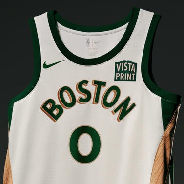
4. Boston Celtics
It's a classy nod to the city's legacy of fine furniture makers. The wooden trim is a brilliant touch, perfectly exemplifying how a little detail can elevate a simple design.
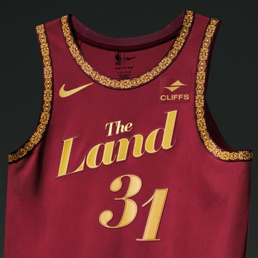
3. Cleveland Cavaliers
This uniform takes inspiration from performing arts and theater, and it definitely steals the spotlight. It's an elegant look with the gold details making it downright royal.
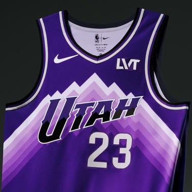
2. Utah Jazz
This is a modern, vibrant look. The gradient used for the mountain range adds dimension while the team name stands out in a perfectly balanced design.
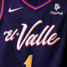
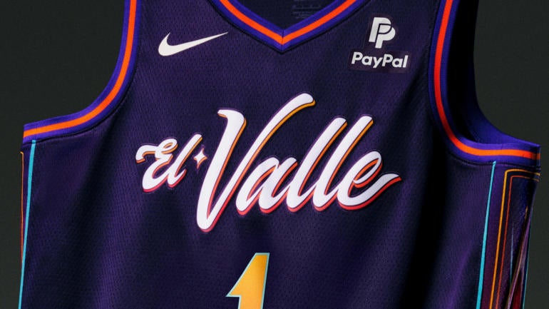
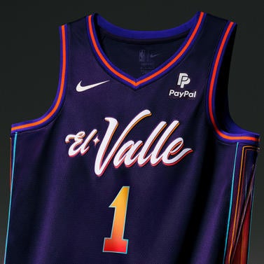
1. Phoenix Suns
With all the colors used, this could've easily gone wrong -- but the designers tastefully sprinkled the right amount throughout the uniform. It's a fun look, and it's hard to not love the El Valle brand and culture.
![[object Object] Logo](https://sportshub.cbsistatic.com/i/2020/04/22/e9ceb731-8b3f-4c60-98fe-090ab66a2997/screen-shot-2020-04-22-at-11-04-56-am.png)


