Courageously ranking each MLB team's road uniforms from 1-30
We've already ranked the home uniforms from 1 to 30, and now it's time to turn our attention to the road duds.

The loyal and abiding Eye On Baseball reader will recall that not so long ago I ranked every team's home uniform for 2015 from no. 1 to no. 30. Given those prior endeavors, it follows that I would eventually get around to ranking all the road uniforms for 2015. That fine day is at last upon us.
Yea and also verily: Below you'll find every team's road uniform for 2015 ranked in descending order of aesthetic excellence. It is quite possible that you'll disagree with the precise ordering of these abroad kits (on occasion, the gentleman will refer to a "road game" as an "abroad game"), but before you air any objections keep in mind that my opinions are actually objective facts costumed as opinions. I also invite you to imagine each uniform worn with high cuffs, so as to expose the socks/stirrups to all who survey this fine game of baseball. Also, no alternate uniforms were considered, no matter how lovely and uplifting they might be. These are the official abroad (abroad!) grays only.
Before we commence, much gratitude to SportsLogos.net and proprietor Chris Creamer for allowing me to use the most excellent uniform renderings found below. Unless otherwise noted, all images come from Sportslogos.net.
With all of that printed out and near at hand for convenient reference, you may begin ...
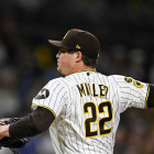
1. Houston Astros

As noted in the prior edition, I’m rather very quite fond of orange paired with blue. Those said colors go nicely together, especially on the hat. Nice piping on the jersey, and good balance with the lettering. Just a great look and an incalculable improvement over their last ensembles.
Show us how it's done, Jose Altuve ...


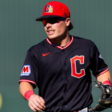
Excellent. The simple jersey font and shading are terrific, and I love the block “C” on the hat. It’s a simple design that evokes the old days.

Blue with orange! I’m always a fan of that pairing. Great font, piping on the jersey, colors look tremendous against the gray backdrop.

Great “TC” hat logo, great jersey script (underlined!), excellent striping on the sleeves and neck, and I like the red bill on the hat. All of it looks tremendous against the gray background.

I love the strong, simple jersey font, and the tri-layered stripes on the sleeves and pant look great. Piping!

As was made abundantly clear last time out, my affections for the “birds on the bat” logo are both boundless and without bound (and those striped socks are utterly beautiful). What drops the road look look a few spots, though, is that the jerseys don’t say “St. Louis.” It is a deeply held belief of mine that road jerseys should rep the city/state in question. While otherwise a lovely look, the absence of municipal touting on the jersey front hurts it a bit.
Also, I'd like to see the Cardinals have road hats that harken back to the team's 1940s/1950s design ...

(Image: Rakuten Global Market)

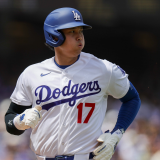
No complaints! As with the home threads, the red numbering is an excellent flourish. The recognizable and iconic jersey script works almost as well with “Los Angeles” as it does with “Dodgers.”

As always, the smiling bird is the driver of the excellence herein. Orange numerals look great outlined in black. The Maryland-repping sleeve patch is also a nice touch. Again, though, the smiling bird lifts up everything else.

Thoroughly classic look. I’d prefer it to be even more spartan, though. Get rid of the white outlines around the jersey lettering and numbering and lose the sleeve stripes. Even with those minor flaws, though, this is an iconic kit.
10. Seattle Mariners

I’m fine with the M’s overall uniform design, and as I noted last time out the nautical touches are pretty cool. This one rates highly, though, mostly because of the strong socks game. As is the case with a number of these road unis, the team colors look much better against a gray background than against the home whites.

Much better than the home unis. Great script on the jerseys, and the black-and-white striping on the pants looks sharp. Needs piping on the jersey! The gray backdrop works much better with the Sox’s colors.
12. Colorado Rockies

Purple hats would vault these into the top five. As they are, though, they’re rather nifty. The purple piping looks great against the gray, and they thankfully ditched the home pinstripes. Underrated threads right here.

Looks good. Nice balance to the lettering, gold striping works very well. Great font, especially on the numbering. Put some of that gold striping on the socks and things get even better.
14. Texas Rangers

Great blend of colors, and one of the best fonts in baseball (love the three-colored layering of the script). Wisely, blue is now the dominant color, rather than red, which is How Things Used To Be. It’s a bit of an evergreen recommendation, but the jersey would be improved with some piping.

The best jersey font in baseball? It’s in the discussion. Great striping on the pants. Before these came along, the Jays were wearing black hats on the road, so consider this look to be a substantial improvement.
16. Chicago Cubs

Love the Cubs patch on the pant, and Cubbies blue looks great with gray. Sure, I’m almost always beating the drum for More Piping, but putting some on the Cubs’ road jersey and framing that C on the button column would really look great. Also, put some stripes on the pant.

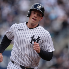
I have no strong complaints. Jersey script looks nice, good sleeve patch, good striping. This kit checks in at no. 17 largely because MLB road uniforms are so well done top to bottom. It’s tough competition, people.

I’m not a fan of the A’s colors, which was the source of some pushback last time. Oakland’s abroad uniforms are an upgrade, though. The gray absorbs the green much better, and, while I’m generally not opposed to hats that have a different-colored bill, the single-colored hat works better for Oakland. It’s an improvement, is what I’m saying.
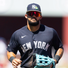
19. Boston Red Sox

These are fine. They could be better. Not long ago, the Red Sox ditched the blue lettering on their road jerseys in favor of red. This, I declare from on high, was a mistake. The Boston road unis from 1979-89 are the best in franchise history …

That’s how Boston should look when not playing in Boston.

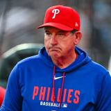
Again, road jerseys should announce the team’s city. Sure, “Philadelphia” wouldn’t fit in anything less than an unwieldy manner, but “PHILLY” in block letters would be pretty cool. Nice stripes!
21. Detroit Tigers

While the Tigers’ home uniforms are among the very best in the game, the road uniforms do not rate so highly. This is because of the galling absence of the “Old English D” on the jersey. In a vacuum, these would rank higher, but, alas and alack, this is no vacuum.
22. Tampa Bay Rays

Sure. They work fine, I suppose, but they’re not interesting. There are worse crimes than being uninteresting, but it’s still a crime. I asked a lawyer and everything.
23. Cincinnati Reds

These aren’t bad, necessarily, but they’re a solid step down from Cincy’s outstanding home threads. The shaded lettering in tandem with the sprawl of the word “Cincinnati” makes the jersey too busy.
24. San Diego Padres

These are better than the Padres’ home uniforms, but only because the jersey font is less bothersome. To repeat -- actually, to bellow from every rooftop and mountaintop -- these aren’t the Padres’ colors. Bring back the brown, Pads, and you’ll be handsomely rewarded with my Fred McGriff-style Full Professional Endorsement.

Again, my primary complaint is that the Royals’ unis feel a bit too Dodgers-derivative. The royal blue color, which is terrific, doesn’t pop quite as much when set against road gray. Also, put some piping on that jersey.
26. Atlanta Braves

There’s nothing really wrong with these, I suppose, but I think for my tastes they look too much like the Braves’ home unis. Go for a plainer look. Drop the tomahawk for road games and give “Atlanta” a nice, plain sans-serif typeface. Follow this advice on pain of ridicule.

These are a vast improvement over the prior generation of D-backs road unis, but in isolation they don’t do much for me. As is the case with the Braves, these look a bit too much like the home uniforms. When you have an excellent home uni like, say, the Cardinals or Dodgers, then there’s nothing wrong with keeping the basic elements in place for road ensembles. However, the Diamondbacks aren’t such a team. The font’s too modern-ish for my tastes, and something evocative of a more classic era (an era that predates the franchise itself) would be better.

This has been the general look of the Angels’ road uniforms for almost the last 15 years. It’s inoffensive but dull. Again,
To lay eyes upon a vast improvement, please regard the 1961-64 Angels road unis …

Bring back the halo-crowned hats, please.

They’re just dull. Not terrible, but dull. As always, the current Brewers look, home or road, serves as a grim reminder of how they ought to look. Viva la ball-and-glove logo …

That’s a great road uniform right there. Sadly, it’s no longer with us.
30. Miami Marlins

All those colors in the mix, and you put white lettering on a gray jersey? Come on, people, we’re trying to run a society here.
(Thanks again to SportsLogos.net and Chris Creamer)