Putting together a truly great NFL uniform seems like a thoroughly difficult task. Not only does it require a helmet that will serve as a primary source of branding, but it also usually requires a jersey that stands out via simple design elements rather than logos, wordmarks or crests. And those two things need to be complemented with visually pleasing pants and socks that tie the whole look together.
It's not easy, and maybe that's why a lot of NFL uniforms that have been unveiled over the past handful of years haven't been received particularly well. (See: Browns, Jets, Buccaneers, etc). But when a team does manage to strike that perfect balance, boy, is it ever a beautiful sight to behold.
Let's take a look at 10 NFL uniforms that bring the whole package in order to stand above the rest.
10. Tampa Bay Buccaneers - The Creamsicle
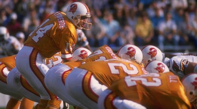
The Buccaneers wore versions of this look from 1976-96 and they were widely panned, which is a crime considering they're one of the best uniforms the league has ever seen. It's possible the world just wasn't ready for them, but it's also possible the Bucs did the unis no favors by largely failing to field a quality on-field product while wearing them.
They're not quite as "badass" as the uniforms Tampa Bay has rolled out since (the latest of which are an abomination) but the creamsicle unis are gorgeously unique and the Bucco Bruce logo is top-notch.
9. Los Angeles Chargers - All-blue Color Rush
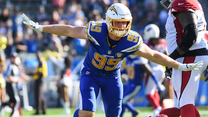
I know everyone seems to love the Chargers' powder blues more than anything else, and don't get me wrong -- they're pretty amazing. But this Color Rush look is superior, mainly because it screams "electric blue," which is exactly what the Chargers should be going for with their uniforms. The white helmet combined with the yellow facemask is an incredible look (which is why the Chargers are switching to it full-time starting this season) and this whole ensemble just works so well -- especially in comparison to a lot of the league's other Color Rush attempts. (That being said, I'd venture to guess it would look even better paired with white pants.)
Unfortunately, it doesn't make a ton of sense for two football teams in Los Angeles to both run with a blue and gold primary color scheme. Then again, it doesn't really make a ton of sense for two football teams in Los Angeles to begin with.
8. Oakland Raiders - Classic home
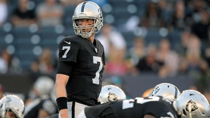
The haters will say that the Raiders uniforms are "boring," but the haters will expose themselves as uncultured fools. While these Raiders unis are exceedingly simple, they're also classics that bring an extremely badass presence to the field. Even when the Raiders stink, they still carry an undeniable attitude thanks to the logo and these uniforms. I mean, even Mike Glennon looks pretty tough in the black & silver.
That's something that's not easy to pull off, and it has taken decades of unwavering dedication to the look. The white road version is extremely clean and also awesome (as is the white alternate with the silver numbers) but the black primary is iconic. It's almost impossible to imagine the Raiders wearing anything else.
7. Cleveland Browns - Brown on orange
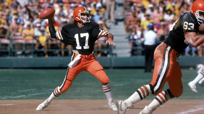
Prior to their somewhat drastic rebranding in 2015, which was NOT received well, the Cleveland Browns had a pretty consistent primary look for decades, though they mixed and matched for a number of slight variations. A lot of those looks worked better than they should have -- I mean, a brown and orange color scheme is tough to pull off -- but the best came in the early '80s when Cleveland went with a classic, clean brown jersey on top of orange pants.
Again, they had no business getting away with it, but the result was exceptionally different and inexplicably impressive. The classic Browns uniforms just ooze "blue-collar football guy" and that's something that was lost when the team switched to the more modern and more soulless look they've carried since '15.
6. Miami Dolphins - Teal throwbacks
The Dolphins have done an OK job modernizing their uniforms over the years, but this throwback still gets run for good reason. It's not only the best iteration they've ever had, but it's one of the best looks in the history of the league.
The helmet is great (though I'd probably prefer a teal or white facemask over the gray) and the jersey perfectly dispatches their awesome color scheme. The teal, orange and white play off one another very well in the numbers and striping. It's such a clean, classic look that feels so perfect for the Fins, so it's somewhat frustrating that they don't just embrace it as their full-time uni.
5. Green Bay Packers - Classic homes
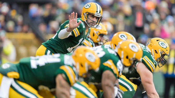
Admittedly, I'm a major sucker for green and yellow being paired together (the Oakland A's have some of the best uniforms in baseball) but the Packers deserve a lot of credit for their excellent uniforms -- especially their home version. Not only do they look great but they also carry plenty of history and tradition, as that home jersey has stayed largely the same since 1970.
The color scheme rocks, the helmet and logo is iconic, and the jersey/pant combination is timeless. It's a vibrant and unmistakable uniform that should never go away.
4. New England Patriots - The Pat Patriot
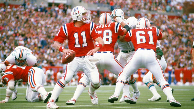
The Patriots may have found a 20-year dynasty with the Flying Elvis, but the height of the organization's fashion sense came in the 1980s with the Pat Patriot. Everything about the classic red unis is gorgeous; There's a great logo on a clean white-on-white helmet, the jersey really pops and the red, white, and blue striping works so well from head-to-toe.
The worst thing about the NFL's helmet rule that only allows one shell per year is that it has basically forced these jerseys into extinction. When (if?) Tom Brady retires, the Patriots should most definitely consider retiring their current look in order to go back to these amazing threads.
3. Los Angeles Rams - The royal and yellow
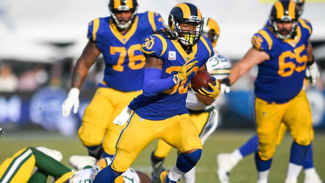
The Rams' return to blue and yellow is the best thing that has happened to the NFL's uniform landscape in a long time. The navy and gold that they wore in St. Louis didn't quite bring the same pop as the old school color scheme, and the revival of these unis seemed to help inject some life into the franchise as they moved back to Los Angeles.
For as eye-popping and electric as the Chargers' Color Rush jerseys are, the Rams' old school blue and yellow is better -- thanks in large part to the horn design in the helmet and on the jerseys. It's just a very cool and unique look that works so well, even if it's slightly bothersome that the helmet blue doesn't match the jersey blue.
In fact, the home uniform is so enjoyable overall that we've all been willing to put up with the rest of their uniform set being a complete inconsistent mess since the move. The team will look to rectify that mess with a new set in 2020, but let's hope the home look stays similar because it's hard to imagine them doing much better.
2. Dallas Cowboys - The navy jersey
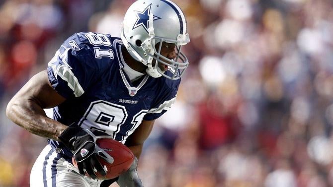
There's something pretty cool and unique about the Cowboys' tradition of primarily wearing the same uniform week in and week out while saving their other main uniform for special occasions. However, it's also sort of a crime that the Cowboys have a uniform as sexy as their navy primary and they don't elect to wear it at any given opportunity.
Maybe part of the reason we all love the navy look so much is because it's so rare and special to see, like a shooting star. Or maybe they became a bit more iconic when the Cowboys found plenty of success in the '90s. Or maybe it's just because they're great, full stop.
In any case, it sounds like we'll be seeing a lot more of them moving forward, as the Cowboys are set to wear the navy jerseys six times in 2019-2020. Twice they'll wear it with white pants, something they'd never done prior to 2017. Wins and losses aside, it's going to be a good-looking season in Dallas.
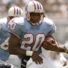
1. Houston Oilers - The baby blues
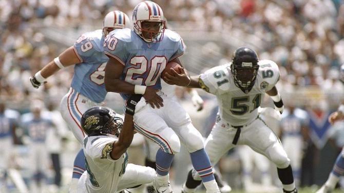
Maybe it's a case of nostalgia or not knowing what you've got until it's gone, but the world just seemed like a much better place when the Houston Oilers and their awesome uniforms were part of the scene. A great logo and helmet on top of a crisp baby blue uniform complemented with red trim and some great striping on the pants/socks? It proves to be a combination that's hard to beat.
With all due respect to the Texans and Titans, erasing these uniforms from our lives was one of the worst crimes the NFL has committed.