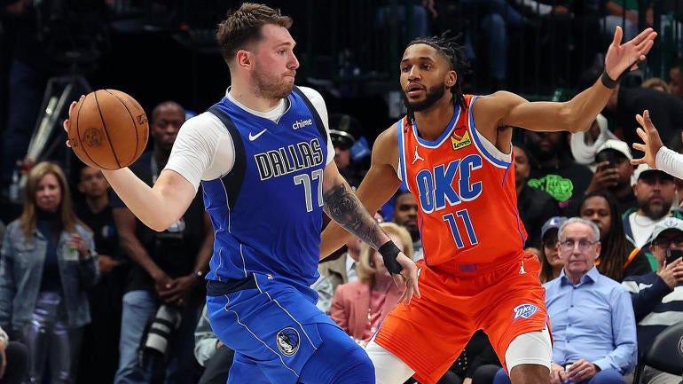
When the Los Angeles Clippers announced a brand overhaul on Feb. 26, it was met with a mixed bag of reviews. Some like the unique angle the Clippers are taking, with a stronger focus on a nautical theme, while others – myself included – think the logo looks like something that would represent a cruise company. Perhaps it will grow on me, but I do appreciate the out-of-the-box thinking from their creative team to come up with something we've truly never seen before from a professional sports team. And a return to the script font on the jerseys is appreciated.
With the Clippers changing up their logo and jerseys, as well as tweaking their color scheme, it got me thinking about which other teams around the league are in desperate need of a brand refresh. This is in no way an exhaustive list, because quite honestly I feel like most of the NBA's jerseys and logos are rather forgettable, but these are the top 5 teams that should ditch their current rotation of jerseys – and in some cases logo – and go back to the drawing board.
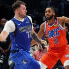
1. Dallas Mavericks
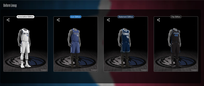
It wasn't difficult to decide who should be atop this list. Two of the Mavericks' four jerseys have been worn since the 2010-11 season. While there's plenty of nostalgia steeped in the Association and Icon jerseys from Dirk Nowtizki's illustrious career that included winning the franchise's only championship, it's time to put those two to rest. The same goes for the Statement edition jersey, which looks more like a Summer League uniform than something an NBA team should be wearing on a nightly basis.
A jersey, and probably logo, overhaul have been long overdo for Dallas, and frankly probably should've been done when Nowitzki retired, officially ushering in the era of Luka Doncic. But Dallas has only made small cosmetic changes to their two main jerseys, altering a shade of blue here, a change in the logo patch there. If anything, this year's City Edition jersey could serve as a starting place for a design refresh. The font is fun, the contrast of the black and blue is appealing, and it could work if you changed the base of the jersey to Dallas' signature blue and white. Now that a new majority owner has stepped in to oversee things instead of Mark Cuban, perhaps one of the things on their to-do list – aside from winning a championship and trying everything in their power to keep Doncic happy and in Dallas – could be to toss out these boring jerseys and bring in something new.
2. Detroit Pistons
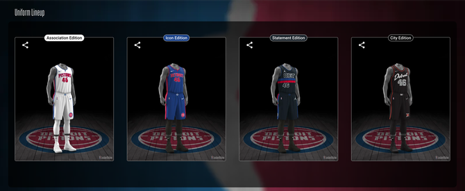
The Pistons have been rocking some iteration of their Association and Icon jerseys since at least the 2004 championship season, and if they didn't look all that great then, they sure don't look amazing now. There's nothing really wrong with the Pistons' two main jerseys, but like many around the league, they're rather boring. Especially when you consider that Detroit has one of the coolest retro jerseys in league history, the teal one with the flaming horse and exhaust pipes to match. That embodied the "Motor City" nickname Detroit is associated with, none of the current four bring that same level of city recognition, even with the City Edition trying to pay homage to the "Bad Boys" era of the team.
The logo is nothing to get excited about, either, with it falling into the category of the minimalist logos we've been force-fed for years from professional sports teams. The logo wouldn't be that bothersome if there was some creativity with the jerseys, even in years past the Pistons don't get particularly flashy with any of their City Edition jerseys. The best was undoubtedly the St. Cecilia green uniforms from the 2022-23 season. At least that took a departure from the typical red, white and blue color scheme while also serving as an ode to a special part in Detroit basketball history.
3. Oklahoma City Thunder
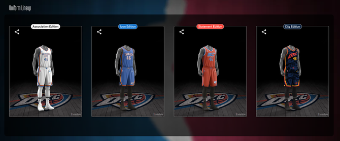
Throw the whole concept away. The color scheme of the Thunder is actually a fun palette considering their one of just two teams to use orange as one of their primary colors (the Suns being the other one). But Phoenix utilizes its orange far better than OKC, and I wish the Thunder would play it up more. The City Edition jersey is a great example of that, the burnt orange pops against the navy blue watermarked jersey, and the gold piping along the sides of the shorts and jersey really stand out. But that's the only memorable uniform of the set. The white Association jersey is bland, and if you're going to have to fit the entire city name of OKC on a jersey, at least make it more appealing to look at.
The Thunder are one of the most exciting young squads in the league with the potential to be in the championship conversation for quite some time, so the jerseys worn by Shai Gilgeous-Alexander, Chet Holmgren and Jalen Williams should match that level of entertainment. OKC should lean more into the orange and the darker blues, ditch the light blue, and get a bit more creative with it. It probably won't happen due to some silly uniform rules, but it would be cool if they could just use "OKC" or "Thunder" instead of having to use the city's full government name.
4. Washington Wizards
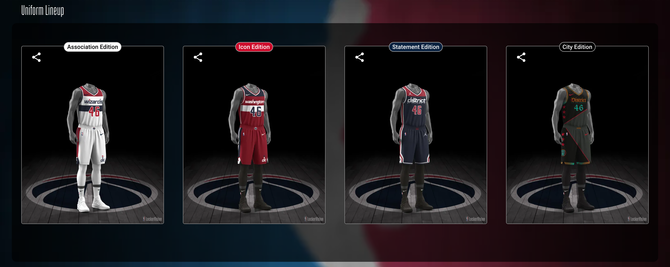
It is absolutely absurd to me that a team with as cool a name as the "Wizards" doesn't lean into the pure silliness of it all. I get it's D.C.'s team, so they want to capitalize off the nation's capital complete with the patriotic red, white and blue color scheme. But I'm sorry you can't go full "USA" and be called the Wizards. Either change the team name to something that falls in the same ilk of the MLB's Nationals and NHL's Capitals, who share the same city as the Wizards, or go full sorcery and give us wands, and a wizard mascot with a white beard and call it a day. The Gilbert Arenas-era Wizards jerseys somewhat accomplished that, but even those were rather tame.
The cherry blossom jerseys were by far the most creative City Edition jerseys I've seen to date, and it was a nice nod to D.C.'s iconic cherry blossom trees that adorn the city in springtime. Still, that same level of uniqueness never extends to the rest of their uniform base for whatever reason. If the Wizards make their rumored move to Virginia, perhaps a brand refresh could be considered, though moving across state lines and changing up the uniform isn't going to be enough to distract from the poor state the on-court product is in right now.
5. Utah Jazz
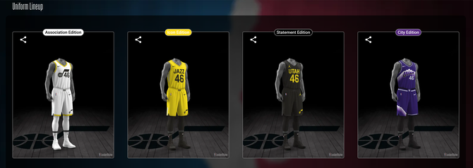
This may be a little harsh considering the Jazz literally underwent a full jersey overhaul just two years ago, but not all changes are for the better and this is certainly a prime example of that. The new color scheme is a complete departure from what we've come to expect from the Jazz, who have gone through countless jersey redesigns, and somehow their creative team landed on highlighter yellow, black and white. The Jazz are one of five teams (Hornets, Lakers, Timberwolves and Magic) that have five jerseys this season, with the fifth being a "Classic Edition" which is just the John Stockton, Karl Malone era purple uniforms, and honestly that's what Utah should just revert back to. Either that one or the purple mountain range ones because those are some of the cleanest jerseys in the league past or present.
When the Jazz announced the rebrand in 2022, they did say that purple would stay in their color palette going forward. That's a positive sign, but it doesn't really fit with the rest of the colors going on here. They should ditch the yellow, add in purple, and just do different iterations of the mountain jersey, or bring back the gradient sunset jerseys. Both of those are better than this current color scheme.