It feels like we've been seeing leaks and teases for the NHL's "Reverse Retro" jerseys for months at this point but, on Monday, the official rollout finally (and mercifully) happened. If you've somehow managed to escape the hype, here's the Reverse Retro project description from NHL.com's release:
"Everything old is new with the Adidas Reverse Retro alternate jerseys, a play on 31 teams' throwback jerseys with modern twists. This marks the first time all 31 NHL teams are included in an alternate jersey rollout, and the collection is a colorful mix of primary and secondary logos, old school and new school striping, and reimagined classics.
"Each jersey was inspired by one worn by the team during a season that has some historical significance and the whole design process took about two years. Teams will wear the jerseys multiple games against each other in designated rivalry games during the upcoming season."
Let's take a look at all 31 jerseys and hand out grades for each.
Anaheim Ducks
We all know the Wild Wing jersey absolutely sucks, so it's a tough place to start from. However, I do want to give the Ducks credit for their willingness to get totally weird here. Plus, at this point I almost respect how hard they're trying to avoid the one jersey that people actually like. Grade: B-
The moment you've been waiting for!
— NHL (@NHL) November 16, 2020
Check out these beautiful #ReverseRetro jerseys by @adidashockey ⬇️ pic.twitter.com/V9RBDOxM6C
Arizona Coyotes
As someone who wants to see the Coyotes move to the Kachina full-time, this absolutely rules. It should be promoted to full-time alternate at some point down the line. Grade: A
— NHL (@NHL) November 16, 2020
Boston Bruins
A lot hinges on what color helmet the Bruins are going to pair with this uniform (please don't do gold on gold) but the jersey itself is a nice twist on the team's best uniform. Plus, the Bruins have been due for a gold jersey. Grade: A-
— NHL (@NHL) November 16, 2020
Buffalo Sabres
Buffalo was so, so close to knocking this one out of the park ... they just chose the wrong jersey from that era. They should have gone with the goat head. Still, these aren't terrible, though I really wish they'd scrapped the "BUFFALO" script across the bottom stripe. Grade: C+
— NHL (@NHL) November 16, 2020
Calgary Flames
Like many teams, I'm not totally sure the Flames understood the assignment ... they didn't exactly put a reverse twist on a retro jersey. That being said, I'm not complaining because this updated Blasty alternate is awesome. Grade: B+
— NHL (@NHL) November 16, 2020
Carolina Hurricanes
It's one of the best jerseys ever and the grey actually works well, but it's hard to even give the Hurricanes any credit here considering ... you know, they're not the Whalers. We need to stop enabling them. Grade: D
— NHL (@NHL) November 16, 2020
Chicago Blackhawks
These are fully "meh" from me. Also, it's probably not a coincidence that this is the only jersey in the NHL's thread that shows the back of the jersey and not the front. Grade: D+
— NHL (@NHL) November 16, 2020
Colorado Avalanche
I'm going to sound like a total hypocrite here because I just criticized the Hurricanes for desecrating a grave but I'm willing to give the Avalanche credit here because 1.) they put their own spin on a classic, and 2.) they've never worn a Nordiques throwback up to this point. It feels somewhat fitting, too, because the Avs are approaching their 25th anniversary of relocating. Most importantly, it just works so well. Grade: A-
— NHL (@NHL) November 16, 2020
Columbus Blue Jackets
Considering the Blue Jackets haven't really had a great jersey ever, they were already working from behind. Unfortunately, we can throw this onto the pile of thoroughly mediocre jerseys from the team. It looks way, way, way too much like the Capitals throwback, too. Grade: D+
— NHL (@NHL) November 16, 2020
Dallas Stars
I appreciate the thought of going back to this template but, uh, that is WAY too much white and silver. This is probably going to look brutal on TV or from more than two feet away. Grade: C-
— NHL (@NHL) November 16, 2020
Detroit Red Wings
The Red Wings were kind of screwed here because they've basically had one primary uniform for their entire existence and it's so good that it should never be messed with ... but, uh, nice jersey, where's the rest of it? Grade: F
— NHL (@NHL) November 16, 2020
Edmonton Oilers
I'm so, so glad they decided to go back to the brighter shade of blue here. It's not the boldest choice of direction but it works super well. Grade: A
— NHL (@NHL) November 16, 2020
Florida Panthers
As someone who doesn't totally love the Panthers old uniforms or their current color scheme, I am somehow totally infatuated with these. This might be their best jersey ever. Grade: A
— NHL (@NHL) November 16, 2020
Los Angeles Kings
Absolutely incredible. They took their best jersey and utilized their best color scheme. These should be their primary jerseys from now on. Grade: A+
— NHL (@NHL) November 16, 2020
Minnesota Wild
Is this jersey the most interesting thing the Wild have ever done? Yes. Since the Dallas Stars are refusing to utilize the old North Stars color scheme, I'm absolutely here for the Wild taking it back on a full-time basis. These are great. Grade: A+
— NHL (@NHL) November 16, 2020
Montreal Canadiens
The Habs took an untouchable classic, messed with it and somehow made something nearly as good. These should enter the Canadiens' full-time rotation as an alternate. Grade: A
— NHL (@NHL) November 16, 2020
Nashville Predators
I wish they had done a reversed version of their 2020 Winter Classic jersey but alas. This isn't my favorite jersey but it's going to be the best one they wear this season. Grade: B-
— NHL (@NHL) November 16, 2020
New Jersey Devils
This should be popular at Christmas, huh? Yes, they're very nice and they'll probably end up being extremely popular, but I can't help but shake the disappointment that they didn't use this opportunity to make the black alternate I've been asking for for years. Grade: B+
— NHL (@NHL) November 16, 2020
New York Islanders
Considering they just took their regular jersey and applied a slightly different (and worse) color scheme, this is a huge bummer. It doesn't look awful but they could have scored a ton of points by getting weird with it. The Fisherman jersey was RIGHT there. Grade: D-
— NHL (@NHL) November 16, 2020
New York Rangers
When the Rangers teased these jerseys, I was extremely excited to see that Lady Liberty was making a return. However, the final result is thoroughly underwhelming. They should have taken the original Liberty jersey and swapped to a red base. Grade: C-
— NHL (@NHL) November 16, 2020
Ottawa Senators
It's not super duper exciting but it works and they'll probably end up keeping these around as a permanent alternate. Grade: B
— NHL (@NHL) November 16, 2020
Philadelphia Flyers
I honestly have no idea how to feel about these. I have to wait until I see them on the ice because I feel like I could either really love them or completely hate them. For now, I'll just say they're ... interesting? Grade: N/A
— NHL (@NHL) November 16, 2020
Pittsburgh Penguins
These are quite nice, if not overly exciting. I think a reversed "Robo-Penguin" would have moved the needle a bit more, but these are clean. Grade: B
— NHL (@NHL) November 16, 2020
San Jose Sharks
I was never crazy about these jerseys and I don't typically love gray/silver as a base, but they're fine. Probably would have preferred to see them go with the original franchise jersey design. Grade: C
— NHL (@NHL) November 16, 2020
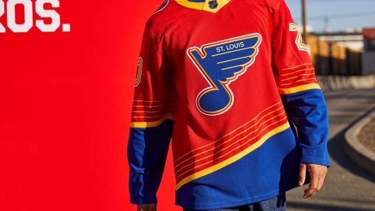
St. Louis Blues
The Blues could have easily taken the coward's way out and just made some slight color tweak to a universally beloved throwback, but they took one of the more criticized jerseys in their history and made it even more outrageous. I am absolutely here for the boldness and, for what it's worth, I absolutely love this dumb jersey. Grade: A+
— NHL (@NHL) November 16, 2020
Tampa Bay Lightning
Speaking of taking the coward's way out ... the Lightning could have gone A LOT weirder here, but I do think these look very nice and will be the best jersey in their rotation next season. Grade: B
— NHL (@NHL) November 16, 2020
Toronto Maple Leafs
Anyone who knows me I'll take any opportunity to criticize and make fun of the Leafs, but putting aside my bias ... these jerseys still absolutely suck. Yikes. Grade: F
— NHL (@NHL) November 16, 2020
Vancouver Canucks
I don't usually like gradient jerseys so I'm very confused as to how the Canucks made me love this one. It's impressive that they took one of their worst jerseys ever and made it exponentially better rather than taking a beloved one (i.e. the Skate) and messing with success. Grade: A-
— NHL (@NHL) November 16, 2020
Vegas Golden Knights
I don't love it but I also don't hate it. It's gotten a ton of hate out of the gate but I feel like it might win some people over once we see it in action. That being said, I'd much prefer the primary logo on the crest. Grade: C+
— NHL (@NHL) November 16, 2020
Washington Capitals
The jersey design stinks to begin with but these actually look better than I expected. The updated color scheme makes them a slight improvement from the original, but they're still not great. Grade: C+
— NHL (@NHL) November 16, 2020
Winnipeg Jets
I have absolutely no idea why the Jets chose to go with a slate base here when their current (and former) color scheme is so great but, man, these are trash. They totally blew it. Grade: F
— NHL (@NHL) November 16, 2020