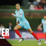
Few days are more exciting in preseason than the day teams reveal their kits, and the NWSL's announcement ahead of the start of the 2024 season was no exception.
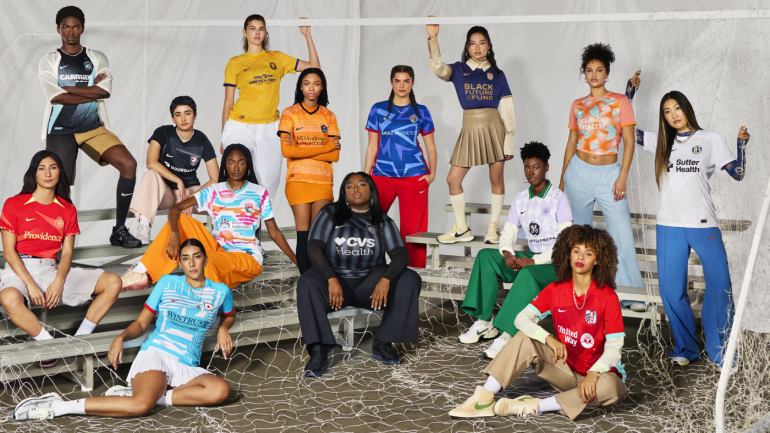
Each of the league's 14 teams unveiled their new looks on Tuesday, marking the first time a professional women's soccer league underwent a full kit refresh before the start of the season. The collection of uniforms is a colorful one and just about every team completed the task of ensuring they are somewhat recognizable in both their home and away strips.
Some clubs used the opportunity to provide some unique looks that are bound to pop on screens and in stadiums once play gets underway. That includes a new colorway for the Washington Spirit, who seem close to launching a rebranding under the leadership of majority owner Michele Kang.
Every major kit unveiling comes with fresh styles and underwhelming looks alike. Some teams relied on a distinct color rather than an actual design, and a handful of clubs have room for improvement when it comes to next year's kit battles.
Here are the 2024 NWSL kits by team, ranked and grouped by their level of impact.
Best overall: Racing Louisville
No team nailed both the home and away kit, but if anyone got close to the brief, it was Racing Louisville. The side is always easily identifiable thanks to their unique choice of lilac as their primary color, but they truly embraced a distinct look in 2024 with the argyle print, which is rarely used for soccer kits. The main concern about the kit is that the lilac might be too light to stand out on a screen, but it's still the best design of the bunch. The dark purple kit does not reinvent the wheel, but it complements the lilac argyle kit nicely and feels true to Louisville's colorway.
A city and kit built for greatness. 🤝
— Racing Louisville FC (@RacingLouFC) February 27, 2024
Introducing the Winner’s Circle kit.
Honorable mentions: Chicago Red Stars, San Diego Wave, Houston Dash, Washington Spirit
There is little sympathy here for plain kits and so each of these four teams land amongst the top ranks because they tried. The Chicago Red Stars are a close second to Louisville for putting together two cohesive looks that pair well together, with their sky blue and white kit standing out for the design's references to the city. The San Diego Wave, meanwhile, earn top marks for embracing color in a way they had not previously done during their first two seasons in the league.
The Houston Dash's orange and blue combination is a fun example of contrasts, and though their home kit might be slightly overdesigned, the design is a nice way to break down a strong orange color. The Spirit, meanwhile, are introducing a new black and yellow color story that looks unique thanks to the lighter shade of yellow. Even though the rebrand still gives off early-stage vibes, it marks a promising start for a new look.
Proud to introduce our new front-of-jersey partner, @Wintrust 🤝
— Chicago Red Stars (@chicagoredstars) February 27, 2024
They'll be prominently featured on our 2024 Primary and Secondary kits.
Pre-sale + more content coming soon 🙌
Better luck next time: Orlando Pride, NJ/NY Gotham FC
The Orlando Pride and NJ/NY Gotham FC each gave it a go when it came to coming up with unique designs, but they failed to meet the mark. The Pride kept things classic with the rich purple home kit but presented a unique design with their away kits, which are inspired by oranges. It's a fun idea but, unfortunately, the execution makes the detail hard to recognize. As for Gotham, they are revisiting the sash look they dropped when they debuted their rebrand three years ago, but it's another overdesigned look that reinvented the wheel for the worse. Their white and sky blue gradient kit, meanwhile, is an unmemorable execution of a boring template. At least they tried, though.
A kit for every occasion… the way it should be. @CarMax pic.twitter.com/f5UDrCsSUT
— NJ/NY Gotham FC (@GothamFC) February 27, 2024
Downgrades from previous seasons: Portland Thorns, Angel City
Both the Portland Thorns and Angel City have done a nice job of dropping some unique kits in recent years, but you will not be saying that about their looks this year. A year after unveiling an away kit that was inspired by tattoo art, the Thorns went incredibly safe with almost plain red and navy looks that are nearly unrecognizable from their previous kits. Angel City, meanwhile, will be rocking watered-down versions of their sharp uniforms from their first NWSL seasons.
Did they try?: Kansas City Current, Utah Royals, North Carolina Courage
While most of the other teams already mentioned attempted something notable in their designs, this trio relied solely on distinct colors to tell the story. The Kansas City Current's bright red is a nice shade that almost gets away with being the standalone feature but the white and toothpaste green gradient suffers the same problem as Gotham's very similar look. The Royals benefit from having a unique color story but left a lot to be desired in terms of design while the North Carolina Courage's two-toned blue geometric kit is unmemorable and the away kit relies on a fairly unflattering shade of pink.
For the love of our people, land, where we come from, and who we are. For the love of the game.
— NC Courage (@TheNCCourage) February 27, 2024
The 2024 kits are here.#ForTheLove pic.twitter.com/LBIfFATrIs
Worst overall: Bay FC, Seattle Reign
The group above them has been fairly accused of not trying, but if anyone truly phoned it in, it's the Seattle Reign and Bay FC. A plain navy kit is not suddenly more interesting if you throw in barely noticeable design element and there is absolutely no way to champion a plain white kit. The Reign can at least grasp at straws and claim they will sport a nice shade of navy, though, while Bay do not have a leg to stand on in any design standard. A plain white look and a plain black uniform is the least inspiring combination of kits one could possibly envision, and it marks a very disappointing look for the NWSL's newest club.