LOOK: Denver Nuggets unveil revamped uniforms with new logos and color scheme
The Nuggets have rebranded themselves as they look forward to a new era in Denver
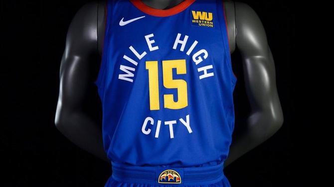
The Denver Nuggets unveiled the full scope of their rebranding on Wednesday night -- during the middle of an NBA Finals game, for some insane reason -- and it brought a new logo, color scheme and three new uniforms.
It seems like the Nuggets have tweaked their look quite a bit over the past decade or so, but they've gone with a drastic change this time around. They're moving away from powder blue as their primary color and going with a navy, red and yellow color scheme that resembles their look from the 1990s and early 2000s.
From the team's official release:
The image revitalization occurs as the Nuggets continue to shift and evolve into a new era of basketball. The innovative marks and uniforms acknowledge the team's past, while concurrently looking forward and identifying the transformation of the Mile High City.
Here's a look at their set of new logos:
Association.#EVOLVE2018 pic.twitter.com/ktEQ21w9Qw
— Denver Nuggets (@nuggets) June 7, 2018
Pretty much all of those logos are an upgrade from the Nuggets' former branding efforts, and most of them will look pretty great on various forms of merchandise.
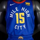
And here is a look at their trio of new uniforms:
Association.#EVOLVE2018 pic.twitter.com/ktEQ21w9Qw
— Denver Nuggets (@nuggets) June 7, 2018
Icon.#EVOLVE2018 pic.twitter.com/3B6asIUvjZ
— Denver Nuggets (@nuggets) June 7, 2018
Statement.#EVOLVE2018 pic.twitter.com/vvkLLH7XEw
— Denver Nuggets (@nuggets) June 7, 2018
Personally, my favorite aspect of the unis is the Rocky Mountains design in the shorts. I'm a big fan of the Statement jerseys, which are somewhat reminiscent of the current Indiana Pacers uniforms, thanks to the circular wordmark around the number on the front of the torso.
The other two uniforms are rather unspectacular. The whites sort of look like they belong to the Cavaliers' family tree, and I'm not crazy about the white trim on the navy uniforms.
As is the case with all uniforms, taste is subjective and it's tough to fully judge a look until it's seen on an actual body and in action. Overall, this new look seems to be an upgrade over the previous one, which is nice. I guess we'll have to check back in and re-assess in a handful of years when the Nuggets decide to adjust this look.


