LOOK: Utah Jazz unveil sleek new logo, uniforms, court design
The Jazz have a brand new look for 2016-17.

•
1 min read

The Utah Jazz have a (slightly) new look for the 2016-17 season. On Thursday they unveiled their new logo, uniforms and new court. Let's have a look at them.
The new Utah Jazz logo system - https://t.co/AuTOcJvUjw
— Utah Jazz (@utahjazz) May 12, 2016
🎷🏀🎶 pic.twitter.com/7Cm2T5SHae
Here's the new home uniform, which does not look discernibly different from the old one but apparently has a new font for the numbers and a different trim for the collar and armholes:
Home Uniform 🏡 pic.twitter.com/SNsDcejUAM
— Utah Jazz (@utahjazz) May 12, 2016
That tri-colored ball on the waistband is new, too, and it will function as an official logo. The away uniform is basically the same, but purple:
Road Uniform ✈️ pic.twitter.com/ymzbCskUfC
— Utah Jazz (@utahjazz) May 12, 2016
It's basically the same deal for the green road alternates, except they now say "UTAH" instead of "JAZZ" on the front:
Alt Road Uniform 💚 pic.twitter.com/AfZvKmzvLG
— Utah Jazz (@utahjazz) May 12, 2016
And finally, there is one drastic change, a new sleeved jersey that the Jazz are calling their "pride uniform." It looks like a soccer jersey to me, and it is inspired by Utah's old warmups. You'll probably either love or hate this:
Pride Uniform 🎷 pic.twitter.com/4NkUMf4ugP
— Utah Jazz (@utahjazz) May 12, 2016
My burning-hot take on the jerseys: They're good! But they were already good. I'm not sure this even necessarily qualifies as a redesign, or as the team is calling it, a "refreshed brand identity."
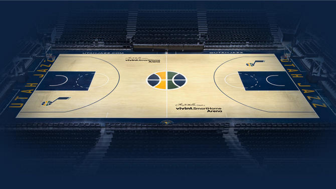
The Jazz also have a jazzy new court, complete with the tri-colored ball at center court. They hit all the right notes with that one.