Miami AD: 'Canes jersey nameplates to revert to 'traditional' font
The futuristic-looking font used originally on Miami's nameplates for its 2015 uniforms didn't go over so well.

By
Jerry Hinnen
•
1 min read
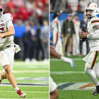
When Miami unveiled its first-ever set of Adidas uniforms over the summer, the initial set of promo photographs didn't include a look at the new jersey nameplates, which wasn't a big deal at the time, because when are nameplates ever a big deal?
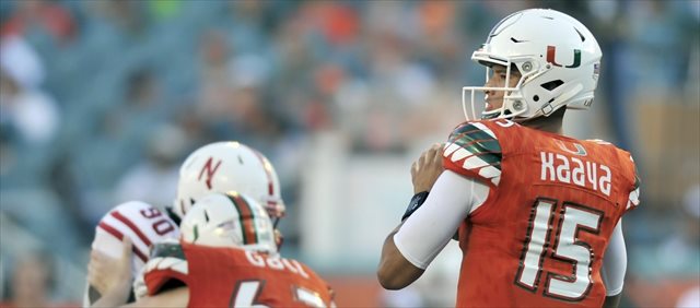
Then Miami actually took the field for the 2015 season, and fans discovered Adidas' choice of font used for those nameplates was an ... interesting one:
#legacy pic.twitter.com/mRHl1gnCIb
— Brian Bowsher (@brianbowsher) September 5, 2015
@adidasUSPRGuy His name is Kaaya not K backwards S backwards S upside down h backwards S pic.twitter.com/cpSqP1V1Zq
— gocanes95 (@Gocanes95) September 5, 2015
A for effort, but it's fair to say most of the college football world isn't yet ready for a nameplate font that looks like it's been stolen from a 1990s movie about college football in the year 2078. And apparently that includes Miami athletic director James Blake:
Miami AD Blake James announced that the nameplate font on the jerseys will be changed to a "traditional block font"
— InsideTheU.com (@InsideTheU) September 22, 2015
Let's check in with the Miami Herald's Manny Navarro for a glimpse of the consensus reaction to this decision:
There is joy! https://t.co/XSYRCmytxN
— Manny Navarro (@Manny_Navarro) September 22, 2015
Don't feel too bad for Adidas, though: when 2078 rolls around, they'll just look ahead of their time.