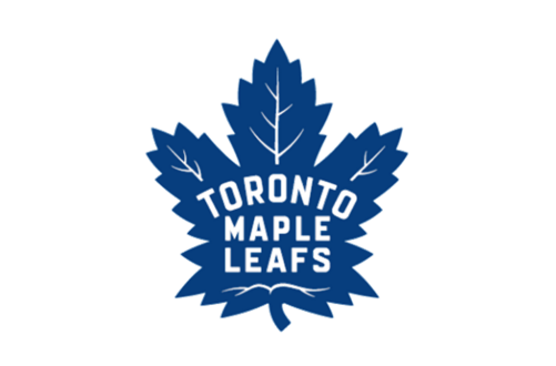
LOOK: This is what the Maple Leafs new logo will look like
The Toronto Maple Leafs are changing their logo next season. This is what it will look like.

We already knew the Toronto Maple Leafs were getting a new logo and uniforms for the 2016-17 season as part of their 100th anniversary celebration. Now we know what the logo will look like.
On Tuesday night the Maple Leafs revealed their new look following their 4-3 come-from-behind win over the Boston Bruins, and here it is.
The Maple Leafs have unveiled their new logo. #TMLtalk
— Toronto Maple Leafs (@MapleLeafs) February 3, 2016
MORE: https://t.co/KRmipfd2uJhttps://t.co/6JxhtUCxaI
The team won't reveal what the new uniforms will look like until the NHL Draft in June.
According to the team, it is based on the logo the team had throughout the 1940s, '50s and '60s with a couple of slight variations. The Leaf itself has 31 points which is a nod to the 1931 team that opened Maple Leaf Gardens, while the 13 veins at the top of the crest represent each of the team's Stanley Cup wins.


