Hawks go retro, bring back 'Pacman' style as new alternate logo
Hawks bring back awesome old school logo.

By
Matt Moore
•
1 min read
More postseason coverage: Playoff schedule, results | Latest news, notes
The Hawks are going retro. They've brought back the so-called "Pacman" logo (on account of it, you know, looks like Pacman from the video game I played on the Atari and oh, God, I'm so old). Take a look:
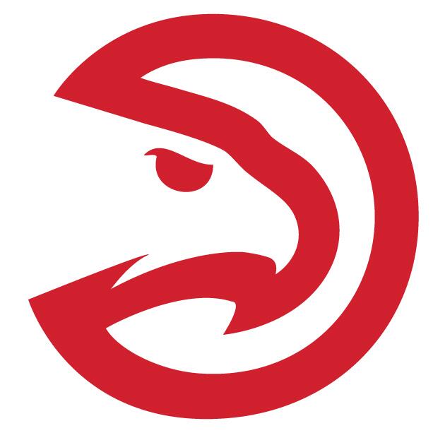
This version was used from 1975-1992, and here's what the original version looked like:

So the new one has the jagged edge below the beak which makes it look a little more Hawk-like and less Pacman-like, but the original concept is still honored. It's very cool. I firmly expect this to lift the Hawks to a victory in Game 6 Thursday night. (Note: Not actually.) (Note2: But maybe.)
With a coach from the Spurs' coaching tree in Mike Budenolzer, a talented roster with rising stars like Jeff Teague and Mike Scott, pillars in Al Horford and Paul Millsap, a new CEO and now this retro new logo, is it possible the Hawks are actually becoming... cool?