Carolina Hurricanes go with 'Canes,' diagonal lettering on new road jersey
Nickname jerseys aren't always received well

•
1 min read
The Carolina Hurricanes will have new road jerseys this upcoming season, and they're probably not what you expected.
The Hurricanes have decided to abandon their primary logo on the front of that jersey, instead going with a diagonal wordmark reminiscent of the New York Rangers. But the Hurricanes are also electing to go with their shortened nickname across the front, as the new jersey simply reads 'CANES.'
A new look for a new era. pic.twitter.com/SAvcH2iii2
— Carolina Hurricanes (@CanesNHL) August 20, 2019
Bold. Clean. Canes. https://t.co/c2TprIaLD6 pic.twitter.com/FYp05DUJXy
— Carolina Hurricanes (@CanesNHL) August 20, 2019
Nickname jerseys aren't always received well (just ask the Lightning and Senators) but this Hurricanes look isn't that bad. Some critics have already declared that it looks too much like a high school jersey, but it's clean while bringing a few cool details that may not jump out right away.
The 'C' on the front of the jersey includes two warning flags, signifying a hurricane warning.
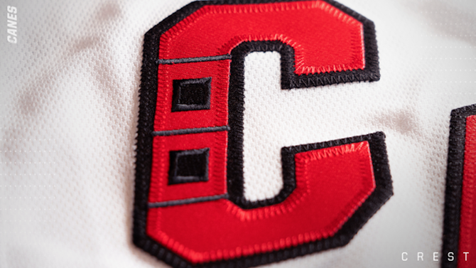
The warning flags also return to the road jersey's waistline, matching the primary home uniform.
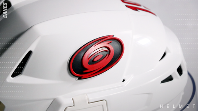
As a cool added touch, the helmets will also featured a raised, 3D decal of the Hurricanes' primary logo.
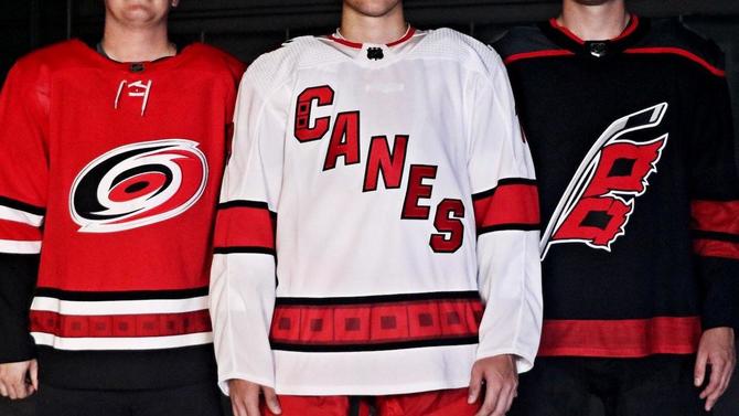
Here's a look at the team's full three-uniform set for the upcoming season:
Overall, the jersey isn't really spectacular, but it brings a little more personality than what Carolina has been wearing on the road for the past few seasons. At the very least, the new look stands out. For a team that's stepping into a new, more fun identity with the goal of separating from the stale, that's a good thing.