LOOK: Auburn has updated its traditional logo, but can anyone see the difference?
Look closely, and you might notice a change

•
1 min read
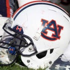
Auburn has decided its time for a change -- at least, a minimal one. After many decades of having the same logo, the university has decided to update the look ever so slightly.
The school announced Thursday that the traditional interlocking "A" and "U" will remain in place, but that the space between the "A"and "U" will be smaller to put more of an emphasis on the "A." Auburn assistant vice president for communications Mike Clardy explained the reason for the change to to 247Sports.
"Auburn updated its visual identity system to make it compatible with the many ways, especially digital, in which it is now used and to help us further elevate the Auburn brand," he said. "It's in fact already in partial use."
The slight modification caused such an uproar on Friday that, yes, a petition was created by Auburn fans opposing change to the logo.
Can you notice the difference?
If you missed it last night: #Auburn has changed its logo https://t.co/xzaUAKygFR
— Brandon Marcello (@bmarcello) August 9, 2019
It's unclear whether the new logo will be included on Auburn's 2019 football uniforms. Even if it was, would you be able to tell the two images apart without knowing which was which?
AuburnUniforms.com reports that the school will also switch its official font from Copperplate to Sabon. That's right, "Sabon," -- one letter off from the last name of the coach of intra-state rival Nick Saban. Go figure.