PHOTO: Georgia unveils new second logo, tweaked jerseys
Bulldogs undergo a subtle 'rebranding.'

By
Jerry Hinnen
•
1 min read
Most college football fans would agree that Georgia's time-tested college football uniforms -- red jerseys, silver pants, red helmet with iconic "Power G" logo -- are among those that would least benefit from a makeover.
And apparently, even Nike has been forced to agree. The company's "re-branding" of Georgia's athletics uniforms, unveiled by the school Tuesday, leaves the Bulldogs' football look untouched save for a revamped number font:
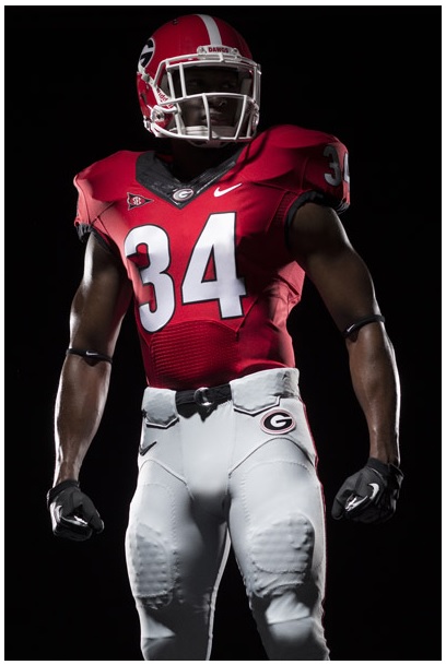
Since the numbers didn't transform into some kind of Oregon-style numerals-from-the-future, that's fine; it's doubtful anyone other than the diehardiest of Bulldog diehards will notice. Less of a "tweak" is the Bulldogs' new secondary logo, which won't replace the "Power G" but will boast an increased presence in Georgia paraphernalia and the like:
![]()
There's not a whole lot to say here -- hey, it's a bulldog, one that happens to have a spiked Georgia collar -- which is why you have to wonder if Nike and UGA missed an opportunity to create something a little more striking.
But like the jersey tweak, it certainly doesn't qualify as a misstep, either. And given the wide number of missteps across the college football design landscape as Nike, Adidas and Under Armour seem driven to outdo themselves in garish excess, that's enough to offer a qualified thumbs-up here.