Courageously ranking each MLB team's home uniforms from 1-30
Fashion opinions! Home MLB uniforms! Not a slideshow!

Although I have no evidence of the claim to follow, I have no doubt that you, the people have been braying loudly for me to rank the best uniforms in all of Major League Baseball. And so I have done this, in large part for the benefit, edification and uplift of same -- i.e., you the people.
To get us started, I have courageously ranked every team's home uniform for 2015 from no. 1 to no. 30. You are free to disagree with these rankings, so long as you do so in respectful silence while genuflecting before a copy of my headshot with a monocle and pair of four-button spats placed before it.
As you might imagine, I have some guiding principles when it comes to these urgent matters. I prefer cream-colored home uniforms to white (they're aren't many of the former these days). Piping on the jersey is demonstrably superior to pinstripes. Teams should wear stirrups, not socks, and those stirrups should be displayed for the betterment of all via pants worn high. Uniform tops that aren't white, cream or gray are not to be worn on pain of ridicule (there is one exception to this mandate, which is noted far below).
Also, when I rank home and road uniforms -- home, in this instance -- I don't consider alternates. On occasion, I'll invoke an alternate only to point out that it's better than the standard kit, but I'm not ranking said alternate. Know that I composed this piece while wearing a magistrate's wig and judge's robes, so it's authoritative in the extreme.
Before we commence, much gratitude to SportsLogos.net and proprietor Chris Creamer for allowing me to use the most excellent uniform renderings found below. Unless otherwise noted, all images come from Sportslogos.net.
With all of that printed out and near at hand for convenient reference, you may begin ...
1. ST. LOUIS CARDINALS

The birds on the bat, although not universally popular at the time of its unveiling, is the best logo in sports, and said logo drives this top-most ranking. They are birds, you see, perched on a baseball bat, which is an implement of the sport that binds us. Also, those striped socks/stirrups are among the tip-tops in the game today.
Show us how it's done, Peter Bourjos ...

(Image: USATSI)
2. DETROIT TIGERS

Spotted above: The best logo in the American League. The “Old English D” is immediately recognizable, thoroughly classic and becoming in its, if I may indulge in a seemingly contradictory phrase, “ornate simplicity.”
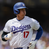
3. LOS ANGELES DODGERS

Mostly, I’m won over the by the color scheme, the classic script on the jerseys and the red numerals on the front (those out-of-nowhere red numbers are one of the most excellent accents on any uniform anywhere). Great interlocking hat logo. Steady, handsome and instantly recognizable.
4. NEW YORK YANKEES

#RealTalk: I generally don’t care for pinstripes. However, there’s no disputing the iconic standing of the Yankee pinstripes. The interlocking “NY” is the second-best hat logo in baseball, topped by only the afore-ranked “Old English D” of Detroit. I love the bold, angular numbering on the back. This has been the Yanks’ home look on a consistent basis since the 1930s; may it never change.
5. HOUSTON ASTROS

Here we have the best of the post-expansion era franchises. When the Astros ditched their orange and blue, they wound up with some of the worst uniforms in baseball. Now, though, the franchise’s true colors are back, and they look terrific. A six-letter nickname makes for the perfect spacing on the jersey front, and the orange piping of course meets with my hearty approval. That hat logo is quite nifty and so, so much better than the “murdered starfish” look from a few years ago …

(Image: MLB.com)
6. CINCINNATI REDS

The most underrated home duds in baseball? Yes, I say. Not enough contemporary jerseys have piping, and here the red piping looks pretty terrific against the home white. The logo on the left side with the number on the right side is an arrangement we don’t see too often, and it gives the top a distinguishing note. The Mr. Redlegs patch on the left sleeve is also a winning accent.
7. BALTIMORE ORIOLES
The O’s find themselves ranked highly for two reasons: one, I like orange, and, two, the smiling bird is just tremendous. The pant stripes look great outlined in black.

Note that Adam Jones's socks are much, much better than what you see above ...

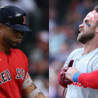
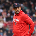
8. BOSTON RED SOX

Great colors, piping, simple and cherished hat logo and one of the best jersey fonts around. Great balance to the lettering, with three letters on each side of the button column.
9. SAN FRANCISCO GIANTS

The Giants crack the top 10 mostly because they have cream-colored home unis. iViva la cream-colored home unis! That’s too rare these days, and the Giants are to be exalted for keeping it alive. Good strong font, and the orange shading is an effective touch.
10. CHICAGO CUBS

These are sharp. Good color scheme, wonderfully spare hat logo, which is a compliment that also applies to the jersey logo. Nifty sleeve patch, as well. Only thing I’d change is to swap out the pinstripes for some piping. Red stripes on the socks would also be a nice touch. So that’s two things I’d change, I guess.
11. WASHINGTON NATIONALS

Yeah, so the “W” looks a quite a bit like the Walgreen’s “W,” but that’s for the copyright attorneys to sort out. Otherwise, these are sneaky good threads. Abundant piping! Double-layer piping, even! I’d prefer more of a block-style “W,” but I like the somewhat unusual number placement on the jersey front.
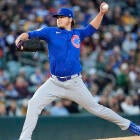
12. PITTSBURGH PIRATES

I generally approve! Great font, love the simple hat logo, nice sleeve patch. Jersey could use some piping. The matte batting helmets are a very nice recent touch ...

(Image: USATSI)
Let it known that the Pirates would be top five if they elevated their Clemente/Mazeroski-era Sunday throwbacks to regular status. Look at these beauties …

(Image: USATSI)

Cream-colored! As just noted above, my fondness for cream-colored unis is both boundless and without bound. However, the Mets have in reality ditched the cream in favor of white home kits this season, so nevermind. Happiest jersey font in baseball? Yes, happiest jersey font in baseball. Great colors, too. Complaints? Put Mr. Met on the sleeve and stripe those socks.
14. TORONTO BLUE JAYS

Nice look right here. I love the Jay logo (with the dangling maple leaf earring!) and the MLB-unique lettering and numbering, and I like the thin double stripes down the side of the pant. My fondness for blue has already been noted. This is the best home uni in Toronto franchise history.
15. MINNESOTA TWINS

They dropped the home pinstripes in advance of this season, which is a modest improvement. As well, the jersey logo is now blue-dominant, which is both, a, a good thing and, b, something that hasn’t been the case since before the Kirby Puckett years. As always, the Twins’ “TC” hat is miles better than its “M” hat. Solid look overall.
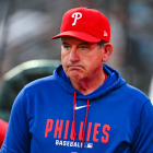
16. PHILADELPHIA PHILLIES

These are solid, eminently defensible uniforms. The number on the sleeve is too rare, so good on the Phillies for that accent. I like dotting the i’s with blue stars. Stripe those socks, people. In this instance, a blue-red-white stripe pattern on the socks would look terrific. Strong overall.
17. TEXAS RANGERS

My big complaint? The belt should be blue. Otherwise, I like the red outlines of the lettering and numbering, and the “regionally appropriate” font is excellent. Good striping on the pants. Good overall, if unspectacular.
18. KANSAS CITY ROYALS

These feel a bit too “Dodgers-derivative” for me, but royal blue is a terrific color. The KC/crown sleeve patch is a great touch and, of course, evocative of one of baseball’s best scoreboards.
19. SEATTLE MARINERS

These are fine. Just fine. Great socks (though, like all other socks/stirrups, not exposed often enough), mediocre color mix, nice nautical touches throughout. As I said: Just fine.
Their new throwback alternates, however, are just about perfect …
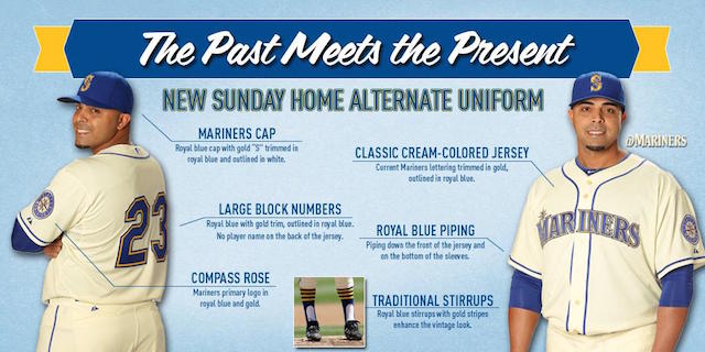
(Image: @Mariners)
Man, that’s a handsome baseball uniform. If this were their home ensemble, then they’d be top five. When I am the unchallenged tribal leader of all I survey, every team will wear cream at home instead of white.
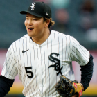
20. CHICAGO WHITE SOX

I don’t particularly like black on white. Too stark. That’s all. They can do better. This, for instance …

That’s what the Sox wore at home from 1951 through 1963, and that, I say, is in improvement over their current home kits. That red outline makes all the difference. I also like the mix of scripts on the jersey and hat. Alas and alack …
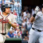
21. ATLANTA BRAVES

The jersey’s too busy. Thinner piping might help, but there’s just not enough white space for my objectively correct tastes. Great belt loops on the hips.
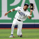
22. TAMPA BAY RAYS

I mean, it’s better than the “Hobie Cat” uniforms of the Jose Canseco/Greg Vaughn era …

(Image: TotalPict.com)
But this home ensemble is otherwise unremarkable. It’s fine, I guess. OK? It’s fine.
23. COLORADO ROCKIES

They’re the only team that incorporates purple into the uniform, so that’s something. Speaking of which, my primary objection here is that purple, not black, should be the driving color of the Rox’s home threads. Live a little, people.
24. MIAMI MARLINS

The “M” sort of looks like it’s flipping the bird at you, which should -- and does -- count for something. These are growing on me, but I still don’t necessarily like them. Making the hats orange would be an improvement. The number shading on the back of the jersey is too much -- it looks like something in 3D without the aid of 3D-enabling eyewear.
25. ARIZONA DIAMONDBACKS

They’re an improvement over the prior generation of D-back uniforms, and the hat logo is interesting enough. I don’t like the jersey script, though -- it’s too prominent and looks not unlike the kind of font that would be used on the label of a “Faces of Death” VHS tape..
26. LOS ANGELES ANGELS

These are harmless and uninspired. I don’t necessarily dislike them, but they’re forgettable. Know what would make things better? This hat …

(Image: ForAllToEnvy.com)
27. OAKLAND ATHLETICS

First and foremost, I would describe the A’s colors as “problematic.” They make for a mess of a hat, as I’m sure you’ll agree. The white cleats are a distinguishing characteristic with which I can live, but no other team need take that cue.
There’s an upside, though …

(Image: USATSI)
Above you see The Only Acceptable Colored Uniform Top In All BaseballTM. It’s “Fort Knox Gold,” in the words of Charlie O. Finley. Too bad it’s relegated to alternate status. A home-white version of this jersey would be a substantial improvement. In my preferred reality, they'd have the jersey design you see immediately above in white plus yellow caps with a green logo. Better already.
28. MILWAUKEE BREWERS

In a vacuum, the Brewers unis are serviceable, if thoroughly dull. However, consider what they once were and what are again on occasion via the throwback …

Beautiful. Such a great hat logo. That the Brewers once fully embraced this look lowers my already low estimation of their current home uni. These should have never gone away.
29. CLEVELAND INDIANS

I’m not one to become easily aggrieved on behalf of others. I’m not forever on the lookout for “microinvalidations” or whatever it is they’re calling it. I don’t have a problem with Native American-inspired team names like Indians, Braves, Seminoles, IIlini or Choctaws (my alma mater!). I don’t have a problem with respectful/neutral renderings such as the ones used by most of the teams just name-checked -- the ones that imbue the subject with a sense of strength and even nobility. However, the grinning, red-faced caricature known as “Chief Wahoo” ought to be beneath us by now. It’s a mockery of its subject, not a testament to it. Little wonder, then, that the team has been quietly marginalizing Wahoo in recent years. Soon enough, I expect it will disappear from the home hats, as it should.
But it's a (widely misunderstood and misapplied) part of team history, you say? Cool. Let it remain a part of team history rather than the present.
Of lesser importance is that the jersey script is a little too billowy for my tastes. Also needs blue piping on the jersey front.
30. SAN DIEGO PADRES

Absent history, these would be inoffensively boring. Since history is an actual thing, though, they stand as a rebuke of how the Padres ought to look. The Padres, you see, were forged as brown and gold, and brown and gold they should be. Despite what you see above, blue is not a part of their true palette.
Not so long ago, Padres fan and visual artists John Brubaker undertook a reimagining of the Padres’ uniforms and reintroduced their true colors.
New-Look Padres, Back in Brown. http://t.co/7GZVRYMZil @Padres @PadresMikeDee @gaslampball @LobShots pic.twitter.com/zEuYJmR78F
— John Brubaker (@johnbrubaker) January 8, 2015
People, that’s what the Padres should look like.
Coming next week: Courageously ranking the road uniforms.
(Thanks again to SportsLogos.net and Chris Creamer)